Metron

Metron

Sunday, October 27, 2013

Introducing Armin Ozdic

It's funny, in a way. I create a blog, to share my thoughts about comic books and comic art, and yet, most of what I actually post about those things ends up being posted elsewhere - namely, on forums. One such forum that I frequent a lot, of late, is the Digital Webbing forum.

It's really a great art-related forum, one that isn't overpopulated, yet which is active. Usually, every time that I visit it, multiple pieces of new art have been posted. Some I like, some I dislike, and some I am indifferent to. But, while it wasn't intended on my part, this place has become my home away from home, sort of, when my mind begins to dwell on things comic art related.

Some days, though, even though this blog is still relatively new, my personal time gets dominated by other things. On numerous days, I want to post here. I fully intend to post here. Being tired, though, negatively impacts my posting ratio. Man, I'm still relatively fresh out of the gate, but already, my vehicle of thought has begun to sputter. I guess that I will have to redouble my efforts, and put more effort into it, eh?

Ack!! I noticed, just now, that my link over on the left hand side of the page that links to the Digital Webbing forum isn't working properly. So, I open up the edit function, and lo and behold! - A previous copy and paste job gone astray was the culprit. I had an extra http:// in it, it seems. BAM!! Problem remedied! How ironic, today, I get to be the one that saves the day.

Oh, yeah - No one is actually following this blog, yet. So, this event goes unnoticed, but not unrecorded. Let those who come after us take note of this deed, and let us strive to not repeat this error of our ways in future days.

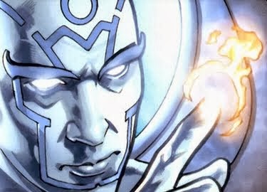
Here's an example of a recent art piece posted in the Digital Webbing forum that caught my eye.

The discussion thread that it was posted in can be found here.

Apparently, what I saw was not what the artist actually intended the reader/viewer to see.  To see what I thought, just click on that link, above, and go there and read it for yourself. No need to rehash what I already posted there.

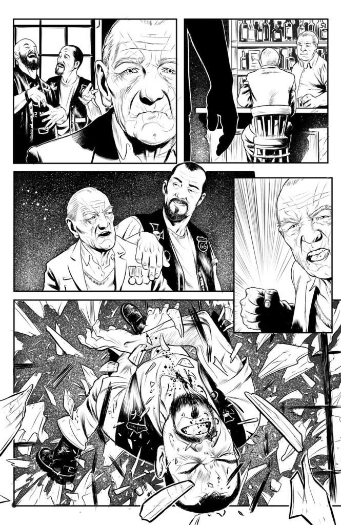
As time progresses, my appreciation for panels, themselves, in comic books and comic art has grown considerably. An awful lot of comic books done by independent artists, and even by the big boys over at Marvel and DC, tend to fail to fully appreciate the value that panel choice adds to sequentials.

The artist that did this particular art is Armin Ozdic, hailing from Bosnia and Herzegovina in Europe. More of Armin's artistic handiwork can be found here, here, and here.

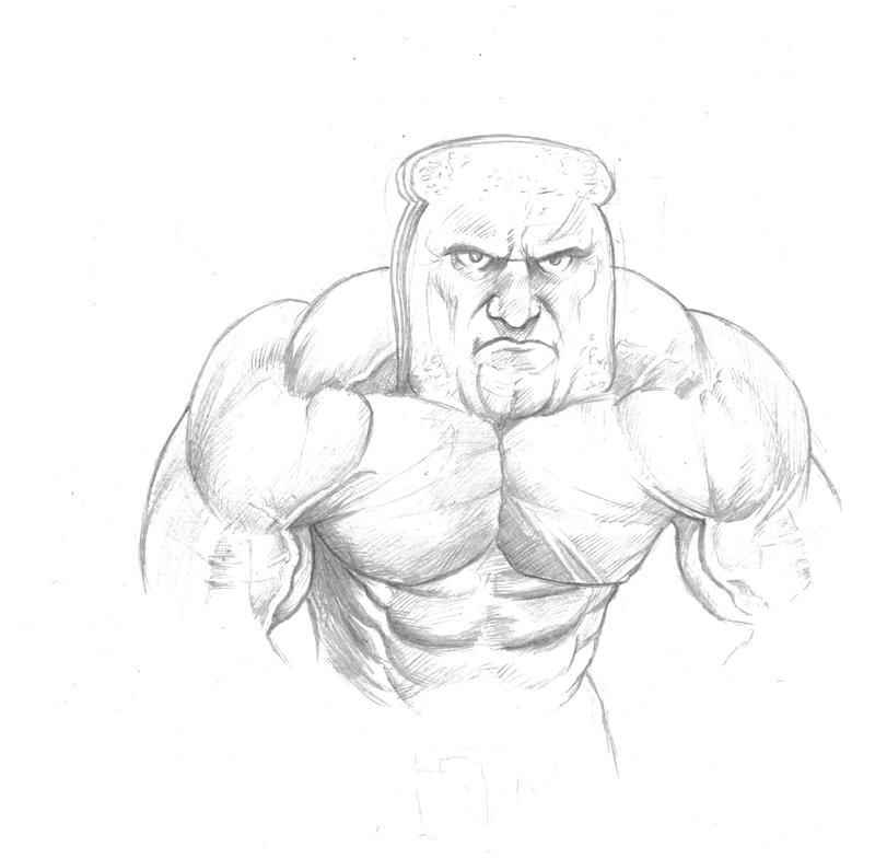
If you fail to check out Armin's other work, then you stand to miss such imaginative offerings as this one.

Powdered Toast Man. How great is that?

Wouldn't you hate to have a run in with this guy? But, now, if it was someone else having a run in with him, would you really want to tell your children, some day, that you missed it? No way!

Armin is a very talented artist. I'm glad that I encountered him along the way.

More talented artists await you, over at the Digital Webbing forum


Saturday, October 19, 2013

I Warned You No Vault Could Keep Me Prisoner!

Ah, Mordru!

Now, here's a guy who makes a fine super villain. And powerful? Man, what are you talking about?

Mordru has been one of my all-time favorite villains, ever since I first encountered him in an issue of Adventure Comics, the one with his hands coming through a the door of what appears to be a big steel vault of some kind.

What better character to showcase, when one hasn't updated their blog in almost a week.

What?!

Yep, it's been six whole days - almost one full week - since I last posted here. One might mistakenly get the idea that I have abandoned this blog, if one happened across it during their journey across the Internet.

But, nothing could be further from the truth!

Actually, I have been posting a good bit, of late, about comic book art, but over on the Digital Webbing forum. Did I ever mention how much I like that forum, a place that has quickly grown on me? Well, of course I haven't, but there's a handy link to it over on the sidebar, if you're itching to join me there.

Unfortunately for me, I don't tend to encounter too many aspiring comic book artists that seem inclined to churn out Mordru images. Alas, such a pity! His claim to infamy is sorely lacking as a result of the preoccupation by artists with other characters.

Nonetheless, I persevere in my affinity for this guy, a sorcerer of the first magnitude.

If blogs had existed, back when I was a kid reading comic books during my comic books heyday, there is no way that I would not have written at length about Mordru.

In the intervening years between then and now, there have been about a bubbazillion comic books published that I have not read - including *gasp* some that have incorporated Mordru into their respective story lines. I really have some catching up to do.

Mordru's old costume isn't likely to win him any modern day fashion awards. Rather, for this fellow, it's all about power - and Mordru (fortunately for the reader but not for his enemies, which tend to be good guys in colorful costumes sporting super powers of their own) has power in spades, and then some.

If blog posts were the equivalent of super powers, then Mordru would quickly vaporize me in any battle between he and I.

But, they're not, and so I remain safe a short while longer here in this humble - and super quiet - abode nestled somewhere in the weeds of the Internet.

Whether he's taking on the Justice League of America or the Legion of Super Heroes, Mordru is ever a threat to be taken seriously by all who dare to oppose him.

Like many in the super powered business, whether good or evil, Mordru's claim to super powers make it difficult to imagine superheroes being able to actually best him. But, comic book writers invariably manage, which is fine and dandy, since it is comic books that we are talking about.

Even still, though, Mordru can't be counted out, nor should he ever be counted out, for the very simple reason that he makes a great foil to superheroes who are ever looking to save both the universe and the day.

Sunday, October 13, 2013

Artist Nick Justus: Dominant Master of Imagery meets Inker Extraordinaire!


I love great art, and in particular, I love great comic book art. If it's of the superhero variety, then all the better. Around six months ago, I encountered the artwork of a one Nick Justus. The example above from his deviantArt online art gallery is one of my personal favorites of his handiwork.

The panels in the scene, above, are a two-page spread from the very first issue of the Jesus E. Lee comic book series.

Nick Justus' growing body of comic book art on the Jesus E. Lee series is only a fraction of his overall artistic accomplishments to date. Some of his very best handiwork in the area of comic book type art isn't even included in the Jesus E. Lee series. For example, I just absolutely love his inked artistry with the character, Cyclops.


The clean lines, the beautiful inking, the sharp contrast between the black ink and the white of the canvas rendered in such a way that the final result is a visual smorgasbord of superhero delight. Cyclops isn't even one of my personal favorite superhero characters, by far - yet, I continually revisit Nick Justus' rendition of him in this short set of five images.

For grand theater being played out in comic book art style, Nick Justus' Obamasaurus Wrecked is a piece that really gets the job done. Dinosaurs running rampant in a modern day city, a scene with people fleeing for their lives, is in synch with my imagination.


Unfortunately, not all of Nick's panels provide his viewing audience and fan base with such awesome visuals. But, on those occasions when he opts to go the full Monty, he is an artist that is truly capable of wowing readers with a dominant mastery of imagery.

Thursday, October 10, 2013

I've Smashed Your Invulnerable Fortress, Superman!

I remember reading this issue of Superman, back in the day. I bought it, and I have always liked the way that the Galactic Golem came crashing through the door of Superman's Fortress of Solitude.

That's back before Superman's special abode on Earth became all crystallized. That big damned door, the one that required that huge key to open, now THAT'S the real Fortress of Solitude, in my book - and in my memory.

I don't remember a lot about this particular story, but I do like the way that the Galactic Golem looked. He looked better on the front cover, than he did in the interior pages. But, such is life in the lane of comic book super villains.

Wouldn't it be wonderful to be able to draw like this?

Well, some people can, of course. I just don't happen to be one of them. If I did, then I think that I would probably just draw most all of the time, in my spare time.

Galactic Golem bursts through the door with such force, that chunks of the door break off and fling through the room where Superman's standing. The motion and direction of these debris pieces are really what make this scene stand out.

The coloring around the speech bubbles for the Galactic Golem help to underscore the forcefulness of his voice.

In spite of his by-now legendary super speed and super reflexes, once again, Superman is caught off guard. Hey, what's up with that, anyway? In movies, especially, Superman's reflexes usually tend to be no faster - and sometimes slower than - otherwise normal human beings. Remember when Lex Luthor (played by Kevin Spacey) manages to stab Superman with a piece of Kryptonite, in that Superman Returns movie? What's up with that?! Faster than a speeding bullet, indeed!

Review - Theoktonia - Issue 0

I grabbed a bunch of free digital comics in PDF format, today, from over at Drive Thru Comics. Included in this smorgasbord of comic book fare was issue # 0 of a title called Theoktonia. It's sub-title is Mata Leao.

Not really knowing what to expect, the front cover did not hold my attention for very long. Some guy with what appeared to be the top part of a lion's head about to consume his head, with someone's arm grabbing him around the throat from behind. He's got chains hanging across his chest. I had no idea what lurked beyond that front cover, since I wasn't familiar with this title, at all.

Turning the page revealed a small amount of wording on the inside of the front cover. Its a credits page, giving credit to where it was due. The choice of font used only served to make it difficult to read the credits. So, I didn't bother with dwelling on it.Thumbs down on the font selection for the credits.

Flip the page, again, and.....BAM!! Some beautiful artwork immediately hits you right over the head. The interior art gets two big thumbs up from me. The colorist's handiwork, especially, is what immediately grabbed me. Even if the story ends up sucking, at least I won't end up hating the artwork that adorns the interior pages of this issue zero. What's up with that, anyway? Issue zero? Really?! Go figure.

It's obvious, now, that the setting is ancient Greece. I have mixed feelings about the font used for the text narratives. Going with a slightly larger font size would have likely mooted this concern of mine. I sort of dreaded having to read the entire issue, with that font staring me in the face. But, the art and color lured me in. I had to turn the page.

Oh, my God! Damn! I turned the page, and again the Wow Factor hits me - full force, this time. I haven't even gotten into the story, yet, and already, I am feeling some really positive vibes emanating from this comic book. This title definitely holds promise - and it holds it in spades!

A double-paged spread of a girl dreaming, a huge battle taking place in the center of the page, with several smaller panels populating the edges. It looks like orcs or zombies or something attacking a Greek temple of some sort. It's just a really beautiful scene. I will even go so far as to say that it's gorgeous. Not that the creatures attacking are gorgeous. Rather, the artwork, itself, the scene, the coloring, they all hit the right notes with me. I am going to have to buckle down, and read what's going on.


As I proceed through the book, I notice that it has some decent special effects lettering in some of the battle scenes.

The guy on the front cover, as it turns out, is Hercules. The guy holding him around the throat? I'll leave that little nugget a mystery. Check it out for yourself. It's worth the download - and at the price of free that I paid for it, I can certainly attest that it's worth the time that it takes to download it.

My personal favorite scenes from this issue of Theoktonia are actually not the ones with Hercules in them. Not that he's rendered poorly, because he isn't. Rather, some of the other artwork, particularly in scenes that are not battle scenes, really add to the aesthetics of this comic book. The non-warrior characters are portrayed at least as well as the warriors, themselves. Personally, I think that these "supporting characters," if I may call them that, are better rendered than the stars of the show, so to speak.

Comic books like this are a real treasure of a find, when you happen across them. This issue reeked of solid quality. Ah, what a refreshing smell that is!


In summation, it's two thumbs up for Theoktonia issue # 0, from me. You're not going to go wrong grabbing this issue. Indeed, this may well prove to be the start of something really great.

You can buy issue # 0 of Theoktonia by clicking here.

The people publishing this comic book title areDeimos Comics, which can be found here.

Story & Script: Demosthenes Daskaleas
Pencils & Inks: Verry Woong
Colors: Novianto Sulastomo
Cover: Rudy Ao

Tuesday, October 8, 2013

Why have you summoned us to your Earth?

Here we are, the first issue of a three issue run that proved to be a milestone for me, when it came to comic books.

It was here that I first met the Seven Soldiers of Victory. This particular multi-issue storyline cemented me in the ranks of those comic book fans whose tastebuds hanker for more than just single issue fare.

The Justice League of America was the entity that drew me towards super groups, more so than to just individuals operating with super powers on their own.

The more the merrier, seemed quite appetizing to me, back in the day - the day when the comic book was king, when comic book tales were the form of literature truest to heart.

All things considered, however, while the hand that shook the world left itself indelibly etched into my memory, I actually retain less memory of this tale than of one that came along just a few issues later.

Enter good old Uncle Sam and his fellow super-powered patriots who were still fighting the Nazis, after the Nazis won World War II.

Say what?!

If you think that Starbreaker makes for a worthy adversary, try tossing a few Nazis into the mix.

This multi-issue story line was a primary inspiration for me to begin painting the toy German soldiers from my World War II play set. Between this Justice League story and my affinity for Hogan's Heroes and books about World War II, black paint meets plastic equaled Gestapo and Adolph Hitler figures.

Even the orbiting satellite that hung high in the sky, dangling from kite string over that tree limb, traces its roots to this particular tale.

Those were the days, eh?

Monday, October 7, 2013

What am I bid for his boots -- his suit -- his cape?

I found it!

As best as I can remember, this is the very first superhero comic book that won me over to the genre, back when I was a young kid growing up.

But, it was a specific page on the interior of this issue that sticks in my mind the most, and not the cover, itself.

This issue hails from the year 1970, so I didn't gravitate toward comic books until some time after my seventh birthday. If memory serves me correctly, my daddy's copy of this comic book was already missing its front cover, by the time that I got around to discovering it.

Three hundred thousand dollars is what Superman's costume fetched from its buyer, back in the day, apparently. "Completely bullet-proof!" it's buyer quipped! Off the top of my head, I don't recall how much the other various components of the Man of Steel's costume brought at auction, on that fateful day.

I am going to contact a local comic book shop, and see if I can't track down a copy of this particular issue from the past. I don't need - nor even care about - a collector quality copy. As long as the pages are all intact, even a heavily worn copy will suit me, just fine.

By comparison, I read relatively few comic books, these days. As a kid, I couldn't get enough.

Superheroes, superheroes, and more superheroes! I liked the super villains, too. Archie, Richie Rich, and various Disney characters, especially Scrooge McDuck, a favorite of my daddy's. Various Westerns and World War II-oriented titles were all consumed with equal fervor.

Comic books were a learning tool, also. Whether pure fiction or historically-based, comic books made learning fun. When words such as Metropolis, Krypton, and Thanagar were already in your vocabulary, spelling tests were a much less daunting task. Comic books unleashed the imagination, and they were certainly far more interesting than school curriculum.

Superman survived his date with the Execution Planet, it seems. At the time, it may, indeed, have been the one doom that Superman feared the most - but, for me, it is a memory that I cherish, even still.

Thanks, Superman! You're OK, in my book.

Sunday, October 6, 2013

Review - Remnants (Issue 2)


What can I say? It was my lucky day.

Having read issue # 1 of this series, I located issues # 2, #3, and # 4 all available for download for free in PDF format over at the Drive Thru Comics website.

You're damned right, I downloaded 'em.

Issue # 1 laid down a good, solid storyline, and it also left me hanging. So, I'm back for more.

Did issue # 2 deliver the goods?

I think so.

What am I saying? I know that it did. I say that, because by the time that I finished reading it, I'm wanting to know what happens next.

And that, my friends from all across the Big Land of the Comic Book, is what a story is supposed to do.

The artwork is pretty much more of the same, as what we saw in issue # 1. It's not bad. It's muted, toned-down. Some pages have what seems to be too much light - probably some special effects from an image editor that they used on the art before finalizing it.

The front cover is a step up from issue # 1. Several characters standing in front of some stained glass windows. Why they chosen to tone down stained glass in an image, I'm not sure. But, it works, nonetheless.

I'll tell you one thing that I do like, and very much so, is the fact that on the inside of this issue, they take time out to introduce us to several of the main characters, replete with pictures of them. So, now I get to see just who in the Hell that the main protagonist, Nick, is.

This comic book title makes effective use of dialogue, at least in the two issues that I have read, thus far. It drives the storyline forward at a good pace. So far, the reader isn't left lollygagging around waiting for something to happen.

It's coming. It's going to happen. And you know it. You've just got to flip the pages, is all.


Now, I don't know anything about this so-called "impregnable vault" that these two gentlemen in this panel, above, are talking about, but I'll just have to take their word for it.

But, of course, it has been compromised. That's why it's called impregnable, after all.

So, adding one and one together, and it doesn't exactly take an Einstein to figure out that something bad has hapened.

The guy in the church who just happened to be carrying several sticks of dynamite was a nice touch. Be sure to pass the collection plate around, fellas.

The panels on the left that I included with this review are a good example of why I like this particular comic book series, Remnants.

The characters are not the most refined or polished art drawings that I have ever seen. But, they are rendered in an effective manner, time and time and time, again.

I especially like the looks on their faces, when these characters catch an unexpected glimpse of all that dynamite going off. Please take note of the scenic vista. If you plan on visiting Shreveport, Louisiana, though, then you might just want to wait until this entire mess blows over.

With many comic books, you never want to give away the ending. That last scene can - and quite often does - hold special meaning to the story.

But, I am going to show it to you, anyway - just so that you can see how these guys that are creating this title are keeping me (the reader) in suspense.


My sentiments, exactly, Captain Merrick.

All things considered, it's another good issue, well worth your time and your consideration. It has my recommendation.

To buy issue # 2 of Remnants, click here.

Once again, credits for this issue include the same team of Scott McClenaghan, Alex Williamson, and J.M. Ringuet.

Review - Remnants (Issue 1)

Sporting a cover price of $4.99, I managed to pick up a copy for free, while browsing the free comic book selection over at Drive Thru Comics. The name of it is Remnants.

I downloaded it in the morning, and went about my business all day. When I got home late at night, I sat down to relax, and remembered that I had downloaded it. So, I opened it up my PDF copy into the Sumatra PDF reader that I use for browsing PDF files, and decided to see if it was worth bothering with or not.

My first impression?

The front cover is OK. So-so, with some police officers staring back at the reader (namely, myself). I tend to gravitate towards superhero comic books, and not police stories, but it was free, and I figured, "What the heck?"

As I begin to flip the pages, the artwork is OK. It's fairly decent artwork. I'm not flipping out, or anything. I'm not agog. I'm not flabbergasted by it. It's just a decent job with the art.

The pages do seem to have a rather muted effect to the artwork, though. None of the colors are popping off the page at me. Nothing is really standing out, grabbing my attention.

So, I fix myself a glass of chocolate milk to drink, as I read through this story.

Let me tell you. Generally speaking, I think that comic books - particularly those in digital form - tend to be way overpriced. At $4.99, I feel the exact, same way about this comic book, too - this Remnants issue # 1 that I've got my hands on.

But, that's just a general peeve of mine.

I will say this. This is a great first issue to a comic book series. By the time that I got through the last page of issue # 1, I'm ready to track down issue # 2, and find out what happens next.

Yeah, it's THAT kind of comic book. It lulls you in with the toned down color scheme. The story is what is going to snag you.

The tale opens with scenes of a television showing what appears to be scenes from a terrorist attack.


But, let me tell you, buddy - this ain't no terrorist attack. Not any ordinary terrorist, anyway. I don't know what it is, yet, anyway. They left me hanging at the end of issue # 1.

Damn them!

The story builds at a fairly fast pace. There's no real languishing around to induce you with boredom. Plus, the artwork begins to fit the tale, just fine. That's my opinion of it, anyway. The combination that they came up with for issue # 1 works - and works well, in my considered opinion.


I'm ending this review, here, because I'm going to go and track down issue # 2, and see if it's available for free, also. I'm not giving five bucks a pop for a PDF comic book of typical size. But, is it a comic book title, a series, that I would be willing to pay something for? If issue # 1 is any kind of an indication, at all, then the answer coming from me is a clear and resounding, "Yes!"

Click here to buy it.

Or visit their website, by clicking here.

Credits for issue # 1 of Remnants include Scott McClenaghan, Alex Williamson, and J.M. Ringuet.

Saturday, October 5, 2013

Review - Vitruvian Underground (Issue 1)

I picked up a digital copy of issue # 1 of Vitruvian Underground a number of months back. It was written and colored by Ramon Villalobos, and it was pencilled, inked, and lettered by Craig Cermak.

They say that you should not judge a book by its cover. I think that axiom is applicable with force, in the instance of this particular comic book. The interior artwork and coloring are far superior to the front cover. Go figure.

The biggest strength of this comic book title is its star character, Kid Vinci. He's a great character, very colorful, and the dialogue within issue # 1 certainly helps to bring Kid Vinci's personality front and center in this title.

The supporting cast of characters, however, do not even remotely approach the level of interest that Kid Vinci achieves with the reader. That's not to say that none of them work. Rather, they are all of secondary interest to Kid Vinci.

Costume-wise, this comic book is unlikely to win any awards, anytime soon. But, the characters do connect with one another, for the most part, and because they do, I could see this team succeeding over an extended run for this title.

I wasn't particularly impressed with the ending of issue # 1. But, the "bad guys" weren't really up to the task of carrying their end of the story. So, the tale, itself, is lacking, even though the chemistry between the characters that comprise the team works.

This comic book features some really nice instances of artwork, and it's a damned crying shame that readers weren't treated to more of the White Dwarf Agents of S.N.O.W..

Vitruvian Underground issue # 1 did a very good job of injecting media coverage into the pages of a comic book. The issue succeeded in its attempt to capture the "aliens" landing on Earth. Both the cell phone panel and the video camera view screens imbued the issue with a solid modern feel.


The "worms" looked good and worked well, but then, the book sort of went downhill. The dialogue presented on the last page of issue # 1 was a nice finale, but the actual story was already over, by then.

 Kid Vinci is a strong starring character. How unfortunate it is, then, that they chose to saddle him with various "blue things." These "devices," if I may call them that, are aesthetically problematic. They detract from the art. What a pity that this particular approach was used. I suspect that they represent 4th Dimensional technology. Be that as it may, it is ironic that Kid Vinci's 4th Dimensional nature is captured much better through the text that constitutes his dialogue, even as the artistic representation of this very same concept falls flat on its proverbial face. Good concept - bad implementation.

All things considered, would I recommend issue # 1 of Vitruvian Underground to others? Certainly. Kid Vinci, alone, is worth the price of admission.I would also be strongly inclined to buy issue # 2, should such a follow-up issue actually materialize at some point down the road.

To learn more about Vitruvian Underground, follow the link here.

To buy issue # 1 of Vitruvian Underground, click here, instead.

The Fuel of Red Suns Flows in My Veins!

I spent a little time, this morning (OK, more than just a little time) searching the Internet for an image from an old comic book that I remember reading as a kid.

Think that it's easy to find anything that you want, on the Internet? Think again, sons and daughters of Superherodom!

I wanted to find that particular image, because it is probably the one scene from a comic book that really drew me into the superhero genre of comic books. It was a comic book that my daddy kept under his bed mattress.

Irony being what it invariably is, my daddy wasn't really a big fan of superhero comic books. It was just one comic book out of what was, perhaps, a couple of dozen that my daddy kept as a handy stash to sate his appetite for an occasional comic book read.

He much preferred Scrooge McDuck to Superman, but I acquired a taste for both.

From Superman to the Justice League is not a particularly big leap, if you stop and think about it. It's a natural progression for a kid introduced to comic books, one without a background of experience to draw upon.

Enter Starbreaker!

Starbreaker was the first real cosmic-level super villain that I encountered while browsing through the comic books sitting in that comic book spinner rack in that drug store located next to that Ben Franklin store. At least, he was the very first one to make a real impact upon me and my comic book tastebuds.

It was this image right here, of Starbreaker handling the Man of Steel with such casual ease, that stuck with me

Now, this was not the image that I was looking for. Rather, this particular image hails from a Justice League of America comic book. For a kid's imagination, Starbreaker was a big step up the ladder into the realm of super powers. A cosmic vampire! Now, that's what I'm talking about!

Looking at this image, today, I wouldn't be likely to award the colorist any awards. But, back in the day, man oh man! This was an image that had visual impact to spare.

The power of a red sun flowing through his veins, Starbreaker had so much power at his disposal that Superman's otherwise equally-invulnerable costume was torn to tatters. Damn! Superman is sent reeling. If Starbreaker can do this to Superman, then what hope does anyone else have?

When - and if - I find that other image that I as looking for, I'll be sure to post it - and to comment on it at greater length. For now, though, I'll have to console myself with second place - the second place tier of influential images in the span of my superhero loving life.

It's less about superheros and super villains than it is about the concept of super powers, themselves. Load them up with all sorts of powers, and let them have at one another. The human imagination becomes a super-powered playground.

It remains that way, today.

Friday, October 4, 2013

No, Virginia, Angel Eyes is not Santa Claus!


Well, it doesn't exactly qualify as an actual super villain lair, but it was the best that I could do on such short notice.

That's right - I'm starting this blog on a whim. A whim, I tell you! I mean, how much more unprepared could one be, than to go off on a tangent like this, based on nothing more than a mere whim?

To be perfectly honest, though (Hey, is that even possible?? Perfect honesty in a human being? I mean, c'mon now.), it really wasn't just a whim. It was more of an idea. Yeah, yeah, that's it. It was an idea.

But, not just any ordinary, common, run of the mill variety idea. Oh, no, that would never do. This, my friends and foes, alike, was a super-powered idea!

You see, that's what this here Blog-O-Matic thingamajig is all about. Having tired of traipsing all over the Internet like a modern-day Kamandi for a place to share and discuss my thoughts on comic books and comic book art, I have opted to retreat into this Blog of a Bunker, this not-so-secure Fortress of Solitude that I have tossed together with a combination of wit, appreciation, and duct tape - mostly duct tape.

If you happen upon this site, then it's pretty obvious to me that you are lost. But, don't let that stop you from browsing, loitering, and falling asleep on the couch. Uh, what's that?? Oh, right - I forgot the couch. Well, two out of three ain't bad.

When it comes to Internet site traffic, this blog is forever destined to get site traffic stomped by the Big Boys of Blogdom. But, don't let that phase you. It certainly won't phase me.

To get this blog started off on the right foot, I thought that I would share an image crafted by a personal favorite artist of mine, Nick Justus. That's either Nick Justus stomping me in the head, for all of the critiques and criticisms that I have tossed his way over the last several months at different pit stops scattered all over this lovely Internet of ours, or its that foul villain, Angel Eyes, stomping on the pride of Richmond, Virginia - superhero Jesus E. Lee.

Hey, I had to start somewhere!

It's a great image, what with Angel Eyes stomping the Hell out of Jesus E. Lee, the ground cracking open from the impact. Those energy lines emanating up from the ground around Jesus E. Lee and on past Angel Eyes really drives the point home.

It wasn't a typical rectangular panel. Plus, the special effects lettering that Nick Justus worked into it sits at an angle on the page, which only adds to the beauty of the overall scene.

It really isn't a complicated scene, at all. There's precious little in the way of background, due to the foreground being given such preference in this particular scene. It's a panel that features no real wasted white space of note.

As such, this is an example of good, solid comic book superhero artwork.

Black and white inked artwork of this variety is one of Nick Justus' stronger skill sets as an artist. Nick is very gifted at crafting fine eye candy in the form of black and white inked artwork.