
I read issues one and two of 3Corps in a back-to-back, rapid succession manner. As soon as I finished issue one, I then immediately took up the reading of issue two. I say this for a reason - that to read issue number one as a standalone item will not give you the picture that you need of either the storyline or the characters, in order to fully appreciate the potential that this comic book series embodies.
As with many first issues put out by independent comic book companies, issue one of 3Corps suffers from its fair share of shortcomings. Namely, the supporting mechanisms find themselves challenged to deliver on the premise of what the underlying story advocates in favor of delivering.
In other words, the story, itself, is the strongest asset that issue number one contains within the expanse of its pages.
Often, when it comes to the creation of comic books, the art tends to command the greatest expenditure of dollars, followed by the coloring. Lettering is often the very first thing placed upon the sacrificial altar, in the name of getting the thing done and out the door.
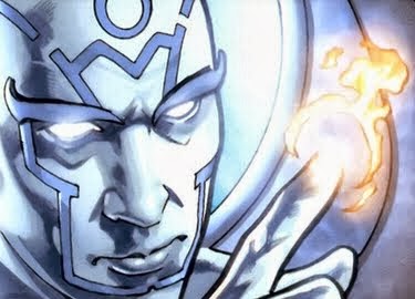
 |
| It's an action packed comic. |
Oh, well, for some inexplicable reason, writing is an undervalued commodity, in the overall scheme of manufacturing comic books.
Issue # 1 of 3Corps is quick to toss the reader directly into the thick of things. One thing is certain - 3Corps is an action-oriented series.
Having read it, having enjoyed it, and having digested it, as I sit here just flipping the pages of issue number one back and forth, in order to give it an additional once over, I find myself coming to the same conclusion already previously reached.
Namely, that the weakest link in this chain is the coloring.
 |
| Uh...What happened to the teeth? |
But, that said and conceded, when considered in its sum totality, the coloring suffers from a thing that I call consistency. It is not all of the same quality, color-wise.
Nonetheless, it is a comic book that can be enjoyed, and the colorist clearly made an effort to stoke this issue with energy. But, the implementation did not live up to the concept, unfortunately.
 |
| A panel portion that visually undersells this comic book. |
Visually, it is the lettering that saves this issue. It has competent lettering, all of the way through it. The special effects lettering, on the other hand, is a mixed bag.
 |
| Solid lettering example! |
The primary point of special effects lettering is to inject visual impact into a scene. There's certainly a variety of different special effects lettering instances on display. Yet, the coloring of them is sub-part, in instances, and none of them really seem to get the job done. They are visual eyesores as often as they are anything else.
I want to like them. I really do. But, ultimately, they let me down. They deflate what I feel, as I make my way through the pages of this story. Rather than save the visual day, the special effects lettering betrayed me, time and time again. Where special effects lettering is concerned, issue one of 3Corps is the issue that could have been.
 |
| Straight as a line, yet visually bland and creatively unimaginative. |
Overall, the issue implements speech bubbles well. Some feel a bit cramped, whereas some others feel underpowered by the lettering that they encase. But, even still, it's a commendable job of lettering this comic book.
 |
| Max is getting fed up. |
But, such a pity, it is, that the artist and the colorist could not collectively get this issue to where it needed to be, visually, that justice to this title could be properly done.
So, when all of the visual eye candy is expended, where does the reader find himself or herself? Back at the story, itself. And there is a good place to be.
 |
| I love this - but, not the rest. |
I liked the story. I enjoyed it. When I finished issue one, I wanted to read issue two. Regardless of how it happened or why it happened, it happened. That, to me, is success.
Now, I may not speak glowingly about it, but if I read your comic book, and after doing so, I still want to read what comes next, then you have clearly done something right. That's a far better situation to be in than if the reader puts your work down unfinished, or if the reader actively seeks to avoid reading your next offering.
The character Gabriel gets off to a strong start. You quickly get the sense that Gabriel is a villain - but, as the pages get turned, I found myself wondering.
 |
| More good lettering, nice speech bubbles. |
My personal favorite character that lurks within the pages of issue number one is the colonel. While he wears more stars on his uniform than most generals, even still, he is a colonel.
But, that's a small nit to pick with a character that I quickly found a literary attachment to.
 |
| Very nice image of the Colonel. |
Now, how a comic book with super powered individuals in it manages to present the least physically gifted character as its most interesting is side issue unto itself. But, to me, that's exactly what happened.
Gabriel and Max engage in epic battle. It's a shame that it couldn't have better captured through art and coloring, but that's what happens, sometimes. Not every comic book is an opus of note.
I will say this about Gabriel - He's committed. He knows how to kick ass, and he's not one to be played for a fool. He's more sufferable than certain plot lines. Yet, how much ground can one issue cover, particularly if that one issue is issue one?
 |
| A commanding presence. |
Stepping from issue number one of 3Corps to issue number two yields a major upgrade in both the art and the coloring. But, my comments about issue two are best reserved for another day.
For the moment, the spotlight remains squarely upon issue number one of 3Corps.
It's a story that I feel is worth taking the time to read, but more importantly, it is a work that sets the stage for greater things to follow.
 |
| Visually stiff. Blah! |
But, it's the kind of overkill that kills my visual interest, because it draws the eye away from the art. It feels less like narration than boxes striving to compete with objects of far greater visual interesting, and having no chance. The reader can find them, without them being presented, thus.
It is not contrast that these bright yellow creatures fail, but rather, they fail on the ground of aesthetics. Granted, sometimes, it's just a hard call. At some point, you have to make a call, as far as what to go with, and then you implement it. But, if you're going to go that route, then at least make the lettering large enough to enable the reader to avert squinting. Yes, comic books in digital format are easily zoomed in upon, but if the reader feels compelled to do that, then you've already made two mistakes - one in production and one in marketing.
 |
| This page looks like crap! |
One lesson about the creation of a comic book, and about the crafting of the pages that collectively comprise the entire work, that Top Secret Press can learn from its production that is Issue # 1 of 3Corps is that even the credits page matters.
To their good credit, they actually have already learned this lesson, it seems, if Issue # 2 of 3Corps is any indicator. I know, because I have already seen issue two, and I have already compared the credits page in it with the credits page that issue one was saddled with.
Granted, the credits page doesn't really impact the story, itself. What it does do, though, is to directly impact the perception of quality that the reader will associate with the end product. If I noticed it, odds are, others will, also.
 |
| Who needs a head when you've got special effects lettering? Off-center in more than one way. |
And, if they are merely flipping through issue one, and they cast their eyes upon the credits page, then the temptation to judge the comic book before reading it rears its ugly head, to the detriment of both 3Corps and Top Secret Press.
 |
| There's a reason he's my favorite character. |
Accordingly, I'm recommending it, even as I chew its ass for its shortcomings. I do so, with a clear conscience, and with the knowledge that issue two of 3Corps has already made progress in moving this comic book series forward, by getting it on more solid ground along a number of different fronts - including both the coloring and the art.
 |
| The Colonel is listening, but is Top Secret Press? |
Ironically enough, 3Corps wasn't the comic book title that tempted me to make the plunge, and give Top Secret Press' comic book products a try. That honor belongs to another comic book, one titled, "The Strange."
 |
| My God, man! Read 3Corps! |
But, sometimes, it's strange, indeed, how things turn out. For right now, though, I'm going on record as waiting for issue number three of 3Corps. I encourage you to give the series, 3Corps, a try.
Trust me - There's a LOT worse comic books out there than 3Corps.
Maybe that's just another reason why 3Corps was brought into existence in the first place. It's a comic book with a mission - a mission with a few casualties along the way to be expected.
3Corps - Issue # 1
Publisher: Top Secret Press
Writer: John Daniel Taylor IV
Artist & Inker: Samir Samao
Colorist: Jay Moyano
Lettering: Inklight Studios
Editing: John Daniel Taylor IV & Francesca Henle-Taylor
No comments:
Post a Comment