

I backed it. The project ended - it's funding goal met and exceeded! Shortly thereafter, a digital copy of the comic book in PDF format made its way into my e-mail in-box.
I consumed it, in short order. Now, after all, not only was this a new title, it was also my first comic book encounter with this company, Unstoppable Comics.
If I may be so bold, if I may be so blunt, the bottom line is that I enjoyed it.
A lot.
For starters, it's got a great front cover. The cover art depicts a guy with energy emanating from behind him, and his clothing is in tatters. He's wearing a metal helmet and gloves. His helmet reminds me of a what you might get if you cross a Cylon with both Rom: Spaceknight and Doctor Doom. That's what it made me think of, anyway. His facial expression, what we see of it, drives home the point that what he is experiencing, from the impact of this energy upon him, is pain.
Having never encountered either the company or the character, before, I really didn't know what to expect - or to think. My impression of what I had encountered, when my impression was formed in its totality based solely and only upon what was being presented on the Kickstarter project page, can be found over on another blog that I wrote by clicking on the following link:
http://squatchkick.blogspot.com/2014/08/kickstarter-project-unstoppable-origins.html

But, that was a review of the Kickstarter project, and what was being presented therein. It was not a review of the comic book, as far as from the perspective of someone who had actually read the finished product. Hence, why I am reviewing the comic book here. Now, I have the advantage of the full experience.
And that, I want to convey, is a good thing.
It really is. I feel that what I ended up receiving was a solid product.
I enjoyed it. It was reading that was both enjoyable and interesting. All things considered, both good and bad, taken together still left me feeling as though I was glad that I had backed the Kickstarter project for this comic book, in the first place, and equally glad (if not more so) that I had took the time and made the effort to read this comic book from cover to cover, all of the way through.

Here, we have a story that makes sense. It gets me interested on page number one, and it retains my interest across the whole issue. When I reached the last page, it left me wanting more.
Ack! It ended here. Why did it have to end so soon.
Great front covers for comic books are OK. They're a good thing. There's a great thing, actually. They grab the eye. They tempt you. But, they don't always relate to what's on the inside.
Unstoppable Origins # 4 doesn't have that problem. The front cover is a perfect choice to tout what lies within, just beyond that initial visual horizon.
The origin at issue in this particular issue is that of one of the super villains from the Unstoppable Comics universe - Dr. Zero.

The issue does a good job, I feel, of not just telling the origin of Dr. Zero, but also, of giving the reader a glimpse of a greater array of characters that populate this universe.
The art and the coloring are what attracted me to this project in the first place - but, it is the storyline of the writer that closes the deal and makes it all work.
In the overall scheme of things, this comic book has more good points than bad points. Actually, it has very few weaknesses, and an abundance of strengths. It is an issue that has substance to it, and on more than one level.
In my considered opinion, the issue's greatest weakness, if it has one, lies in its lettering. Overall, the lettering is OK. In any event, the lettering is legible. I had no problem reading the comic. There are a few minor quibbles with select instances of punctuation and grammar, but I don't want to leave anyone with the wrong impression that it approaches rampant sloppiness - for it doesn't. But, it could have benefited from an even more thorough proof-reading than what it was subjected to.
I don't give the lettering an A+, but neither do I give it a failing grade, all things considered. It would probably get a B rating from me, on the lettering. It is far better than the average independent comic book, as far as those considerations go. These particular criticisms are more a criticism of the editing, than with the lettering, per se, as that is one of the core functions that naturally lie within the editing domain. Yet, it is through the lettering that such shortcomings become noticeable, as these problems are text-based in nature. The bulk of the editing is fine, though.

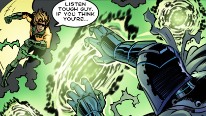
This issue has some decent special effects artwork encompassed within its pages. This really imbues the comic with a very energetic feeling. The special effects lettering, however, I have mixed feelings about. The strength of the issue does not lie there.
The cast of characters is visually diverse, and visually interesting. The art, itself, is one of the great strengths of this issue. Dynamic poses and good facial expressions make the art more than just pretty pictures to look at. They are integral to making a superhero type comic book to come alive. This issue gets that part of the equation right.

The coloring is solid, but it is not quite as consistently strong across all pages of the issue, as the art that underlies it is. But, it really does contain some very nice instances of color with vibrancy. It caught my eye, during the Kickstarter, and it continued to catch my eye, after I received the final product via e-mail.
Unstoppable Origins # 4, the Origin of Dr. Zero, is flush with color. The quality of the color on display in this issue is head and shoulders above most independent comic books that I encounter. Some of it, though, is solid gold - really great, as far as coloring goes. None of it is terrible.

The writer succeeds in giving us a villain that clicks, one who it is easy to have some sympathy with, as to how he became who he was - and even with why he became a villain.
But, because this is only an origin issue, Dr. Zero begs to be fleshed out, in future stories.
Another of this issue's top strengths lies in its use of panels. There's lots of variety to the panels on display, and even instances of characters breaking out of panels. With a lot of independent comic books, panels seem to be something given little, if any, thought. Here, though, they help to transform the overall work into a true visual treat.
When all is said and done, this issue of this comic book, which served as the gateway for my entry into this particular comic book universe, made a very positive impact upon me. It hooked my interest - not just for this one issue, but for a whole universe that it posits before me.
It left me wanting more - and that, in a nutshell, persuades me that it does an awful lot of things right.
If this is the kind of comic book products that Unstoppable Comics intends to publish, then I think that comic book readers have something worth looking forward to.
Publisher: Unstoppable Comics
Writer: Jaydee Rosario
Illustrator: Russ Leach
Colorist: Michael Summers
Letterer: Jaydee Rosario
Editor: Richard Rodriguez
No comments:
Post a Comment