Metron

Metron

Sunday, August 16, 2015

Review - Jennifer the She-Wolf - Issue # 1

One of the bad things about getting out of the habit of writing, whether about writing comic book reviews, specifically, or whether about writing, in general, is that it can end up taking you longer to get back into the groove of writing than you had ever expected it would take.

Much longer, in fact!

So, on the one hand, I owe a formal apology to Mister Luis Cruz, who has been waiting most patiently on me forever and a day, to get around to actually writing a review for his comic book called Jennifer the She-Wolf. On the other hand, it is a blessing to have a comic book publisher prod me - repeatedly - to get back into the swing of things. So, for that, I owe Luis Cruz a special thanks, on top of the apology for the rather lengthy delay.

Now, with my own sloth as a reviewer out of the way, let me move straight into the meat of the matter, where this comic book review is concerned.

I have read this particular comic book, Issue # 1 of Jennifer the She-Wolf, several times, now. Because of the delay incurred in getting around to it, I went ahead and read it, once again, just now, that its content might be fresh in my thoughts and in my mind, once more.

Luis had asked me before, more than once, in fact, to just tell him whether I liked his comic book or not. I could have told him, of course, but my initial intention had been to write an actual review for the comic, and in spite of my own self-inflicted delays in getting around to it, a review was what was intended, and a review was what would be delivered forth. To be quite honest about it, to not review this comic book would be to do a disservice. There's more here, than at first meets the eyes.

So, what do I think about this comic book, this thing called Jennifer the She-Wolf?

Well, in all honesty, I actually think more than one thing about it, simultaneously.

There's stuff about it that I like, and there's also stuff about it that I don't care for all that much. In the overall scheme of things, though, with everything about it taken into consideration and judging the work as a whole, as a singular and collective work, I think that it has more going for it than it has weighing against it.

They say that you shouldn't judge a book by its cover. There's reasons for that, you know. In fact, I think that that saying applies with special force, in the instance of Jennifer the She-Wolf Issue # 1.


I've looked at the front cover art on Issue # 1 many, many times. I'm not really a fan of it, neither of the cover art, itself, nor of the coloring, thereof. The wolves and the woman on the front cover are just posing. They're engaged in no action. The only action on the front cover is what appears to be a shadow of a werewolf in motion.

The coloring of the front cover is too thickly applied. It ends up imbuing this comic book with an amateurish and cartoonish look. The front cover art for Issue # 1 of Jennifer the She-Wolf does not do justice to the content that lies just beyond.

To not move past the front cover is to miss the artistic and literary gems that glitter, and which imbue this work with some visual and textual heft.

One of the core challenges of writing a comic book review lies in telling you about the book, without spoiling the book for you by saying too much. It's a pitfall that is best to avoid, but at the same time, there are times when you have to risk crossing that fine line, so that you can better clue people in on what to expect.

If you flip the page and turn past the front cover, you are treated to a bare bones, straightforward credits page. It serves its core purpose, but it does nothing to stimulate the mind. The title is depicted in bright red lettering on the credits page, and the actual credits are in white lettering. It is legible and serves its purpose, but nothing more.

But, hey! It's just the credits page. Right? In this instance, the answer to that question is, "Yes."


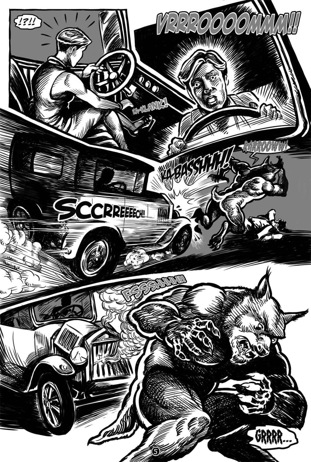
Once you flip the page, again, and move from the credits to the story, you head straight into the year 1922, and the artwork is a combination of black and white and gray scale. Later on, as the story progresses, you are taken to the year 2014, where the artist and colorist conspire to bring you more of a present context for the story line to progress through. These later pages in Issue # 1 are rendered in full color.


I don't dislike this approach. In fact, I like it, just fine, and not just because I am partial to comic books rendered in black and white format. Rather, this dual take provides a good way, visually, to transition from the past to the present, insofar as the timeline of the story's progression is concerned. Personally, I think that it facilitates the art of telling the story in a visual manner.

Of the two, both the color and the black and white and gray scale, I think that the coloring did not live up to the story being told. Yes, it suffices. The colorist did not treat readers to a bunch of glarish, eye-hurting colors. The colors are presented in pale tones. It has a deadening effect, which may be what was the colorist strove for.

In fact, that color scheme worked well enough, once the zombies arrived on the scene.

The what??

That's right. You heard what I said - Zombies!

But, isn't this a comic book about werewolves?

Well, yes, it is, but then again, it's not a comic book that's just about werewolves.


So, what that translates into for you and I (and for other readers, as well) is that this comic book's story line has some meat on its bones.

The story, itself, isn't hard to follow. The pacing, in fact, is pretty much spot on. It reads well, if I may characterize it that way.

But, as the story progresses, plot devices are employed that imbue the story with more depth.

Why did the zombies attack? Where did they come from? Why do they all shut down, in one scene, when someone pushes a digital button? Who is this someone? Who is on the other end of that telephone?

The quality of the art, itself, isn't bad. It's higher than I typically encounter with independently published comic books, in fact. The visual difference between the best scenes and the worst ones left me wondering why the artist seemed so into it, in some scenes, and somewhere else, with the visual handiwork on display in other scenes.

As far as the inking goes, I am of two minds about it. Some of the inking, I like quite a lot. Other instances of it detract from the overall quality of the visuals, impairing the atmosphere of the story being told. But, all things considered, the inking largely succeeds, in my book.

Again, as with the artwork, the quality of the inking is inconsistent. That I love some of it is a testament to the strength of the inker, but that so much of it leaves me feeling ho-hum is a testament to the fact that this comic book title could stand some greater attention to detail and better adherence to consistency in future issues of Jennifer the She-Wolf.

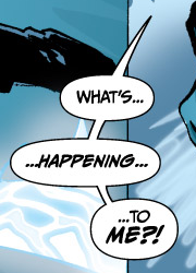
The page where the werewolf appears, and the page following that one, are pages where my eyes open wider, and the story begins to sink in, visually. Those are, in my considered opinion, the two best pages in the whole issue.

Where the car hits the werewolf, I've nothing but thumbs up for this comic book, and the panel where the werewolf attacks the man who was driving the car, initially, my eyes light up with interest. It is at that point that my eyes are grabbed, and they drag me to a whole new level of interest, compared to the comic book ride up to that point.

The panel work isn't bad. It is at least a bit imaginative, and the panels add to the comic book's overall value. I would encourage this creative team that brought Jennifer the She-Wolf Issue # 1 to life to continue exploring what they can achieve, where the use of interesting panel work is concerned.

The lettering throughout the comic book is passable. It's OK. The speech bubbles are not one of this comic book's strong points, and while it is doubtful that the lettering on display in Issue # 1 is likely to win any awards, it was still nice to be able to read the comic book all of the way through, from front to back, without trying to figure out what the dialogue and narration were trying to tell me.


The first half of Issue # 1 was better rendered, visually, than the second half, even with the issue of color completely aside. Half way through the issue, it's as though the creative team forgot how to use narrative boxes.


Personally speaking, I think that narrative boxes worked very well, as far as driving the story line in the first half goes. They increased my interest in the story being told. Once you get to where the story picks up in the present era, the style of storytelling changes, and maybe that's one of the weak points of Jennifer the She-Wolf Issue # 1.

But, I don't want to give the wrong impression. Personally, I think that one of this particular title's strong points lies in its storytelling. Kudos to the writer, for it is the story, itself, that is ultimately responsible for the biggest share of why I liked this comic book.

When I reached the end of Issue # 1, I found myself still interested in the story, and that is exactly where you want your comic book to be, if you're the one publishing it. It's at the very core of why I would want to pick up and continue reading, come the next issue.

As I sit and flip the pages of this comic book back and forth, one thing that sticks out to me is the lack of consistency in quality of the art rendered, from panel to panel. I've mentioned this, already, but it really does stand out to me, as I browse and ponder what lies before me.

Overall, the mood of this comic book is serious and somber. That fits the bill for what is visually on display here.


On a personal level, I'm not a huge fan of werewolf stories. This may well account for why I am receptive, as a reader, to zombies being injected into the mix. For me, at least, that breaks fresh ground, where comic books are concerned.

The special effects lettering is a mixed bag. None if it is spectacular, but a lot of it is sufficient for driving a point home, or for heightening the feel of a particular action or event taking place in the panels.

Overall, I think that this independent comic book is better than the sum of its individual parts. Some panels are bland and boring, while others do a solid and respectable job of entertaining me, both visually and in a literary manner.

The story progresses rapidly. It might even be paced a tad too fast, but one thing that I didn't get, while reading through Issue # 1 of Jennifer the She-Wolf, was bored.

At least the pacing is sufficient to retain my interest, and it did accomplish getting me interested in the first place. Looking back on it, after reading it, though, I can't help but to feel as though the author was in a rush to get us to where he was taking us, as far as the story was concerned.


But, without reading the next issue, yet, how can one be sure?


So, in summation, while this comic book didn't leave me howling at the moon, nonetheless, something in my blood yearns for the release of Issue # 2.

Count me in as part of the pack of fans, where this comic book is concerned!


Cruzin Comics - Issue # 1 - Jennifer the She-Wolf
Publisher: Cruzin Comics
Story: The Mystery of the Undead (Part One)
Writer: Luis M. Cruz
Artists: Henry Simon & Miky Ruiz
Colorist: Henry Simon

Letterer: Jorge Medina

Tuesday, March 31, 2015

Crowdfunding meets the underdog


I will freely confess that I am a big fan of both crowdfunding, in general, and of Kickstarter, specifically. They both allow for creative sparks to take actual life. They make things that might otherwise be left relegated to the obscurity of the idea realm, alone, into reality. In other words, they make dreams come true.

Maybe not for everyone, but certainly, for some.

This blog of mine that I seem to spend far more time forgetting about than I do posting on is focused primarily upon comic books or things of a comic nature. So, it should come as a surprise to no one that happens upon this out of the way blog upon the Internet of Many that my gaze for this particular blog posting lands squarely - and heavily - upon (what else?) a comic book.

Sidekicks: Dedicated - Dependable - Disrespected is a crowdfunding project launched by creator and writer Russell Brettholtz.

Writer Russell Brettholtz
Now, it's not important that you know who Russell BrettHoltz is. It's not even important whether you have ever heard of his whole Sidekicks comics concept before or not. No, what's important, for the purpose of this blog posting, is that I tell you why I am backing this project - and for that matter, why the Sidekicks concept for a series of comic books attracted my attention in the first place.

I'll take the last one first.

I've long been a fan of comic books, and of the superhero genre of comic books, specifically. Thus, the concept of what a sidekick is has long since become ingrained into my entertainment-loving psyche.

Yet, despite their close association with superheroes (or even super villains, for that matter), nonetheless, to be a sidekick is, by and large, to suffer the fate of being second fiddle. It's Batman and Robin, not Robin and Batman, after all.

People can relate to what it's like to play second fiddle, in life. Hell, it's part and parcel of the legacy of being an underdog. Who amongst us can't relate to being an underdog at some point in our respective lives?

To crowdfund a project for the very first time can no doubt come across as an intimidating prospect, for many. Thus, to launch a Kickstarter, at all, has a thick air of underdog quality about it. Doubt has a way of seeping in. Underdog status attaches, whether one likes it or not, whether one wants it to or not.

You're under the gun. You've got a project to fund. It's work. It's time consuming. Every crowdfunding project needs a superhero to accompany it, as standard equipment. But, life just plain doesn't work that way.

Now, Russell Brettholtz has crowdfunded, before. This ain't his first attempt at utilizing crowdfunding to turn dream into reality. He's attended this dance, before.

But, were you to ask him about his current project, Sidekicks: Dedicated - Dependable - Disrespected, I suspect that he would tell you that he's feeling a little bit under the gun, right now.


Time is running out, and he still has a considerable distance to close, on the funding end of things, before this latest venture into the realm of crowdfunding becomes successfully funded.

I'm backing this project, because first and foremost, it reeks of quality to me. Brettholtz's Sidekicks concept has always caught my eye, from the first moment that I laid eyes on it before his first Kickstarter that embodied it, to this latest incarnation of the same.

Sidekicks is blessed with characters that have been imbued with a heavy dose of humanity. Russell has a way of making them come alive, to me. They feel more real. I can relate to them - not just as characters, but as personalities.

The Flying Fox
With barely five days left in his project's crowdfunding campaign, his project is a little more than half way to its funding goal. It may succeed. It may fail. And it is the prospect of failure that moves something inside of me. Something within tells me that both Russell Brettholtz and this Sidekicks: Dedicated - Dependable - Disrespected project of his could use a few sidekicks of their own.

Now, the world won't end, certainly, if this project fails to meet its funding goal. But, I can't help but to think that the world won't be the better for it, if it does.

While I do love both Kickstarter and crowdfunding, I tend to back projects with small pledge amounts. I'm not one of the big guys, when it comes to the wallet wars. Nope, I'm just a little guy. Meet the proverbial nobody.

That's Mr. Nobody, to you!

I believe in becoming part of the crowd, not in becoming the crowd. I have no desire to become a crowd of one, and effectively try to fund a crowdfunding project to success, all on my own.

But, some crowdfunding projects just seem to have a way of mattering to you more than others. Granted, it doesn't automatically translate into more money magically appearing in your wallet, to make upping the ante on your pledge of support substantially bigger. Yet, projects like this one seem to press upon me a renewed sense of importance in them becoming a reality.

So, while I don't even have the benefit of a decent costume to wear, I choose to enter the fray, just the same.

Won't you join me?

The clock is ticking, and right now, Time, itself, seems to be the biggest enemy of all. Time is running out. Who will ride to the rescue? Who will save the day?

Click HERE to visit the Kickstarter project page for Sidekicks: Dedicated - Dependable - Disrespected

Never been a sidekick for a crowdfunding project, before? Not a problem. Just climb aboard. Just join in.

Still undecided? Just take your time.

You've got five days.

Me??

I'm already in the fight!

Sunday, March 8, 2015

To support or to not support: Support is not a static medium

There is the message, and then there is messaging.

During my treks across the vastness of creativity that is the Internet, I encounter all sorts of creative lads and lasses. People who are just starting out, individuals who have been out and about for a while, and even seasoned veterans of the independent publishing market.

One of the common themes that tends to run through their various attempts at communicating with the public masses is that of "support independent creators."

As an individual who is receptive to the core, underlying message, yet as an individual who tends to support independent creators in a limited, incremental fashion, I never cease to be amazed at the messaging and chosen approach to interacting and engaging that independent creators embrace, in an attempt to get people to support them and their artistic endeavors in various different ways.

I've backed Kickstarters. I've purchased independently published comic books. I've even begun to dabble with using Patreon as a mechanism for supporting independent creators.

Independent creators are free, of course, to choose the messaging that they prefer. They are also free to interact or not interact, as their individual preferences dictate. But, how and whether they do something does tend to impact how or whether I will bother to respond to various requests, pleas, and solicitations for support.

Much as though I were flipping a coin, I will intermittently flip around in my head the idea of who to support, and how much support to toss their way. Do I continue supporting this creator? Do I stop supporting that one?

Budgetary considerations tend to impact such decisions, also. Can I afford to support this? Should I take a chance on that? What if I find a way to support this one more thing?

Obviously, I can't buy every comic book published by every independent creator. Even if I did, what real difference would it make?

Along the way, I make observations, every now and again. One of those observations that I have made, and which I choose to share aloud, today, is that the people most likely to support a given artist or a particular creative undertaking may well not be the ones that the artist hopes to gain the support of.

If I'm inclined to support you, then odds are, something about or included within your messaging is responsible. It has been my experience, to date, that independent creators often don't have a clue as to why others are inclined to support or not support their creative endeavors.

If I ask a question, and an independent creator ignores or side-steps it, then is it more likely or less likely that I will be inclined to support that lack of answers?

Most work by independent creators that I encounter, I don't even bother to comment on. There would never be enough hours in the day for that. If I pause long enough to critique something, then something about it caught my eye long enough for me to part with some of my time. Yet, many independent creators fail to grasp that even critique is an opening for gaining support. If your work fails to connect with me, at all, then that is far worse than if your work generates a critique from me.

Critique tends to follow from where potential is encountered. Support tends to follow from where messaging, interaction, and engagement are sound.

Ultimately, building and growing and evolving relationships is critical to gaining and growing support for independent creators. There's a world full of people, of course, so every potential supporter isn't necessarily critical to gaining the level and degree of support that a given creator is after.

But, that said, every potential supporter can certainly help you get to where you are going, support-wise.

Creators have a message for us Earth people. Whether we understand the message and grasp why it should be important to us, just as it is important to the creator behind it or not, is another matter, entirely.

The world is full of creative types. The vast majority of them are not actively and effectively seeking support. Granted, it may sometimes seem like nothing can be further from the truth, if you're the poor creator out there racking your brain, trying like Hell to figure out how to persuade people to support you and your creative undertakings. But, you can thank the sheer number of people in existence for the fact that there's more than one way to kill a snake - with the snake, here, being the obstacle of securing sufficient support to allow you to make your artistic dreams a reality.

The art or other creative aspect, itself, in question is only one door to obtaining and growing support. There is also the personal element, making a personal connection (whether active or passive, or a combination of both). I don't always bother to explain to a given creative type why I am inclined to support them. Sometimes when I do, they don't always seem to listen.

One common mistake that creative types make is that they assume that because someone has supported them, previously, that they will necessarily remain inclined to support them. If you want to maintain a strong network of support, then make certain that you do not take your existing network of supporters for granted.

But, beyond that, which should be as obvious as the nose on one's face, one of the primary obstacles for many creative types is that they are often their own worst enemies, when it comes to being advocates for their artistic cause. Typically, they undersell themselves. All too often, they skimp or pass over details that non-creative types might actually find to be infinitely interesting.

Monday, February 23, 2015

To Patreon or not to Patreon?


Patreon is a website that bills itself as enabling fans to give ongoing support to their favorite creators. For that matter, it doesn't even have to be your favorite creators. It can be any creator who has a creator account on the Patreon site.

I am fairly new to Patreon as a patron, which is someone who supports creators. At the moment, I have pledged support to a handful of creators, and all of my pledges are for fairly small amounts. As of the time that I write this posting, here's a list of the creators on Patreon who I am supporting:

Paul Brian DeBerry

L. Jamal Walton

Don Edwards

Ray Dillon

Mort Todd


The reasons as to why I decided to support each of these respective artistic creators varies, from individual to individual. Both Ray and Mort already had established followings, as of when I created my account on the Patreon site, in order that I might be able to begin utilizing the Patreon website as a mechanism for supporting artistic creators. Paul, Jamal, and Don all face the task of growing a base of followers of size sufficient to make a noticeable difference in the amount of support that they receive from patrons such as myself.

Even in the relatively short amount of time that I have been using the Patreon website, I have already begun to take notice of various things that I think can help make a positive difference on the part of creators, to persuade me to think more seriously about increasing the amount of support that I pledge to each of them, respectively.

Not that any of these gentlemen that I am a patron of actually read and follow what I post on this blog, but on the off chance that someone on the Internet happens upon this particular blog posting of mine, here are a few things that I take note of, as far as getting me to pledge to support you, initially, as well as things that matter to me, as far as making me want to really think seriously about upping my pledge amount, even by a little bit.

1. Content that is visible.

If you are a creator on Patreon wanting people to become pledging patrons of you and your artistic creations, then having content on your Patreon page and in the activity feed that can visually grab my eye and tempt me makes a big difference in me pausing and considering pledging, or in me just passing your little Patreon page by, in favor of me pledging to support someone else. If your content is invisible, and accessible only by those who have already made the decision to pledge to support you, then it really doesn't generate much in the way of visual temptation for myself and others to take note of - and to support - your career as an artistically-inclined individual.

2. Frequency of posting content.

How often have you been posting content? Have you been persistent, even if (and especially if) nobody has been pledging to support you? When was the last time that you posted something that is visible to me or to other visitors on your Patreon page's activity feed? If you want people to support you, then you really need to consider how much substance that you have poured into the creation and ongoing interaction of yourself with your own Patreon page. If your Patreon page sends the visual message that you, yourself, don't have time to bother with it, or that you don't really seem to care about taking your Patreon undertaking seriously, then why should I or anyone else feel moved to support a half-ass or non-existent effort?

3. Your level of engagement.

One of the biggest considerations for myself, as far as increasing the level of my pledge to a Patreon creator, is how well (or how poorly), not to mention how frequently or infrequently, that a creator engages me and interacts with me. If I have already found your Patreon page, and especially if I have already pledged to support you on Patreon, then the hardest part is already done. You have my eye - and my attention - at that point. So, why not make the most of it?

If I post a comment on your Facebook page, or on your blog site, or even in a forum that we both are members of, and it is difficult to generate a flow of dialogue with and from you, then engagement with this prospective supporter will likely be minimal, indeed, if it exists, at all. If you want greater support, then it requires greater interaction. If you want people talking about your handiwork as an artistic creator, then how do you expect to obtain that, if you don't interact with those making an attempt to talk and interact with you?

4. Milestone goals.

This is one of the very first things that I look at, when I visit someone's Patreon page for the very first time. If you have a really high initial milestone goal set, and you have little to no following on Patreon, then good luck ever reaching that milestone.

Set low milestones, at first. Make them extremely achievable. Then, each one that you achieve will help to send a message to your future Patreon page visitors that you are enjoying some degree of success. Success tends to attract people faster than failure does. People like to be a part of successes. People tend to avoid failures. Give more people more reasons to support you, by utilizing milestone goals as a mechanism to send a strong message of success to both prospective and current supporters.


Hopefully, someone out there will find this bit of Patreon advice to be of some use!

Sunday, February 22, 2015

A ramble to relax by

I love art, particularly art of the superhero genre variety.

In spite of that, this month of February 2015 has not been a very productive one for me, thus far, as far as this blog is concerned. But, it remains my sanctuary, nonetheless.

I have been busy, elsewhere. Several elsewheres, to be exact, but that is neither here nor there. Instead, I just want to ramble a bit.

I find it to be relaxing.

The Spectre is one of my favorite comic book characters. I think that he is at his very best, when he is taken seriously - and depicted seriously - by comic book teams that undertake to bring him to life upon the pages of comic books.

He has evolved quite a bit, over time, but then again, I guess that most characters do. That's something that they share in common with those of who who live in the real world. That is as it should be, I suppose.

Artists are like super heroes and super villains, in a way. They wield dire energies, and they shape the existence - and the fate - of countless numbers. Each in their own way and to their own degree, artists wield both shadow and light. Some are mere mortals, but others - others cause the world to tremble at their coming.

Comic books are a realm of never-ending one-upsmanship. Heroes and villains best one another, time and time, again, gaining fame and notoriety along the way. Some become near and dear to us, while others fade in our memory, to lie forgotten until another day.

It's hard to have a single favorite comic book character. I've loved many, in my day. There's all sorts of great characters out there, having been brought to life by very creative minds. It's the thing of which envy is made, I tell you!

There's fantastic costumes, and not-so-fantastic ones, as well. Many colors and numerous styles in play. It makes for a visual smorgasbord.

Sunday, January 25, 2015

Review - Digital Webbing Presents - Spotlight Special - Issue # 1

I first read this comic book, Digital Webbing Presents Spotlight Special Issue # 1, a few months back. But, having begun focusing more on writing comic book reviews, of late, I wanted to go back and dig it up.

Why?

Well, to share a few of my thoughts about it, of course, and to spotlight this Spotlight Special, because I think that it is worthy of bringing some attention to.

Again, though, I pose the question: Why?

Well, mainly it's because of the second of the two tales that this particular issue encompasses within the scope of its pages.

Not because the first story has no merit, because it does. Rather, I have a friend who runs his own pest control business, so naturally, I thought of him, when I began reading the second story in this issue.

Good facial expressions. Nice special effects.

But, that's more of a reason as to why I was drawn to it, rather than why it warrants an actual review. The fact of the matter is that I just plain enjoyed the story, itself, as well as the characters that it contained.
Solid lettering & speech bubbles.

Comic books are a medium of expression that are well-equipped to bring any kind of concept to life. One of the reasons that I like comic books is because they invariably cause me to spend more time thinking about them, than it takes for me to actually read them. In other words, the imagination-to-reading ration tends to be fairly high. It is usually a net positive for the imagination side of the equation.

But, lest the creators behind the first tale, The Last Paladin, think that I have entirely dispensed with mention of them, let's talk about that story, first.

The Last Paladin is the longer of the two tales contained within this issue, with the shorter story being the one featuring the Klik Boom Exterminators, Got Buggz?

BAM! Power on display!
A comparison of the two tales to one another strikes me as a very natural thing to do, even though they are quite different in their approach to telling their respective stories.

The Last Paladin is a serious read. It is a tale that is told in a serious vein. It means business.

Got Buggz? is, by contrast, an exercise in humor. It doesn't take itself too seriously, at all. Then again, you shouldn't either.

I want to compare the two, for the very simple reason that they are close by one another, stuffed side-by-side into the same issue, together. They are conveniently situated, which makes it extremely convenient for me to think about one, while I am thinking about the other. The issue, as a whole, benefits from the depth and range that containing more than one story typically provides.

Great special effects lettering really makes the page vibrate, visually!

If you like the color blue, then this issue should be a good choice for you - for the entire issue is awash in it. That is more of an observation-in-passing, than anything else. It's just something that I noticed, while reading this comic book. It stood out to me. My eyes took notice of it.

Tool of the superhero trade.
 The Last Paladin starts out with an accident. It isn't long before Dr. Zack Machin finds himself unexpectedly transformed into an Atlantian Paladin, which as it turns out, is a royal guard of Atlantis.

The Atlantis connection to this story isn't expected, at first. Rather, it is sprung upon you, mid-story. That's a good thing, though, in this instance, because the story takes on a more dynamic and energetic look, thereafter.

The look of the paladin character reminds me of Doctor Fate, somewhat. Notably, the helm and the color scheme of his costume are responsible for this mental association, even though I don't walk away from this story with the feeling that the character is a rip off of Doctor Fate.

Pitiful looking attempts at zombies.
That said, I do have some personal nits to pick with it - but, they may well be nits that others simply don't share my occupation with.

I like the lettering. It's really good, both the English and the Atlantis-inspired equivalent. Good lettering, though, tends to be something that the reader doesn't notice. Instead, it tends to get taken for granted. You tend to notice - and pay attention to - lettering more, if it isn't good.

The special effects lettering helps bring the visuals to life. Special effects lettering is a form of eye candy - and the candy is visually tasty, in this one! On page one of The Last Paladin, I am not a fan of the lettering for the credits. The white text with blue outline, in conjunction with the font choice in use, makes it difficult for me to make the names of those responsible for producing this story without me zooming in on my PDF copy of this comic book.
Women can be trouble.

But, who really cares about the credits, right? Well, aside from those who actually produced this baby, probably not many, I suspect.

Overall, I think that it's a hard call, between the artist and the colorist, as to who did the better job with The Last Paladin. My eye tends to favor the colorist on this one, though. But, if the special effects lettering wasn't there, honestly, I just plain don't know.

Unlike the second tale, Got Buggz?, the first story makes frequent resort to narrative boxes. The Last Paladin features what I will call a double edge, on the lower and right edges of the narrative boxes, for instances where the narrative boxes are used strictly for dialogue between characters, as opposed to instances where they are used for narration, itself. Now, is this a better approach to utilizing narrative boxes? Honestly, I don't know. Functionally, there's a difference, but visually speaking, what's the net gain for the reader? For me, personally, there really wasn't any.

It looks better up close, than when read at actual size.

Rather, as I go back and flip back and forth through The Last Paladin, those narrative boxes catch my eye - but, not in a good way.

Good visual!
As I continue flipping the pages of this comic book, my eye begins to appreciate the colorist more, and the artist less. The artist gets the job done, but the visual impact brought forth in the panels is dominated by the colorist. The colorist was more consistent with making the pages feel energetic, than the artist was with the rendering of facial expressions for emotional effect. In a way, it's a comparison of apples to oranges, but comparisons of various types are part and parcel of what a review process necessarily entails.

One area where I will hold the colorist out for special criticism is in the coloring of the skin of characters in The Last Paladin. In instances, it looks globbed on, and the coloring of human skin was the weakest area of performance by the colorist for this particular story.

I love the rough edges. It adds an aged look.
Apparently, a royal guard of Atlantis has multiple options at their disposal, when it comes to combat. They carry sidearms and they possess powers that are not sidearm-dependent.

The human eye is a very hi-tech device. It is geared towards color and contrast. It is well-versed in nuance and degree. I really wish I better understood why the creators of The Last Paladin opted for the color scheme that they chose for the narrative boxes. Overall, the choice made for less visual contrast on the pages. Pages soaked in blue were treated to more blue, and pages clothed with brown were treated to even more brown. Why is that to be desired, I wonder? What drives colorists to make decisions like this?

The darker blue narrative boxes near the end of The Last Paladin, the ones adorned with white text, those provided the least visual contrast - and text is something that performs best, visually, when contrast is strong. This was actually the worst part of the comic book's construction. It visually detracts from the storytelling, as it seeks to drive my eye away. In layman's terms, it's eyehurt. Oh, sure, the zoom option is always there, for a comic book being read in digital format. But, simply to read a comic book, I don't feel that I should even have to worry about whether to zoom in or not. If I have to, then deficiency in the construction of the comic book has set in.
A Turth Blade, dammit!
The Last Paladin doesn't waste a lot of time introducing you to the characters populating its panels. But, it does a decent enough job of setting the reader up for what is to follow in the next issue.

The panelwork, itself, is pretty good. It offers diversity in the visual presentation of the story, and the panels add to the telling of the story.

Now, on to the second tale presented in this comic book - Got Buggz?

Who ya gonna call? Ghostbusters or Klik Boom? Bugs are more common that ghosts.

What we have here is a delightful little (as in short, aka brief) story about a couple of exterminators taking a job - a job that turns out not quite as expected.

Great character depictions help to bring this story to life. Kudos to the artist for that!

It knocked the wind out of me, too.
These particular exterminators are well-armed to get the job done. But, that doesn't stop them from the error of their own ways.

I don't think that bungling is the right word to describe them, but they sure do get in over their head - and really quick, at that.

If words could kill, then these fellows would be the deadliest guys in the business, because they are dialogue-blessed. But, it suits them, and it serves the story well.

Yeah, Harry! Go on!
The characters are colorful, well-animated, and full of facial expressions. This combination lies at the very core of why I love them!

Instead of bungling, the word that I am looking for is antics. These guys are full of antics, and when all is said and done, they know how to deliver on the humor.

Did I mention that they seem to be made out of what?

What the Hell?!

But, it makes for some good visuals.

The lettering in Got Buggz? is solid. It's another positive performance by letterer Ed Dukeshire.

Beautiful lettering, beautiful bubbles! Nice tie.
The special effects lettering? Well, compared to The Last Paladin, special effects lettering is not the strength of Got Buggz? It's been all but exterminated, it seems, though in the few instances in which it is used, it is utilized in a subdued manner. It doesn't hurt the story, though.

Overall, Got Buggz? is a vastly cleaner visual presentation than The Last Paladin. The colorist makes use of a far wider range of colors, and my eye is loving it. Narrative boxes are nowhere to be found, with the text being handled by some nicely rendered speech bubbles.

Lest I be remiss, though, the speech bubbles in The Last Paladin looked good, as well. They certainly contributed to that story far more than the narrative boxes did, as far as the visual quality of that production is concerned.

A great visual. That van with the big bug on top helps to set the mood.

At a mere eight pages in length, our friendly exterminators at Klik Boom don't receive much in payment in the form of page allocation. Nonetheless, they still manage to get the job done.

The story of his life, no doubt.
The last page sews their performance up rather nicely, I think. It left me wanting more.

So, if you have a craving for a comic book story to read, or if you just need an exterminator, give Klik Boom a call.

They'll be glad that you did!


Digital Webbing Presents - Spotlight Special - Issue # 1
Publisher: Digital Webbing Press
Story: The Last Paladin
Writer: Ian Ascher
Artist: Mahmud Asrar
Colorist: Matt Webb
Letterer: Ed Dukeshire
Editor: Randy Buccini
Logo: Scott LeMien

Story: Got Buggz?
Writer: Ron Phillips
Artist: Ryan Ottley
Colorist: Chris Mendoza
Letterer: Ed Dukeshire
Editor: Ed Dukeshire

Don't be a dog or a doofus! Read this story, instead.

Friday, January 23, 2015

Review - Puny Mortals - Issue # 0

Thou shalt not judge a book by its cover!

Not only is this the case with comic books, generally, but it applies with special force in the present instance. Issue zero of Puny Mortals is one of the shortest comic books that I have read, of late. This, I assure you, is regrettable.

Hailing from the press of In Comics, Puny Mortals is puny fare, indeed - if what you are after is a comic book title with no successive issues. It's harder to be more mortal, as a comic book, than when you've been relegated by your own creators to the ignominy of single issue status.

But, when you've got some decent material going on, on the interior pages, a mystery is conjured up. Namely, the kind of mystery that begs to know why, in God's name, that the powers that be behind this little venture of a comic book never followed up issue zero with the very same substance that this mini-issue of a comic book was packing?

But, it is not for me to decide the fate of all comic books. I'm a late comer, to this one, although I freely admit that I encountered it, previously - only, at that time, I wasn't risen from the swamps of primordial reviewer ooze that I have seemingly aspired to, since then.

Vaporizer kicking ass!
Maybe the creators of Puny Mortals didn't quite realize the little gem of a comic book that they had on their hands. Comic book publishers are, after all, a rather creative sort. Perhaps they fled the universe of Puny Mortals, in search of greener comic book pastures elsewhere. In any event, it's a true shame - for I really do like this snazzy little breeze of a read.

The entire issue, from front to back, is a mere eleven pages. For a comic book that aspires to tale its own version of superhero tales, that makes it a tight fit to try and cram a decent story into a the mere space of nine interior pages.

But, be that as it may, Puny Mortals issue zero manages to leave me wanting more. I'm just afraid that more isn't just around the proverbial corner. Indeed, Puny Mortals may have been more puny than any of us could ever even hope to realize, for it doesn't currently seem to be a priority for anybody to continue.

Are YOU a Snad??

Except, of course, for me!

With the bulk of independently published comic books that I encounter, more often than not, what potential readers are met with are decent looking front covers, while the interior pages are often little more than visually toxic artistic sludge. I hate to be the one to say it - but, I'm saying it!

Bloodsucker at your service.
Yet, Puny Mortals managed to evade that common fate, and in the process, it managed to turn that traditional comic book publishing equation squarely on its head.

If you can bring yourself to disregard the visually embalmed look of the credits page, and press on to the actual interior pages of this comic book, what you will find is some decent looking artwork, which in turn is bolstered by some passable coloring.

Just don't stare too closely, or for too long, at various characters' heads. Don't ask why - just don't do it!

For all of its talk about Snads, this is no Snad of a read. It's got some visual gonads growing on it.

Super villain, Road Kill, is just rolling right along.

Now, don't misunderstand. This micro-length comic book has little hope of pounding you into a perpetual state of visual oblivion bliss. But, all across its pages, the interior shines with the gossamer of substance.

Who has the power, now?!
In other words, this here is some solid stuff, folks. I mean, where else are you going to find super villains named Road Kill sporting over-sized tires as weapons?

Is it cheesy? Sure, it is! But, after all, superherodom of comic books is replete with countless instances of campiness or cheesiness. It is easily convertible into something that can be useful, both in a visual sense and in a literary sense.

All things considered, the art is superior to the coloring, in issue zero of Puny Mortals. But, I dare say that the colorist gets the laugh laugh - a booming, bellowing laugh, and without even laughing at all. Near the end of the book, the colorist explodes upon the page, and the reader is treated to a moment of vibrant color and visual impact that rises above the bar of the ordinary.

For the most part, though, the colorist took a subdued path on issue zero of Puny Mortals. While this is not an inherently bad thing, it does come at a visual price. While it does drain this issue of a noticeable amount of energy, nonetheless, it plays right into the hands of the mood that this comic book seeks to strike. A little gloom, anyone?

Stupid is as stupid does. Don't be stupid - Read Puny Mortals!

Puny Mortals tells us about how a Joe Blow might buy a "gadget" on the power market. Little does this comic book or its creators seem to realize that they have quite the gadget in their possession, all along. In the search for creating something bigger and better and more interesting, one would be well-served to more fully appreciate what they already have in the palm of their hand.

Just a nice little scene from the comic.
But, what do I know about any of it?

Not nearly enough, I'll tell you that.

Even still, I do know what I like when I see it, even if I can't always explain the "why" behind my particular likes, as they relate to comic books.

Puny Mortals showcases power, and it does so under the guise of impotence. It is a tale of wannabees, of ordinary people who dream of the chance to strike a super-powered blow of their own.

What this aspect of the concept is, is a way to connect with you or I - the humble readers that do more than just read comic books. We think about them. We wonder about them. Sometimes, we even live vicariously through them.

How else do you explain all of these super-powered thoughts that run through our minds, at any given hour of the day?

Which is why it is an especially sharp loss to see this little title not continued on.

This is exactly how I feel, knowing that the next issue is nowhere to be found.
So much promise (and decently executed, at that), but a legacy of merely a single one. One issue. That's it.

The comic book world is all the poorer for it, too!

This little comic book has decent lettering, too. Did I mention that?

The tale, itself, is told through a combination of narrative boxes and dialogue, with the narrative boxes taking the dominant form on the pages that unfold before you.

So much potential!

Yet, a great bulk of it remains unrealized, to this very day.

Pity such puny mortals!

The lettering is good, and helps make Puny Mortals an enjoyable read.

Could've been.

Wow! The creators of Puny Mortals certainly coined the right phrase with that one, for this tiny giant is a sterling example of what could have been.

Is Puny Mortals' future obliterated?
Of what could still be.

But, this review comes late in the day, proverbially speaking. One might as well wish and hope for super-powered gadgets from the power market, for one's very own - for that is probably as likely to succeed as wishing into the Internet aether for this mini-me of potential to come roaring back from where it has lain collecting dust, in the time between when it was first released and now.

So, while I won't be holding my breath for Puny Mortals to make a come back, I will make the effort to memorialize this exercise in comic-book-could've-been in review form, that its creation not have been entirely in vain.

Sometimes, you see, the little guy is worth remembering, worth reflecting upon, worth seeing in action.

Even if he doesn't make it.

Even if she doesn't succeed.

Even if his or her best laid plans go astray, in doomed bids to influence the demons and demi-gods of a super powered universe that the big guys of comic bookdom can't be bothered to give us.

When Zoomba is not enough, call Ball Lightning!
We might never be so fortunate as to learn the fate of Ball Lightning, but at least she made a valiant attempt to end an episode of chaos that the super villain of the hour had thrust upon the world.

But, maybe she had simply had enough, and walked away into the sunset where all comic book go to never be read, again.

Or, like me, perhaps she is still out there, lurking in the shadows of the Internet, just waiting for one more chance to unleash her power upon the unsuspecting comic book ilk of this universe.

When all is said and done, I like it - this Puny Mortals, as they call it.

That's why I'm giving it this not-so-puny recommendation to others, to those of you others out there who are looking for some good comic books to read.

Puny Mortals issue number two comes at a very puny - albeit affordable - price. That's right, it's free for the downloading.

Be bold! Grab your copy of it, today!


Puny Mortals - Issue # 0
Publisher: In Comics
Writer: Christopher Howard Wolf
Artist: David Newbold
Colors: Keith Garletts


Click HERE to download a free copy of
Puny Mortals - Issue # 0 in PDF format!