Metron

Metron

Sunday, January 25, 2015

Review - Digital Webbing Presents - Spotlight Special - Issue # 1

I first read this comic book, Digital Webbing Presents Spotlight Special Issue # 1, a few months back. But, having begun focusing more on writing comic book reviews, of late, I wanted to go back and dig it up.

Why?

Well, to share a few of my thoughts about it, of course, and to spotlight this Spotlight Special, because I think that it is worthy of bringing some attention to.

Again, though, I pose the question: Why?

Well, mainly it's because of the second of the two tales that this particular issue encompasses within the scope of its pages.

Not because the first story has no merit, because it does. Rather, I have a friend who runs his own pest control business, so naturally, I thought of him, when I began reading the second story in this issue.

Good facial expressions. Nice special effects.

But, that's more of a reason as to why I was drawn to it, rather than why it warrants an actual review. The fact of the matter is that I just plain enjoyed the story, itself, as well as the characters that it contained.
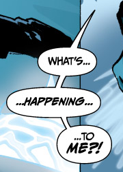
Solid lettering & speech bubbles.

Comic books are a medium of expression that are well-equipped to bring any kind of concept to life. One of the reasons that I like comic books is because they invariably cause me to spend more time thinking about them, than it takes for me to actually read them. In other words, the imagination-to-reading ration tends to be fairly high. It is usually a net positive for the imagination side of the equation.

But, lest the creators behind the first tale, The Last Paladin, think that I have entirely dispensed with mention of them, let's talk about that story, first.

The Last Paladin is the longer of the two tales contained within this issue, with the shorter story being the one featuring the Klik Boom Exterminators, Got Buggz?

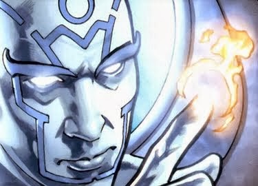
BAM! Power on display!
A comparison of the two tales to one another strikes me as a very natural thing to do, even though they are quite different in their approach to telling their respective stories.

The Last Paladin is a serious read. It is a tale that is told in a serious vein. It means business.

Got Buggz? is, by contrast, an exercise in humor. It doesn't take itself too seriously, at all. Then again, you shouldn't either.

I want to compare the two, for the very simple reason that they are close by one another, stuffed side-by-side into the same issue, together. They are conveniently situated, which makes it extremely convenient for me to think about one, while I am thinking about the other. The issue, as a whole, benefits from the depth and range that containing more than one story typically provides.

Great special effects lettering really makes the page vibrate, visually!

If you like the color blue, then this issue should be a good choice for you - for the entire issue is awash in it. That is more of an observation-in-passing, than anything else. It's just something that I noticed, while reading this comic book. It stood out to me. My eyes took notice of it.

Tool of the superhero trade.
 The Last Paladin starts out with an accident. It isn't long before Dr. Zack Machin finds himself unexpectedly transformed into an Atlantian Paladin, which as it turns out, is a royal guard of Atlantis.

The Atlantis connection to this story isn't expected, at first. Rather, it is sprung upon you, mid-story. That's a good thing, though, in this instance, because the story takes on a more dynamic and energetic look, thereafter.

The look of the paladin character reminds me of Doctor Fate, somewhat. Notably, the helm and the color scheme of his costume are responsible for this mental association, even though I don't walk away from this story with the feeling that the character is a rip off of Doctor Fate.

Pitiful looking attempts at zombies.
That said, I do have some personal nits to pick with it - but, they may well be nits that others simply don't share my occupation with.

I like the lettering. It's really good, both the English and the Atlantis-inspired equivalent. Good lettering, though, tends to be something that the reader doesn't notice. Instead, it tends to get taken for granted. You tend to notice - and pay attention to - lettering more, if it isn't good.

The special effects lettering helps bring the visuals to life. Special effects lettering is a form of eye candy - and the candy is visually tasty, in this one! On page one of The Last Paladin, I am not a fan of the lettering for the credits. The white text with blue outline, in conjunction with the font choice in use, makes it difficult for me to make the names of those responsible for producing this story without me zooming in on my PDF copy of this comic book.
Women can be trouble.

But, who really cares about the credits, right? Well, aside from those who actually produced this baby, probably not many, I suspect.

Overall, I think that it's a hard call, between the artist and the colorist, as to who did the better job with The Last Paladin. My eye tends to favor the colorist on this one, though. But, if the special effects lettering wasn't there, honestly, I just plain don't know.

Unlike the second tale, Got Buggz?, the first story makes frequent resort to narrative boxes. The Last Paladin features what I will call a double edge, on the lower and right edges of the narrative boxes, for instances where the narrative boxes are used strictly for dialogue between characters, as opposed to instances where they are used for narration, itself. Now, is this a better approach to utilizing narrative boxes? Honestly, I don't know. Functionally, there's a difference, but visually speaking, what's the net gain for the reader? For me, personally, there really wasn't any.

It looks better up close, than when read at actual size.

Rather, as I go back and flip back and forth through The Last Paladin, those narrative boxes catch my eye - but, not in a good way.

Good visual!
As I continue flipping the pages of this comic book, my eye begins to appreciate the colorist more, and the artist less. The artist gets the job done, but the visual impact brought forth in the panels is dominated by the colorist. The colorist was more consistent with making the pages feel energetic, than the artist was with the rendering of facial expressions for emotional effect. In a way, it's a comparison of apples to oranges, but comparisons of various types are part and parcel of what a review process necessarily entails.

One area where I will hold the colorist out for special criticism is in the coloring of the skin of characters in The Last Paladin. In instances, it looks globbed on, and the coloring of human skin was the weakest area of performance by the colorist for this particular story.

I love the rough edges. It adds an aged look.
Apparently, a royal guard of Atlantis has multiple options at their disposal, when it comes to combat. They carry sidearms and they possess powers that are not sidearm-dependent.

The human eye is a very hi-tech device. It is geared towards color and contrast. It is well-versed in nuance and degree. I really wish I better understood why the creators of The Last Paladin opted for the color scheme that they chose for the narrative boxes. Overall, the choice made for less visual contrast on the pages. Pages soaked in blue were treated to more blue, and pages clothed with brown were treated to even more brown. Why is that to be desired, I wonder? What drives colorists to make decisions like this?

The darker blue narrative boxes near the end of The Last Paladin, the ones adorned with white text, those provided the least visual contrast - and text is something that performs best, visually, when contrast is strong. This was actually the worst part of the comic book's construction. It visually detracts from the storytelling, as it seeks to drive my eye away. In layman's terms, it's eyehurt. Oh, sure, the zoom option is always there, for a comic book being read in digital format. But, simply to read a comic book, I don't feel that I should even have to worry about whether to zoom in or not. If I have to, then deficiency in the construction of the comic book has set in.
A Turth Blade, dammit!
The Last Paladin doesn't waste a lot of time introducing you to the characters populating its panels. But, it does a decent enough job of setting the reader up for what is to follow in the next issue.

The panelwork, itself, is pretty good. It offers diversity in the visual presentation of the story, and the panels add to the telling of the story.

Now, on to the second tale presented in this comic book - Got Buggz?

Who ya gonna call? Ghostbusters or Klik Boom? Bugs are more common that ghosts.

What we have here is a delightful little (as in short, aka brief) story about a couple of exterminators taking a job - a job that turns out not quite as expected.

Great character depictions help to bring this story to life. Kudos to the artist for that!

It knocked the wind out of me, too.
These particular exterminators are well-armed to get the job done. But, that doesn't stop them from the error of their own ways.

I don't think that bungling is the right word to describe them, but they sure do get in over their head - and really quick, at that.

If words could kill, then these fellows would be the deadliest guys in the business, because they are dialogue-blessed. But, it suits them, and it serves the story well.

Yeah, Harry! Go on!
The characters are colorful, well-animated, and full of facial expressions. This combination lies at the very core of why I love them!

Instead of bungling, the word that I am looking for is antics. These guys are full of antics, and when all is said and done, they know how to deliver on the humor.

Did I mention that they seem to be made out of what?

What the Hell?!

But, it makes for some good visuals.

The lettering in Got Buggz? is solid. It's another positive performance by letterer Ed Dukeshire.

Beautiful lettering, beautiful bubbles! Nice tie.
The special effects lettering? Well, compared to The Last Paladin, special effects lettering is not the strength of Got Buggz? It's been all but exterminated, it seems, though in the few instances in which it is used, it is utilized in a subdued manner. It doesn't hurt the story, though.

Overall, Got Buggz? is a vastly cleaner visual presentation than The Last Paladin. The colorist makes use of a far wider range of colors, and my eye is loving it. Narrative boxes are nowhere to be found, with the text being handled by some nicely rendered speech bubbles.

Lest I be remiss, though, the speech bubbles in The Last Paladin looked good, as well. They certainly contributed to that story far more than the narrative boxes did, as far as the visual quality of that production is concerned.

A great visual. That van with the big bug on top helps to set the mood.

At a mere eight pages in length, our friendly exterminators at Klik Boom don't receive much in payment in the form of page allocation. Nonetheless, they still manage to get the job done.

The story of his life, no doubt.
The last page sews their performance up rather nicely, I think. It left me wanting more.

So, if you have a craving for a comic book story to read, or if you just need an exterminator, give Klik Boom a call.

They'll be glad that you did!


Digital Webbing Presents - Spotlight Special - Issue # 1
Publisher: Digital Webbing Press
Story: The Last Paladin
Writer: Ian Ascher
Artist: Mahmud Asrar
Colorist: Matt Webb
Letterer: Ed Dukeshire
Editor: Randy Buccini
Logo: Scott LeMien

Story: Got Buggz?
Writer: Ron Phillips
Artist: Ryan Ottley
Colorist: Chris Mendoza
Letterer: Ed Dukeshire
Editor: Ed Dukeshire

Don't be a dog or a doofus! Read this story, instead.

Friday, January 23, 2015

Review - Puny Mortals - Issue # 0

Thou shalt not judge a book by its cover!

Not only is this the case with comic books, generally, but it applies with special force in the present instance. Issue zero of Puny Mortals is one of the shortest comic books that I have read, of late. This, I assure you, is regrettable.

Hailing from the press of In Comics, Puny Mortals is puny fare, indeed - if what you are after is a comic book title with no successive issues. It's harder to be more mortal, as a comic book, than when you've been relegated by your own creators to the ignominy of single issue status.

But, when you've got some decent material going on, on the interior pages, a mystery is conjured up. Namely, the kind of mystery that begs to know why, in God's name, that the powers that be behind this little venture of a comic book never followed up issue zero with the very same substance that this mini-issue of a comic book was packing?

But, it is not for me to decide the fate of all comic books. I'm a late comer, to this one, although I freely admit that I encountered it, previously - only, at that time, I wasn't risen from the swamps of primordial reviewer ooze that I have seemingly aspired to, since then.

Vaporizer kicking ass!
Maybe the creators of Puny Mortals didn't quite realize the little gem of a comic book that they had on their hands. Comic book publishers are, after all, a rather creative sort. Perhaps they fled the universe of Puny Mortals, in search of greener comic book pastures elsewhere. In any event, it's a true shame - for I really do like this snazzy little breeze of a read.

The entire issue, from front to back, is a mere eleven pages. For a comic book that aspires to tale its own version of superhero tales, that makes it a tight fit to try and cram a decent story into a the mere space of nine interior pages.

But, be that as it may, Puny Mortals issue zero manages to leave me wanting more. I'm just afraid that more isn't just around the proverbial corner. Indeed, Puny Mortals may have been more puny than any of us could ever even hope to realize, for it doesn't currently seem to be a priority for anybody to continue.

Are YOU a Snad??

Except, of course, for me!

With the bulk of independently published comic books that I encounter, more often than not, what potential readers are met with are decent looking front covers, while the interior pages are often little more than visually toxic artistic sludge. I hate to be the one to say it - but, I'm saying it!

Bloodsucker at your service.
Yet, Puny Mortals managed to evade that common fate, and in the process, it managed to turn that traditional comic book publishing equation squarely on its head.

If you can bring yourself to disregard the visually embalmed look of the credits page, and press on to the actual interior pages of this comic book, what you will find is some decent looking artwork, which in turn is bolstered by some passable coloring.

Just don't stare too closely, or for too long, at various characters' heads. Don't ask why - just don't do it!

For all of its talk about Snads, this is no Snad of a read. It's got some visual gonads growing on it.

Super villain, Road Kill, is just rolling right along.

Now, don't misunderstand. This micro-length comic book has little hope of pounding you into a perpetual state of visual oblivion bliss. But, all across its pages, the interior shines with the gossamer of substance.

Who has the power, now?!
In other words, this here is some solid stuff, folks. I mean, where else are you going to find super villains named Road Kill sporting over-sized tires as weapons?

Is it cheesy? Sure, it is! But, after all, superherodom of comic books is replete with countless instances of campiness or cheesiness. It is easily convertible into something that can be useful, both in a visual sense and in a literary sense.

All things considered, the art is superior to the coloring, in issue zero of Puny Mortals. But, I dare say that the colorist gets the laugh laugh - a booming, bellowing laugh, and without even laughing at all. Near the end of the book, the colorist explodes upon the page, and the reader is treated to a moment of vibrant color and visual impact that rises above the bar of the ordinary.

For the most part, though, the colorist took a subdued path on issue zero of Puny Mortals. While this is not an inherently bad thing, it does come at a visual price. While it does drain this issue of a noticeable amount of energy, nonetheless, it plays right into the hands of the mood that this comic book seeks to strike. A little gloom, anyone?

Stupid is as stupid does. Don't be stupid - Read Puny Mortals!

Puny Mortals tells us about how a Joe Blow might buy a "gadget" on the power market. Little does this comic book or its creators seem to realize that they have quite the gadget in their possession, all along. In the search for creating something bigger and better and more interesting, one would be well-served to more fully appreciate what they already have in the palm of their hand.

Just a nice little scene from the comic.
But, what do I know about any of it?

Not nearly enough, I'll tell you that.

Even still, I do know what I like when I see it, even if I can't always explain the "why" behind my particular likes, as they relate to comic books.

Puny Mortals showcases power, and it does so under the guise of impotence. It is a tale of wannabees, of ordinary people who dream of the chance to strike a super-powered blow of their own.

What this aspect of the concept is, is a way to connect with you or I - the humble readers that do more than just read comic books. We think about them. We wonder about them. Sometimes, we even live vicariously through them.

How else do you explain all of these super-powered thoughts that run through our minds, at any given hour of the day?

Which is why it is an especially sharp loss to see this little title not continued on.

This is exactly how I feel, knowing that the next issue is nowhere to be found.
So much promise (and decently executed, at that), but a legacy of merely a single one. One issue. That's it.

The comic book world is all the poorer for it, too!

This little comic book has decent lettering, too. Did I mention that?

The tale, itself, is told through a combination of narrative boxes and dialogue, with the narrative boxes taking the dominant form on the pages that unfold before you.

So much potential!

Yet, a great bulk of it remains unrealized, to this very day.

Pity such puny mortals!

The lettering is good, and helps make Puny Mortals an enjoyable read.

Could've been.

Wow! The creators of Puny Mortals certainly coined the right phrase with that one, for this tiny giant is a sterling example of what could have been.

Is Puny Mortals' future obliterated?
Of what could still be.

But, this review comes late in the day, proverbially speaking. One might as well wish and hope for super-powered gadgets from the power market, for one's very own - for that is probably as likely to succeed as wishing into the Internet aether for this mini-me of potential to come roaring back from where it has lain collecting dust, in the time between when it was first released and now.

So, while I won't be holding my breath for Puny Mortals to make a come back, I will make the effort to memorialize this exercise in comic-book-could've-been in review form, that its creation not have been entirely in vain.

Sometimes, you see, the little guy is worth remembering, worth reflecting upon, worth seeing in action.

Even if he doesn't make it.

Even if she doesn't succeed.

Even if his or her best laid plans go astray, in doomed bids to influence the demons and demi-gods of a super powered universe that the big guys of comic bookdom can't be bothered to give us.

When Zoomba is not enough, call Ball Lightning!
We might never be so fortunate as to learn the fate of Ball Lightning, but at least she made a valiant attempt to end an episode of chaos that the super villain of the hour had thrust upon the world.

But, maybe she had simply had enough, and walked away into the sunset where all comic book go to never be read, again.

Or, like me, perhaps she is still out there, lurking in the shadows of the Internet, just waiting for one more chance to unleash her power upon the unsuspecting comic book ilk of this universe.

When all is said and done, I like it - this Puny Mortals, as they call it.

That's why I'm giving it this not-so-puny recommendation to others, to those of you others out there who are looking for some good comic books to read.

Puny Mortals issue number two comes at a very puny - albeit affordable - price. That's right, it's free for the downloading.

Be bold! Grab your copy of it, today!


Puny Mortals - Issue # 0
Publisher: In Comics
Writer: Christopher Howard Wolf
Artist: David Newbold
Colors: Keith Garletts


Click HERE to download a free copy of
Puny Mortals - Issue # 0 in PDF format!

Review - 3Corps - Issue # 2

With issue number two, the 3Corps series takes a strong leap up the comic book ladder, quality-wise. Both the art and the coloring are amped up, and 3Corps begins to look more like a professionally produced comic book, rather than a comic book published by a small, independent publisher.

Not that no other comic book published by independent publishers ever come out looking professionally done. Some do. Most, however, do not, if my own past experience with them is any kind of indicator, at all.

Publishing a comic book can be an arduous - and expensive - undertaking. Publishing a comic book that has a professional grade look to it can be even more difficult, and even more expensive. Yet, the extra effort and the added expense doesn't always translate into a comic book becoming popular.

After all, the public can be finicky. It doesn't always embrace things that have merit to them. Sometimes, even solid products fail, and for a variety of different reasons.

This is one of the better examples of special effects lettering from issue two.

That said, with issue two, 3Corps succeeds grabs me from where I left issue one off at, and visually beats interest into me. It commands my attention, and even more importantly, it leaves me wanting more, by the last page of the issue.
My man, the Colonel!

Issue two succeeded in convincing me that 3Corps is a comic book title worth following. I feel like this title is a series headed somewhere worth tagging along to. The improved art and coloring were instrumental in abducting both my eye and my interest, but it is the story which ties my hands and won't let me escape.

I am, in other words, a willing prisoner. I have now become more than just a reader. I am more than just some meager excuse for a comic book reviewer. I am, quite plain and simply, a fan.

Now, does that mean that there's nothing about issue two of 3Corps that I don't like? No, not at all. But, all things considered, issue two managed to bust out, and advance deep into the territory of my interest, as a reader.

Nice snow scene helps to set the mood.
If I told you everything about issue two of 3Corps that I like, the fact of the matter is that I would end up spoiling the book for you, especially where the story, itself, is concerned - and, generally speaking, that's something that I strive to avoid, when writing reviews of comic books.

In issue one, 3Corps - whether intentionally or unintentionally - left my mind wondering who the actual villain was. Gabriel came off as a bad guy, initially, but he did a decent enough job of making me attach some sympathy to him. I began to like him, as the story in issue number one progressed. Within the span of a few pages, Gabriel came across to me as better constructed, as a character, than the guy that he was fighting, a superhero by the name of Max.

Holy fuck! Now THIS is a villain! Meet Dr. Specter! Spectacular visual!!

By comparison, issue two yields up a villain that is visually worthy of being called that. He looks the part, this Dr. Specter.

You can tell, right off the bat, that Dr. Specter grasps the role the villain. There is no way that your mind won't make that connection. Plus, he's not just another bad guy. He doesn't just do bad things. He is violent. He is vicious. He doesn't suffer from compunction.

Devastator looking good.
Maybe he's a big reason that issue two of 3Corps really began to click with me in ways that issue one failed to. That really gorgeous panel of Dr. Specter didn't hurt any, I'm sure.

His fist is clenched. He has that really devious look on his face. That sinister grin. That exposed brain.

That what?!

Yeah, you heard me. I said that he has an exposed brain - as in, I can see it.

Superheros tend to be visually pleasing, in most instances. Not that all super villains look bad. Some come across as quite dashing or as absolutely beautiful, in fact.

She has a name - Krimson!
But, not Dr. Specter.

Nope, not this guy. Not this fellow.

Dr. Specter takes devious pleasure in offending your eye. He is quite at home with blood - and by extension, bloodshed.

Plus, he talks like a villain should talk. He's an unapologetically wicked fellow. He's evil. Depending upon his mood, he might have two legs, or he might have six.

Say what?!

The Colonel getting right into character for issue two of 3Corps.

I phrase it that way, for a reason. This is one of those characters that you come across in a comic book that you really need to see for yourself, to fully appreciate what he brings to the pages of a comic book title.

Interest-wise, Dr. Specter made a bold grab for my attention. He's not content with just killing people and doing bad things. Oh, no, not Dr. Specter. The "good" doctor intends, I believe, to hook me, and to make himself one of my personal favorite villains of all time.

A wicked man.
Unfortunately, issue two of 3Corps wasn't long enough to afford our esteemed villain ample opportunity to accomplish quite that much. In other words, Dr. Specter was robbed!

But, his loss is the reader's gain, as I now want to learn - above and beyond wherever it is that the 3Corps storyline ultimately leads - just exactly what this doctor is up to over in his neck of the comic book woods. Whatever it is, it can't be good - but, that helps to make a comic book into a juicy read.

Both issue one and issue two of 3Corps begin taking the reader elsewhere. In the case of issue one, it starts out talking about Daedalus and Icarus. Where issue two is concerned, the reader is treated to King Arthur and Merlin.

Both Arthur and Merlin, in fact, were part of a beautiful visual score within the pages of issue two. Now, the people over at Top Secret Press have my eye craving for more of those figures ripped from the pages of myth. It rose to the level of being a sub-production within a production. It was a fine start to issue two, and I hope that Top Secret Press will continue this trend of baiting readers of its 3Corps series with characters and elements of tales firmly rooted in mythology and lore.

ACK!! This made me want more of Arthur and Merlin.

3Corps maintains a firm grip on solid lettering, in issue two. It opens well, in issue two, and it remains visually strong across the entire issue - with one notable exception.

I really do NOT care for the lettering scheme (and the speech bubbles, for that matter) that issue number two saddled the character, Devastator, with. Honest to God, Devastator deserved better.

This looks dreadful. Thumbs down!
The coloring is still not exactly where it needs to be, as some scenes visually underwhelmed me, due to the coloring, alone.

But, by and large, issue number two of 3Corps really gets this series moving in the right visual direction. Top Secret Press clearly made a conscious effort to up the visual ante, to bring its visual A-game to the fore.

And that, my fine comic book friend, is most commendable!

Special effects lettering remains a mixed bag. There's not a lot of it going on in issue two, but where it does exist, the special effects lettering has both some really good examples and some examples that are the visual equivalent of blah.

Divine speech bubble with solid lettering.
Issue two introduces the reader of this series to some new characters. They bring interest, both of the visual variety and of the literary variety, to this title.

Enter Krimson and Faceless.

It's good to have a woman in the superhero mix, now, and Krimson gets off to a strong start, by engaging the reader verbally through her opening scene with the Colonel.

Remember the Colonel? He was my favorite character out of the bunch from issue one of 3Corps.

The Colonel firing off a few choice words after his sanctuary is invaded.

Well, he's back - and he's looking good, in issue two. Plus, he's still sporting some choice dialogue. Even his opening thought bubble in issue two was right on the mark. Between his dialogue and his thoughts, the Colonel is, I believe, the best developed character in this comic book series, to date. Then again, 3Corps is still at an early stage in its life, as a comic book title, at only two issues in.

Krimson is supposed to be a speedy character, according to the Colonel's top secret files on her. Rumor has it that she is capable of speeds up to four hundred miles per hour.
Very nice!

But, that certainly didn't stop knocking the Hell out of her.

In fairness, he had her by the hand, just prior to knocking her up side the head. Even still, the fastest visual depiction of her, special effects-wise, was the scene where she is show impacting a tree, following Devastator laying the smackdown on her.

Thus far, I find myself being more of a fan of Krimson's talk than I do of her game. She's courageous, albeit it a little foolish, as she's quick to rush in where angels might be well-advised to fear.

OUCH!! That hurts!
Max performed a little better in issue two, than he did in issue one, but even still, I am still finding myself trying to like this Max fellow. He has potential, but for me, personally, Max is a superhero that has more power (in a superhero sense) than he has appeal (in a character sense).

The colorist doesn't help Max, in his bid to achieve my respect, as a reader. One of Max's moment's of intense anger in issue two was effectively killed, in a visual sense, by the resort by the colorist to color that particular panel with pale colors.

The result?

Max's intensity was sacrificed upon the alter of bad choices.

Beautiful scene. Nice coloring - only pale, which is counter to intense.

At least Gabriel, back in issue one, had the decency to beat the living Hell out of Max. That was a visual treat, even if the coloring in that issue was not up to issue two's visual standard, as a whole.

Faceless is a character that I find to be interesting, but at the same time, he's not played a very big role in the storyline, yet.
The character, Faceless.

Visually, Faceless has a strong entrance into issue two. In a nutshell, he has a solid look, visually speaking. Action-wise, he's visually downplayed in this issue.

Why??

Some mysteries in comic books take time to explain, though, but here's hoping that Top Secret Press increases Faceless' onscreen time on the panels that populate the inside of 3Corps' future issues.

Through dialogue, Faceless managed to accomplish more for issue two than he accomplished via visual imagery. His exclamations near the end of issue two were a solid way to introduce the reader to Max's fury - something that Max, himself, still struggles to visually bring to the table in this comic book series.


The thing that I don't understand about 3Corps, and by that I mean, the one thing that really continues to bother me about this comic book, is how the artist is bringing home the visual bacon one minute, but the visual impact upon the reader ends up getting muted, whether by the colorist or the artist a panel or two later.

You're damned right! Nice visual, nice special effects lettering. Solid visual punch!

That inconsistency is, I believe, robbing this comic book title of a lot of its potential impact upon readers. One minute, my eye is going, "Wow!" The next thing that I know, my eye is visually dozing off to sleep. Yet, let me tell you, and make no mistake about it - there's some really enticing scenes in issue two of 3Corps. There are some super examples of comic book art. There's even some excellent examples of coloring. But, some of the potentially best scenes do not seem to have the artist and the colorist on the same visual page. The end result is that my eye is left wanting - for something more, for something bigger, for something better.

A no-name character, but he looks good.
Namely, for that something that was in place and intact only a panel or two before. I stress this, because it is crucial - absolutely crucial, if what Top Secret Press is truly after is to deliver the best comic book experience possible.

Presently, 3Corps still isn't quite there - not in every way, anyway.

But, issue two did go a long way in moving the ball visually down the field, to get this comic book title within scoring distance for a future issue in the 3Corps series.

Unabashedly, I recommend issue two of 3Corps.

Nicely rendered, but that lettering.
Unapologetically, I continue to criticize certain things about this series.

But, all things considered, this is a comic book series that has progressed (and noticeably so) from issue one to issue two, and it is achieving the goal of being an interesting read.

Don't wait to get drafted! Grab yourself a copy, and join up as a 3Corps reader, today!

In the meantime, I'm going to soldier on as a fan of 3Corps.


3Corps - Issue # 2
Publisher: Top Secret Press
Writer: John Daniel Taylor IV
Artist: Ferran Sellares
Inker: Jordi Tarragona
Colorist: Jay Moyano
Lettering: Inklight Studios
Editing: John Daniel Taylor IV & Francesca Henle-Taylor

Regular Cover
Penciler: Ariel Medel
Inker: Juan Albarran
Colorist: Jay Moyano

Variant Cover
Penciler: Sergio F. Davila
Inker: Juan Albarran
Colorist: Ivan Nunes