Metron

Metron
Showing posts with label comic book. Show all posts

Sunday, August 16, 2015

Review - Jennifer the She-Wolf - Issue # 1

One of the bad things about getting out of the habit of writing, whether about writing comic book reviews, specifically, or whether about writing, in general, is that it can end up taking you longer to get back into the groove of writing than you had ever expected it would take.

Much longer, in fact!

So, on the one hand, I owe a formal apology to Mister Luis Cruz, who has been waiting most patiently on me forever and a day, to get around to actually writing a review for his comic book called Jennifer the She-Wolf. On the other hand, it is a blessing to have a comic book publisher prod me - repeatedly - to get back into the swing of things. So, for that, I owe Luis Cruz a special thanks, on top of the apology for the rather lengthy delay.

Now, with my own sloth as a reviewer out of the way, let me move straight into the meat of the matter, where this comic book review is concerned.

I have read this particular comic book, Issue # 1 of Jennifer the She-Wolf, several times, now. Because of the delay incurred in getting around to it, I went ahead and read it, once again, just now, that its content might be fresh in my thoughts and in my mind, once more.

Luis had asked me before, more than once, in fact, to just tell him whether I liked his comic book or not. I could have told him, of course, but my initial intention had been to write an actual review for the comic, and in spite of my own self-inflicted delays in getting around to it, a review was what was intended, and a review was what would be delivered forth. To be quite honest about it, to not review this comic book would be to do a disservice. There's more here, than at first meets the eyes.

So, what do I think about this comic book, this thing called Jennifer the She-Wolf?

Well, in all honesty, I actually think more than one thing about it, simultaneously.

There's stuff about it that I like, and there's also stuff about it that I don't care for all that much. In the overall scheme of things, though, with everything about it taken into consideration and judging the work as a whole, as a singular and collective work, I think that it has more going for it than it has weighing against it.

They say that you shouldn't judge a book by its cover. There's reasons for that, you know. In fact, I think that that saying applies with special force, in the instance of Jennifer the She-Wolf Issue # 1.


I've looked at the front cover art on Issue # 1 many, many times. I'm not really a fan of it, neither of the cover art, itself, nor of the coloring, thereof. The wolves and the woman on the front cover are just posing. They're engaged in no action. The only action on the front cover is what appears to be a shadow of a werewolf in motion.

The coloring of the front cover is too thickly applied. It ends up imbuing this comic book with an amateurish and cartoonish look. The front cover art for Issue # 1 of Jennifer the She-Wolf does not do justice to the content that lies just beyond.

To not move past the front cover is to miss the artistic and literary gems that glitter, and which imbue this work with some visual and textual heft.

One of the core challenges of writing a comic book review lies in telling you about the book, without spoiling the book for you by saying too much. It's a pitfall that is best to avoid, but at the same time, there are times when you have to risk crossing that fine line, so that you can better clue people in on what to expect.

If you flip the page and turn past the front cover, you are treated to a bare bones, straightforward credits page. It serves its core purpose, but it does nothing to stimulate the mind. The title is depicted in bright red lettering on the credits page, and the actual credits are in white lettering. It is legible and serves its purpose, but nothing more.

But, hey! It's just the credits page. Right? In this instance, the answer to that question is, "Yes."


Once you flip the page, again, and move from the credits to the story, you head straight into the year 1922, and the artwork is a combination of black and white and gray scale. Later on, as the story progresses, you are taken to the year 2014, where the artist and colorist conspire to bring you more of a present context for the story line to progress through. These later pages in Issue # 1 are rendered in full color.


I don't dislike this approach. In fact, I like it, just fine, and not just because I am partial to comic books rendered in black and white format. Rather, this dual take provides a good way, visually, to transition from the past to the present, insofar as the timeline of the story's progression is concerned. Personally, I think that it facilitates the art of telling the story in a visual manner.

Of the two, both the color and the black and white and gray scale, I think that the coloring did not live up to the story being told. Yes, it suffices. The colorist did not treat readers to a bunch of glarish, eye-hurting colors. The colors are presented in pale tones. It has a deadening effect, which may be what was the colorist strove for.

In fact, that color scheme worked well enough, once the zombies arrived on the scene.

The what??

That's right. You heard what I said - Zombies!

But, isn't this a comic book about werewolves?

Well, yes, it is, but then again, it's not a comic book that's just about werewolves.


So, what that translates into for you and I (and for other readers, as well) is that this comic book's story line has some meat on its bones.

The story, itself, isn't hard to follow. The pacing, in fact, is pretty much spot on. It reads well, if I may characterize it that way.

But, as the story progresses, plot devices are employed that imbue the story with more depth.

Why did the zombies attack? Where did they come from? Why do they all shut down, in one scene, when someone pushes a digital button? Who is this someone? Who is on the other end of that telephone?

The quality of the art, itself, isn't bad. It's higher than I typically encounter with independently published comic books, in fact. The visual difference between the best scenes and the worst ones left me wondering why the artist seemed so into it, in some scenes, and somewhere else, with the visual handiwork on display in other scenes.

As far as the inking goes, I am of two minds about it. Some of the inking, I like quite a lot. Other instances of it detract from the overall quality of the visuals, impairing the atmosphere of the story being told. But, all things considered, the inking largely succeeds, in my book.

Again, as with the artwork, the quality of the inking is inconsistent. That I love some of it is a testament to the strength of the inker, but that so much of it leaves me feeling ho-hum is a testament to the fact that this comic book title could stand some greater attention to detail and better adherence to consistency in future issues of Jennifer the She-Wolf.

The page where the werewolf appears, and the page following that one, are pages where my eyes open wider, and the story begins to sink in, visually. Those are, in my considered opinion, the two best pages in the whole issue.
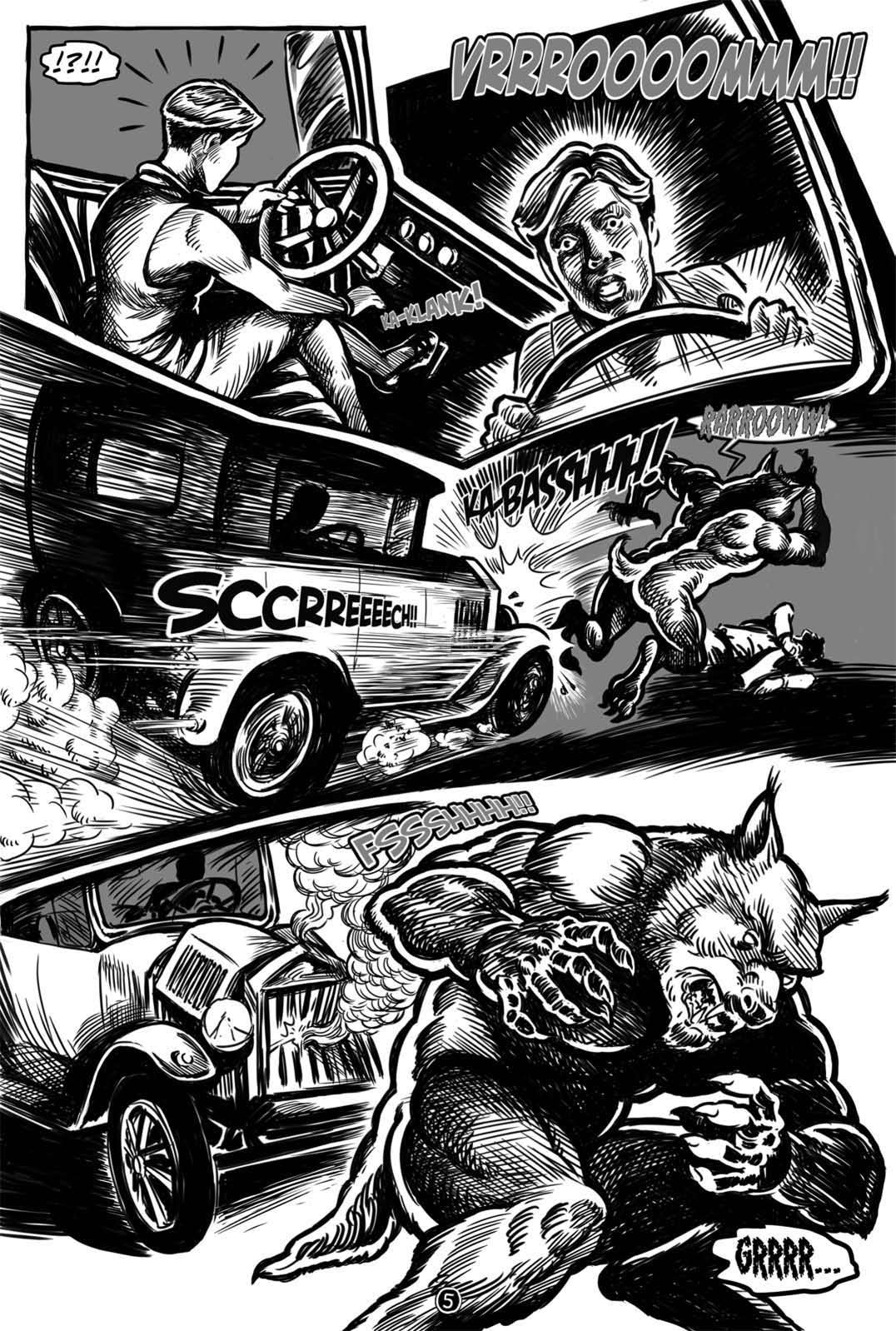
Where the car hits the werewolf, I've nothing but thumbs up for this comic book, and the panel where the werewolf attacks the man who was driving the car, initially, my eyes light up with interest. It is at that point that my eyes are grabbed, and they drag me to a whole new level of interest, compared to the comic book ride up to that point.

The panel work isn't bad. It is at least a bit imaginative, and the panels add to the comic book's overall value. I would encourage this creative team that brought Jennifer the She-Wolf Issue # 1 to life to continue exploring what they can achieve, where the use of interesting panel work is concerned.

The lettering throughout the comic book is passable. It's OK. The speech bubbles are not one of this comic book's strong points, and while it is doubtful that the lettering on display in Issue # 1 is likely to win any awards, it was still nice to be able to read the comic book all of the way through, from front to back, without trying to figure out what the dialogue and narration were trying to tell me.


The first half of Issue # 1 was better rendered, visually, than the second half, even with the issue of color completely aside. Half way through the issue, it's as though the creative team forgot how to use narrative boxes.


Personally speaking, I think that narrative boxes worked very well, as far as driving the story line in the first half goes. They increased my interest in the story being told. Once you get to where the story picks up in the present era, the style of storytelling changes, and maybe that's one of the weak points of Jennifer the She-Wolf Issue # 1.

But, I don't want to give the wrong impression. Personally, I think that one of this particular title's strong points lies in its storytelling. Kudos to the writer, for it is the story, itself, that is ultimately responsible for the biggest share of why I liked this comic book.

When I reached the end of Issue # 1, I found myself still interested in the story, and that is exactly where you want your comic book to be, if you're the one publishing it. It's at the very core of why I would want to pick up and continue reading, come the next issue.

As I sit and flip the pages of this comic book back and forth, one thing that sticks out to me is the lack of consistency in quality of the art rendered, from panel to panel. I've mentioned this, already, but it really does stand out to me, as I browse and ponder what lies before me.

Overall, the mood of this comic book is serious and somber. That fits the bill for what is visually on display here.


On a personal level, I'm not a huge fan of werewolf stories. This may well account for why I am receptive, as a reader, to zombies being injected into the mix. For me, at least, that breaks fresh ground, where comic books are concerned.

The special effects lettering is a mixed bag. None if it is spectacular, but a lot of it is sufficient for driving a point home, or for heightening the feel of a particular action or event taking place in the panels.

Overall, I think that this independent comic book is better than the sum of its individual parts. Some panels are bland and boring, while others do a solid and respectable job of entertaining me, both visually and in a literary manner.

The story progresses rapidly. It might even be paced a tad too fast, but one thing that I didn't get, while reading through Issue # 1 of Jennifer the She-Wolf, was bored.

At least the pacing is sufficient to retain my interest, and it did accomplish getting me interested in the first place. Looking back on it, after reading it, though, I can't help but to feel as though the author was in a rush to get us to where he was taking us, as far as the story was concerned.


But, without reading the next issue, yet, how can one be sure?


So, in summation, while this comic book didn't leave me howling at the moon, nonetheless, something in my blood yearns for the release of Issue # 2.

Count me in as part of the pack of fans, where this comic book is concerned!


Cruzin Comics - Issue # 1 - Jennifer the She-Wolf
Publisher: Cruzin Comics
Story: The Mystery of the Undead (Part One)
Writer: Luis M. Cruz
Artists: Henry Simon & Miky Ruiz
Colorist: Henry Simon

Letterer: Jorge Medina

Tuesday, January 6, 2015

A fleeting glimpse into a decision to buy some digital comic books

So, have you ever wondered what kind of things get taken into consideration, when somebody such as myself ponders whether to make an online purchase of a comic book or not?

I really had not planned to post any of this, here on this blog, but it dawned on me that somebody out there might find it to be of some use, in the refinement of their own independent comic book publishing processes.

What follows is a copy and paste extract from a Facebook message that I sent to John Taylor IV of the comic book publisher known as Top Secret Press.


The comic books purchased were:

Enjoy, and happy reading!

--------------------------------------------------------------
Beginning of Message
--------------------------------------------------------------

Separate from any of this, if you're interested in how I got from being off work, today, to making the decision to place an order for the comic books in question, even though I am familiar with some of your company's comic book works from Kickstarter browsing, previously, it was a Facebook posting, today, that caught my eye. I've been on your website more than once, today, in fact.

I want to say that I saw a posting in a Facebook comic book group, but honestly, I don't recall which one, off the top of my head.

The Issuu preview thing that you use on your site isn't my personal favorite way to view comic book sample pages online, but it did suffice to give me an idea of the quality of some of your comic book products. I checked the sample thing out, more than once, before deciding to make the purchase.

The Strange is initially what caught my eye, but I remember seeing the Kickstarter for Wicked Betty. Looking at that Kickstarter page, right now, it reminded me that I backed that project for a buck. The Kickstarter didn't really factor into this particular purchase, though - not notably, anyway, even though I did recall seeing the project on Kickstarter, prior to making the decision to purchase comic books from you, today.

The Special Holiday Offer is ultimately what made the difference in me opting to make the actual purchase. I prefer PDF format comic books to print format comic books, so there was zero chance that I would have purchased higher priced print option of the same products.

Going from memory off the top of my head, I actually took notice of the Special Holiday Offer from the image on your company's Facebook Cover Photo, before every paying it any real attention on your company's actual website.

If the Special Holiday Offer wasn't an option, then I probably would not have ended up buying anything from your company, at all, today. I didn't really want to spend the five bucks.

But, ultimately, I concluded that the quality of the products that I had already seen from the samples posted on your website and via the Issuu viewer thing, would likely be worth the five bucks.

One hesitation that I did have, one that almost made me go the other way on my purchase decision, was the yellow narrative boxes in the 3Corps preview. I really debated with myself about that, and I have a gut feeling that I won't care for that particular thing, once I receive the comic book in question and actually sit down to read it.

If the art and coloring were of lower quality in the previews that I looked at, then the yellow narrative boxes would have killed the sale. The lettering samples looked OK, although the preview quality via Issuu is probably less than what the end comic book will be in PDF format. That was speculation on my part that I was willing to gamble on, where the lettering was concerned.

All things considered, it was a combination of different things that, collectively, got my attention, kept my attention, and persuaded me to buy comic book products from you on this particular day.

Sorry for the length of this, but I thought that you might be interested in learning and knowing what of your overall process actually worked to snag you the sale in question.

- Charles -
--------------------------------------------------------------
End of Message
--------------------------------------------------------------

Sunday, December 28, 2014

Review - Interceptor # 1

Recently billed as the most successful Kickstarter that they've had at Unstoppable Comics, issue # 1 of Interceptor is the latest reading fare to make its way to me, from the realm of comicdom. Hither, now, comes my review of it!

Regardless of Interceptor # 1's billing as Unstoppable Comics most successful Kickstarter to date, make no mistake - it is not Unstoppable Comics' best comic book produced, to date.

Far from it, in fact.

However, I quantify that statement by pointing out that the issue, itself, proclaims August 2014 as its actual time of creation, even though the Kickstarter project for this issue didn't end until December 19th, 2014. Thus, there's a span of four months to account for, when weighing and assessing and comparing Interceptor # 1 to other comic books by the same company.

For example, another comic book that they published, one that I recently reviewed - namely, Unstoppable Origins # 4: The Origin of Dr. Zero - asserts September 2014 as its time of creation, even though I read and reviewed it prior to ever reading Interceptor # 1. So, unless Unstoppable Comics got the dates wrong on the inside pages of its own comic books, from a creation point of view, Interceptor issue number one strikes me as an earlier product than The Origin of Dr. Zero. As such, this helps me to reconcile what I feel are some of the shortcomings with Interceptor # 1.


Before I go into greater detail of the issue's respective strengths and weaknesses, I would preface my remarks-to-come with a simple statement that I enjoyed reading the comic book. Rest assured, by this point in time, I count myself as a true fan of Unstoppable Comics. I look forward to each of their new comic books, as they come out, and I think that, by and large, they are doing a very respectable job of publishing what I feel are quality comic book products.

That said, I have no qualms about criticizing various instances of what I feel are points of weakness in the end product that they are putting in the hands of comic book readers.

The credits page of Interceptor # 1 lists the following individuals as being responsible for the comic book that I have just read and am now reviewing. Respectively, they are:

Brandon Easton - Writer
Russ Leach - Illustrator
Michael Summers - Colorist
Letterer - JayDee Rosario
Richard Rodriguez - Editor
Max Dunbar - Variant Cover


Issue number one of Interceptor is a mixed bag, one that leaves me a bit miffed. On the one hand, it contains a select few instances of panels that are spot on the money for being top notch. On the other hand, the bulk of what we see in the panels that collectively comprise the various pages of this comic book do not even remotely rise to that level of praise worthiness.

Interceptor # 1 isn't terrible. It's really not.

But, neither is it terrific.

Instead, it is a mish-mash, a veritable hodgepodge of middle ground accomplishment.

Of the individuals listed in the credits for this comic book, the one that I, personally, think should come in for the least criticism is Max Dunbar. After all, his contribution to the effort that was this issue is confined to the variant front cover for it.

The pre-order front cover does a pretty good job of crafting a visually interesting front cover. It visually entices me, somewhat. It doesn't reach out and grab me, nor does it make me drool with excitement, when I look at it. But, for the most part, the front cover works. It serves its purpose. It gets the job done.

It's job only, though. What it does not get done are the other jobs - namely, the jobs attributed to the other individuals previously listed, above.


Max's variant cover grabs my eye, with Interceptor in running form in the foreground, as a giant Union Jack dominates the background. It's not a better, not more visually interesting, alternative to the pre-order version of the front cover for this comic book, but it does embody more visual energy than its more visually interesting counterpart.

Overall, Russ Leach manages to churn out some pretty decent artwork. This issue was not a stellar performance by Russ, to be certain, where the artwork is concerned, but I will say this for him - his work is consistently good, with much of it being well above par, compared to what you usually find scattered throughout the independent comic book industry.

None of Russ's artwork in this particular issue is terrible. None of it is really even bad. Rather, the biggest visual drain on the artwork rendered by Russ Leach for Interceptor # 1 is the coloring that accompanied it.

Not that I want to say that colorist Michael Summers was the real villain of this issue, but yeah, he was. Sorry, Michael, but it's true.

And that is where the greatest mystery of issue # 1 of Interceptor lies. The great unknown is not the magical ley lines that writer Brandon Easton has dangled before us. Rather, it's how Michael Summers' coloring can vary so greatly across the pages of a single issue.

What the Hell is going on here, guys?

This particular issue runs the coloring gamut from excellent to ho hum. In other words, it's a consistency issue.

I do not believe that Interceptor # 1 is a sterling example of Russ Leach's most imaginative drawing, as an illustrator, but from page to page from front page to last page, Russ Leach's artwork is rendered consistently better than Michael Summers' coloring.

Two of the four panels on the first page of this story are rock solid eye candy, both from a drawing perspective and from a coloring perspective. The other two are little more than an exercise in coloring mediocrity. Not terrible, but nothing to write home about, either.

The villain, Throttle, gets issue # 1 off to a good start.

Colorist Michael Summers' crowning glory for this issue is his treatment in colors of the character known as Throttle, although there are some instances of Interceptor that make Michael's work as a colorist shine.

The far more interesting, Throttle, beating up on Interceptor.

Brandon Easton's contributions as the writer for this issue are successful, all things considered. But, the story that he tells, while it gets the job done, does not make me clamor for more. It was an interesting story. It was OK. It was all right. But, it doesn't make me want to subscribe to Interceptor, compared to how I was left feeling after reading Unstoppable Origins # 4: The Origin of Dr. Zero.

There, somebody needed to slap JayDee Rosario around, and make him stay in a room until he delivered the next issue of Dr. Zero to us. Here, I'm more interested in seeing what Unstoppable Comics comes out with next, more so than I am in following the further adventures of Interceptor. Blame me, if you like, but that's what you guys at Unstoppable Comics made me feel, where Interceptor # 1 is concerned.

Interceptor carries a shield called Pridewynter.
On the editing front, Richard Rodriguez did a better job on the story part, than he did on the punctuation front. The editing needs more attention to detail, but for whatever flaws that it may have, ultimately, it's a very readable story. It's easy to follow, and it's legible.

Which leads us into the lettering, and to my main man over at Unstoppable Comics, the illustrious Jaydee Rosario.
Is this the real JayDee Rosario??

Interceptor # 1 makes use of narrative boxes, something that was noticeably absent from Unstoppable Origins # 4: The Origin of Dr. Zero. Perhaps credit for that should go to the editor, rather than the letterer, but that particular quibble aside, the lettering suffices to get the job done.

At times, it feels a slight bit cramped, relative to the size of the speech bubbles utilized in select instances, but none of it rises to the level of critical.

Far better that the lettering be legible than that it be a visual parade of horribles - as is often the case with comic books published by independent publishers across the comic book industry.

Of course, there is that opening narrative box that is quasi-pale red with yellow lettering - which was definitely not lettering's finest moment.

But, the grand bulk of the lettering is presented with black text in a white speech bubble, which yields solid visual contrast, so that the simple act of reading a comic book doesn't become a form of visual torture.


I like this!
In terms of the special effects lettering presented here, issue # 1 of Interceptor is no tour de force of visual delight. Instead, once again, readers are given the mixed bag treatment. Not horrible, but nothing that rises to a visual majesty. Rather, what we are treated to largely seems to be content to just get the job done.

This, not so much.
This issue of Interceptor continues Unstoppable Comics' apparent tradition of injecting interesting concepts into its storylines. I liked the ley lines concept a lot, and I also liked the link between Interceptor's shield and the famous sword of literary fame, Excalibur. The Axis of Neverwynter also caught my eye and my interest.

But, when all was said and done, I was more interested, as a reader, in one of the villains - Throttle - than I was in the hero, Interceptor.

The villain, Grave Walker, fell flat with me.


Grave Walker in action.
As with many things in the superhero genre, Interceptor # 1 struck me as being more worried with creating an origin story for a character, than in simply telling an interesting tale in a very interesting way.

Sure, it's interesting, because it is new to me. The characters are new, and the story, itself, is new. But, beyond that, it doesn't really win me over to the title's namesake character, nor does it persuade me

that the title, itself, is worth following, as a series.
Rather than drawing me into a compelling storyline, Interceptor # 1 leaves me feeling distant. It's not outright boring, but neither is it particularly exciting. Instead, it is interesting, but interesting with a touch of the mundane.

Nonetheless, for all of its flaws and shortcomings, Interceptor # 1 doesn't make me like Unstoppable Comics, any the less. Each issue presents its own set of challenges, and overall, my impression of the company is a very positive one. I don't have to look forward to what Interceptor is doing next, in order to still be very interested in what Unstoppable Comics is coming out with next.


Publisher: Unstoppable Comics
Brandon Easton - Writer
Russ Leach - Illustrator
Michael Summers - Colorist
Letterer - JayDee Rosario
Richard Rodriguez - Editor
Max Dunbar - Variant Cover


Saturday, October 4, 2014

Review - Parking Garage Planet (Issue 1)

Parking Garage Planet hails from comic book creator Tim Rocks, whose previous artistic undertakings gave the world Goldbug, Slob-oids, and the Elite Leafblower Corps. Tim is a gifted caricature artist, and I always look forward to seeing what happens, when new ideas meet his artistic talent unleashed. This comic book is published under the Peak Fun label.

The front cover of Issue # 1 sets the stage for a horse of a different color. Billing two of the characters depicted on the front cover as "the most shocking new duo yet seen in print" - aka the Sale Sisters, the comic makes a bold grab for the reader's attention. Yet, if they are so shocking a duo, then why are they cowering on the front cover?

The real visual heavyweight that dominates the visuals on the front page is none other than the notorious Dubell Decka. Think big, as in a double decker bus, people, or a double-decker parking garage, if you prefer. She is upstaged on the front cover only by the colorful words which emanate from her mouth.

I won't say that Parking Garage Planet is Tim's best work to date, nor that the setting is one of my personal favorites, simply because neither would be true. But, in all fairness, this comic book does demonstrate, anew, certain aspects of the comic book craft that Tim Rocks excels at.

In an attempt to love this comic, I went back and forth through it multiple times. Nonetheless, it failed to grab me. The storyline isn't one that I want to sink my teeth into, and come back for more, issue after issue after issue.

Oh, it starts out well enough. The front cover's artwork may not seize my attention, but the dialogue does. Sentry gimps. Youthful fashionistas. Hoped-for heroes. Verbally, Issue # 1 is talking the talk, right there on the front cover, and soon enough, the reader is treated to a two-page Kirby-esque "splash page" of action. That's what the great moped jump scene reminds me of, anyway.

Without question, Parking Garage Planet flirts continuously with the imagination. Imaginative is one of Tim Rock's stock-in-trade staples of the comic book art form. His characters are imaginatively drawn. His dialogue tends to be heavily saturated with imaginative verbiage.

Parking Garage Planet is a smorgasbord of imaginative touches. Whether it's a character singing words from a Statler Brothers song, or the use of Goo-Goo Clusters as an obsessive literary device, or a villain who reeks of being a watered-down Darkseid, of sorts, Parking Garage Planet does not disappoint, when it comes to being imaginative, when it comes to utilizing ordinary things in an imaginative way.

When it comes to panels, however, while Tim Rocks is clearly comfortable at the craft of rendering sequentials, Parking Garage Planet Issue # 1 is tepid in its embrace of panels, themselves, as an artform. Why an individual possessed of such mastery in multiple areas of the comic book craft presented this story and its art within the frames of such an unimaginative set of panels is beyond me. It's not as though Tim Rocks possesses no skill in that area, either. The panels in Issue # 1 of Parking Garage Planet warrant Tim Rocks taking a trip into the Pit, way down in the sub-sub-sub basement level. Tim knows what I'm talking about, with this reference, even if you don't.

Story-wise, this issue carries us along with the Sale Sisters, as they deal with the "discovery" of their parents supposed double-suicide, by going shopping, in search of (what else?) sales. Along the way, they manage to end up on the Parking Garage Planet, even though they started out on Earth. Beware strange rings and even stranger elevators!

I think that what I hate the most about this issue of Parking Garage Planet is not so much what I, the reader, was treated to, but rather, that which I was only teased with, but which Tim squandered in passing.

The lady in the booth. The aunt and uncle that were flying in, but weren't. Tobiz.

Some of the more visually interesting characters to greet my eye during my flipping of the pages in this comic book turned out to only warrant the cameo treatment from Tim. It was almost as if Tim was more interested in an artificial page count than in grabbing the reader and yanking them fully into the full depth of his imagination unleashed. When some of the best eye-candy leads to visual dead ends, that can't be good for a comic book.

This issue builds to the crescendo of Dubell Decka's appearance, but then it becomes anti-climactic, after that. Ultimately, I'm left not really knowing what I think - or feel - about this issue, it's storyline, its cast of characters, or where the whole ball of literary wax is going.

I want to like it. I don't end up liking Tim Rock's art and comic book craftsmanship any the less than I did heading into reading this book. But, what's a reader to make of it all?

In the end, when all is said and done, I find myself wondering aloud to myself what the whole point of it all was. Yeah, sure, maybe it needs more issues, to allow Tim sufficient room to chart out this imaginative place that is the Parking Garage Planet and to expound upon the details and the personalities that populate this world.

But, without that, issue # 1 is what it is, and for my two cents worth, I'm not entirely sure what it is that I ended up with.

The lettering is sufficient. It's not bad. But, his lettering skill isn't nearly as developed as Tim's skill with dialogue. His skill with crafting dialogue is, in my considered judgment, superior to his skill at storytelling. He is better within a particular panel, than he is across panels.

And, maybe that's part of what' wrong with Issue # 1 of Parking Garage Planet. I think that, clearly, Tim's imagination was along for the ride - but, what about his heart? There are instances, segments if you will, that I love about this issue. But, do I love the story and its storyline? No, not really.

You can find Parking Garage Planet Issue # 1 online, if you want to check it out for yourself. It can be found here. Or, if you just want to check out Tim's blog and website, that can be found here, instead.

As far as I know, Tim Rocks did all of the writing, art, lettering, and color for Issue # 1 of Parking Garage Planet. The sum total of his talents and skill sets are many, and while I don't consider this issue or this title to be Tim at his best, nonetheless, I do applaud him for continuing to push the envelope on what he is willing to artistically dabble in.


NOTE: I was sent a digital copy of Parking Garage Planet, Issue # 1, in PDF format, so that I could review it.

Saturday, September 27, 2014

Review - The Adventures of Punk and Rock (Issue 1)


The Adventures of Punk and Rock, Issue # 1, is a comic book that was sent to me, that I might review it.

It hails from the hands of artist Scott Twells and letterer Dario Reyes, with the cover logos handled by Bob W. Pierre. The writer is Austin Hamblin. It is being published under the auspices of Hamblin Comics!

It is the tale of two characters named Punk and Little Rock. Little Rock is a character who reminds me of The Thing from Fantastic Four fame, as far as his looks go. And Punk? Well, he's a thug, of sorts, one with a rather lengthy rap sheet.

Artistically, Issue # 1 is an exercise in gray scale. The gray tones dominate the visuals, albeit in an inconsistent manner. But, I will freely confess that gray scale is not my personal preference, when it comes to comic books. For this comic, I think that the gray scale approach worked better, when the gray was in lighter tones, rather in the instances where it was applied in a heavier, darker manner.

This comic book adopts a light approach to its subject matter. It encompasses humor lined with sarcasm.

The story is also told with an active narrator - one who directly injects himself into, and participates in, the storyline. This part of the comic book is handled competently enough, and the story moves itself along, without this approach unduly weighing the story down.

As far as the story, itself, goes, there's not a lot of depth to it.

Rather, it's just a short tale about one episode in the lives of Punk and Little Rock.

They are hired by a lady to retrieve a cat from her ex-husband, and this quickly proves to be an invitation to complications in their lives. The cat, you see, is in the possession of her ex-husband, a fellow who, as it turns out, just so happens to be an interstellar crime lord.

Did I mention that the cat is located on a planet that is one big strip club?

Of course, the point of a review is typically not to divulge the entire story, nor to spoil the ending for other readers, so I am faced with the balancing act of telling you about something, without actually telling you too much.


The story proceeds at a fairly fast pace. These two guys, Little Rock and Punk, they clearly are experienced at getting themselves into trouble - which is to the reader's benefit, since it doesn't take long before things begin to get screwed up, and our "heroes" of this little tale find themselves in the trouble that they are all too familiar with.

Of the two of them, I think that punk is the more visually interesting of the two. When they were handing out looks, Little Rock apparently found himself near the end of the line.

The greatest strengths of this particular issue are its dialogue and storyline, which are the province of the writer. The lack of depth to the storyline was intentional, since this is merely one take out of many from the lives of these two second-rate hoodlums. Honestly, I don't even know what I should call them. Hoodlums strikes me as too generous a word for the likes of these two fellows. They are incompetents, lightly coated in likeability. But, that's the whole point, isn't it?

Perhaps misfits is the right word. Like those broken toys from that Rudolph the Red-Nosed Reindeer animation that I used to watch as a kid growing up, Punk and Little Rock are looking for a home, it seems.

I want to like them. I certainly don't hate them. But, do I love them enough to give them a home by actively seeking them out in future issues?

Honestly, the answer to that question is, "Probably not."

It may well be, though, that the beauty and depth of these two characters is something that can be brought front and center over the long haul. But, what is it, I ask myself, that I - the reader - am supposed to fall in love with about this comic book and this cast of characters?

The art in this book is sufficient to carry a comic. But, to make readers fall in love with this series, the artist really needs to step up his game. To borrow some phraseology from Issue # 1 of The Adventures of Punk and Rock, visually speaking, this issue is sorely lacking in what the narrator of the book would call bad assery.

But, whatever criticisms could be directed at the artist, the weakest point of Issue # 1 is the lettering. The dialogue balloons are passable, but the narrative boxes cry out for substantial improvement in the rendering of the lettering.

Additionally, though this issue contains a multi-page fight scene, this comic book made sparing use of special effects lettering - and where it did occur, it came across as unimaginative and lazily rendered. Apparently, the letterer even had to enroll the services of the narrator, to fill the gap in certain instances.

 This comic book has potential. But, having potential and effectively exploiting potential are two very distinct things.

It's far from being the worst thing on the market, and in fact, it's better than most of the stuff that I see churned out by independent comic book creators.

But, it's not my place to make excuses for the shortcomings of comic books. Rather, it is the job of those producing them to not just publish a product that people can read, but to publish a comic book that people gravitate to.

This particular comic book was Issue# 1 of what I suppose is going to be a series. It's not that things cannot be improved upon in the next issue. Rather, Issue # 1 should be a grand attempt to grab the reader's eye and to command their attention. Otherwise, you stand to lose momentum for your follow on issue.

The Adventures of Punk and Rock is not without merit. It was enjoyable, to a certain degree. Not all comic books are. But, I believe that there is substantial room for improvement.

This issue did feature a color cover. But, even that ended up equaling missed opportunity. The pose of the characters on the front cover is animated, which is a plus, but the coloring is second rate and accomplishes nothing of note. If this comic book were sitting on the shelf of a comic book store, that front cover would get deliberately passed over by potential buyers, I do believe.


The saving grace of the front cover is not the animated pose of the Punk and Little Rock. Rather, it is the artwork of the title lettering.

If you want to judge this comic book for yourself, you can pick up a copy at their online storefront.

The credits for Issue # 1 belong to Austin Hamblin, Scott Twells, Dario Reyes, and Bob W. Pierre