Metron

Metron
Showing posts with label religion. Show all posts

Saturday, January 3, 2015

Review - Theodicy: Book Two

Recently, I reviewed Book One of the Theodicy series of comic books. That review can be found here. For all of my complaints about that issue, the fact remains undisturbed that I ended up liking Book One.

Theodicy: Book Two takes up where Theodicy: Book One left off. Unfortunately for this series, Book Two offers no salvation for comic book fans who gravitate toward either art or coloring, to sate their thirst for comic book greatness.

The very same individuals who contributed in various ways to the creation of Book One are also responsible for the creation of Book Two. How very unfortunate then, for both this series and its readership, that the visual imagery offered up in Theodicy: Book Two remains mired where it shouldn't be.

Lest anyone misconstrue where my criticism falls the hardest, make no mistake - the coloring remains the biggest disappointment in my exploration of this particular comic book series.

I will even go so far as to say that the art and the coloring for Book Two are worse than they were for Book One.

Nice speech bubbles. Good lettering. Deficient anatomy. So-so coloring.

Why?

Well, at least in Theodicy: Book One, there was an entire page of art - namely, the one that features what I shall dub "the water scene" that converted me to a fan of Book One. Nothing, whatsoever, in Theodicy: Book Two even remotely approaches the visual impact that the page in question from Book One managed to achieve. In a word, that page left its mark. In contrast, Book Two foundered.

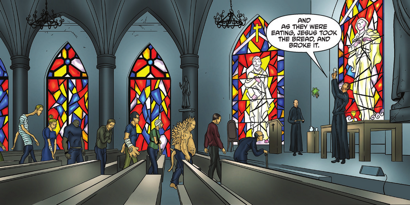
Good visual energy is generated here.
The problem with Theodicy: Book Two is not the story. The underlying storyline remains viable. The writing continues to engage me. The dialogue between characters is strong, and the work as a whole benefits substantially by presenting the reader with intelligently conceived characters.

That is not to say that all characters are equally strong, but this comic book series has a cast of characters that includes several different ones that are worth reading about and following. Notably, Book Two introduces a character who is a miracle investigator that expands upon an already solid cast.

Special effects lettering in Book Two is slightly improved upon from what we were treated to in Book One of the Theodicy series. Even still, it remains a largely unimaginative visual footnote. There remains enormous room for utilization of special effects lettering to drive the visual interest element of this series. Basically, it's largely a missed opportunity, one that the series' creators seem content to do little with.

How boring an example of special effects letting is this?

On the lettering as a whole, it remains pretty solid. Indeed, the lettering is one of the saving graces of this comic book title. Some of the speech bubbles try to cram a bit too much text into them, resulting in smaller text than I would prefer. But, none of it rose to the level of being a critical flaw.

On a positive note, there are numerous examples of lettering in Theodicy: Book Two that are right on the money. In comic books, even though it often seems to be lost on the bulk of the independent comic book industry, lettering is a big deal.

Good lettering making a solid and positive visual impact.
A really big deal, in fact!

Lettering is arguably the most under-appreciated facet of comic book creation. Good lettering is worth its weight in visual gold to a comic book. Letterer Kel Nuttall is pulling his fair share of weight - and then some, where this comic book series is concerned. I single Kel out for special recognition, by virtue of the fact that the lettering on display warrants it.

Verily, in my review of comic books, I have no vested interest in crucifying the creators of the very things that I undertake to review. Whether I gape in awe and admiration, or whether I reel, aghast at what I find, nonetheless, I enjoy comic books as a medium of entertainment. I also thoroughly enjoy encountering comic book creators foisting new comic book creations into the public psyche.

That said, as I explore the pages of Theodicy: Book Two, as I flip them back and forth, going over them time and time, again, I invariably keep coming back to what I feel are the biggest shortcomings with the Theodicy series, to date.

This is NOT professional grade coloring!
One, the coloring. Two, the art.

The art is a combination of two things - pencils and inking. Because the colorist keeps on saturating the panels with his coloring theology of choice, the end result of the penciling and the inking is continually corrupted, visually speaking.

The colorist isn't without talent, to be certain. Actually, there is a lot of coloring talent on display across the pages of Books One and Two in the Theodicy series.

That said, the coloring of human skin and the propensity for glaring, plain backgrounds are primary contributors to the visual famine that plagues the imagery of this comic book series. The attempt to utilizing lighting and shadows on faces, in particular, leaves me shaking my head in dismay.

My colorist, my colorist, why hath thou forsaken me?

White splotches populate people and walls.
The inherent nature of comic books as an art form typically means that pencils, inking, and coloring all intermingle to such a degree that, absent seeing each contribution standing alone, it can be a constant challenge to give proper and full credit where it is due.

I believe that the underlying pencils are more at fault than the inking, where Theodicy: Book Two is concerned.

Why?

For the very simple reason that it falls to the pencils to establish the various visual zones or segments of white space. Inking is often referred to as the embellishment of pencils, although personally speaking, I think that such a characterization substantially understates inking as its own medium of expression.

In Theodicy: Book Two, the inker is working with backgrounds that, in numerous instances, are lacking in any actual details to ink. The end result is a diminishment of the comic book's overall visual impact. While some instances of this technique are useful for focusing the reader upon a particular character, other instances of it leave me wondering why a given panel bothers to make so little impact upon me. That is a good way to generate disinterest on the part of the reader, which is something that a comic book should strive to avoid.

Boring road. Boring sidewalk. Boring car. Boring victim.
This latest installment in the Theodicy series does not mean that the inker gets off scot-free, by any means. Close ups of stained glass windows, walls made of bricks or blocks, and even doors are missed opportunities for the inker to increase the visual heft of this book.

But, I don't read through or visually explore Theodicy: Book Two, and say to myself, "Hey, the inking of this comic book is really screwing this one over!" That's simply not the case. The greatest visual sins of Theodicy: Book Two lie not with the inker.

One of what I feel to be amongst the greatest mistakes of aspiring comic book creators is what I shall characterize as the static visual treatment of the background environment in which comic book characters are visually posited before the reader.

Theodicy: Book Two is guilty of this. Take, for instance, a wall or a road. In one panel, a very light visual treatment of such innocuous, ordinary things might be beneficial to a comic book. Other panels featuring such things might benefit greatly from greater attention to detail or emphasis of the same. Book Two of the Theodicy series deserves to be taken to task for failing to visually demonstrate a keen appreciation for this basic fact.

Infrared vision or visual eyesore?

This comic book did make some attempts at being imaginative with coloring, notably where the Sanction Collection Agency is attempting to collect a "debt." I am talking about a scene where one of that entity's personnel utilizes infrared vision to see inside of a house. But, imaginative though it may be in concept, nevertheless, it ends up coming across as some of the worst coloring in the issue, in practice.
Here is a better example of a concept effectively implemented, visually.

Overall, the problem with the coloring lies less in the palette of colors chosen by the colorist than with their penchant for manipulating their colors with filter effects. That's how I will characterize it, anyway.

Some of the speech bubbles with yellow border that appeared at the beginning of Book Two, I felt that they worked fairly well, in the instances in which they were resorted to. I did not really care for the speech bubbles that appeared further back in the issue, which featured yellow coloring on the interior of the speech bubbles. This particular item wasn't visually critical, but I'm not really sure what the rationalization was for it being resorted to, in the first place.

Quality speech bubbles and nice lettering.
Overall, the presentation of speech bubbles in Theodicy: Book Two was visually strong. Both the speech bubbles and the narrative boxes are visual positives for this issue.

There are some decent facial expressions in Book Two, but overall, I don't think that the penciler utilization of facial expressions was as strong, as it was in Book One which preceded it. For the very reason that the Theodicy series is, at its core, a tale of human drama playing itself out against a backdrop of theological trappings, to not capitalize upon the use of facial expressions (and the attendant art form of exaggeration that they naturally embody), is to do a great disservice to this comic book series. It falls to the penciler to dominate this particular aspect of the panel work. More attention to detail is needed in this area.


This lettering, while mild, is more visually interesting than the anatomy.
As a whole, Theodicy: Book Two succeeds at the individual panel level more than it does as a collective whole. Certainly, it succeeds at advancing the storyline, but what it does not do is to maintain the same degree of momentum achieved at the end of Theodicy: Book One.

On the story end of things, Theodicy: Book Two leaves the reader hanging in suspense. Book Two succeeds on this level, but I don't believe that it pulled it off quite as successfully as was achieved with the ending of Book One in the series.

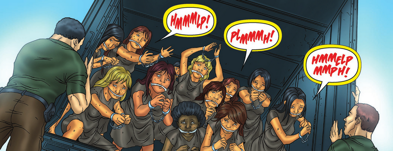
Lots of visual eye candy in play. This panel clicks.
Because the series encompasses a setting where violence is readily resorted to by certain elements, it leaves the reader wondering which of the characters will actually make it and which ones won't. One level which I feel Theodicy, as a series, succeeds at is on the level of persuading me, as a reader, to begin to grow attachment to certain of the characters. This is important, as an ingredient of success for the human drama element of the tale.

Yellow border on speech bubble succeeds in spite of yellow sky glare.
Theodicy: Book Two shows progress, I think, in the area of human hair. It's a small item, to be certain, but I do feel that hair is one of the better depicted aspects of human anatomy to be found in this series, so far.

Some of the characters in this series utilize emotion, well, and this is showcased in some of the dialogue that takes place between characters. This is one of the core reasons that the human drama of the story actually enjoys some tangible drama in its telling.

Good injection of emotion.
In summation, after having read through Theodicy: Book Two from cover to cover, I find myself still interested in learning what is yet to come. The ending of Book One left me in a more elevated state of interest, compared to Book Two, but when all is said and done, and you get right down to it, I still find myself along for the ride, as this series heads into Theodicy: Book Three.


Writer: Chad Handley
Penciler: Fernando Brazuna
Inker: Ryan Boltz
Colorist: Minan Ghibliest
Letterer: Kel Nuttall


Sunday, December 28, 2014

Review - Theodicy: Book One

One of the things that I do, when I obtain a new comic book, whether for review purposes or not, is to just flip through it, catching only fleeting glimpses of the art and coloring that lies in store for me.

I do it for my own reasons. I do it for my own purposes. I find it to be continually useful, as it instructs me in a first-hand and forceful manner to abide by the dictum, "Never judge a book by its cover."

Theodicy: Book One is a perfect example of this axiom in play. Just flipping through the pages, without bothering to absorb either the story that it tells or the talent that it encapsulates, is to miss this little gem of a comic book.

I was actually asked to review this comic book a couple of months ago, and circumstances and health conspired to effectuate me losing track of it. I wasn't even looking for it, when I happened back upon the digital copy that writer Chad Handley had sent to me back on October 1st, 2014.

I won't call it a miracle, that it made its way back to my attention, but I am thankful that it did, nonetheless. 


Note the contortion of anatomy in transition from neck to face.

At a glance, this is not a comic book that I would gravitate to. The coloring and the art of the interior pages relegate this work into the realm of standard fare independent comic bookdom. In other words, there's plenty wrong with them.

Make no mistake, the art and the coloring of Theodicy: Book One is a long, long way from the very worst that independently published comic books have to offer. Yet, neither rise to the occasion of showcasing this little diamond in the rough.


Though I read this comic book in PDF format, which is a digital format, if this comic book were in traditional paper form, and if it was sitting on the shelf of my local comic book shop, its front cover would catch my eye.

The front cover features an artistic depiction of a young boy, a quadruple amputee, wearing a Jesus Heart Me (Jesus Loves Me) tee-shirt. The artwork of the front cover is actually the best drawn and best colored art to be found in the entire issue. None of the interior pages are as fortunate.

That said, the front cover's art and coloring neither offend me nor attract me to sufficient degree that I feel compelled to open the book, to see what's inside. In that sense, I would adjudge the front cover art to be a failure, for isn't that the whole or overriding purpose of any comic book's front cover? If it doesn't grasp me, if it doesn't command my attention, if it doesn't interest me with artistic temptation, itself, then aren't I - and others like me - likely to simply pass it by?

All the more to pity, then, for this is comic book ground that should not be allowed to lie fallow.

Theodicy's theme is a religious one, and it makes sparing - but effective - use of resort to the quoting of scripture from the Bible to ground itself and to serve as a foundation for suspension of disbelief, that readers might allow themselves to get swept up into the story, itself.


Once I turn past the credits page, and land squarely on the first page of the story, itself, I am met by coloring that so visually dominates the eye-scape that I immediately want to just close the book.

Amateur. Amateur. It just screams amateur, at me, in a visual manner. I can already tell that I am not going to like this comic book. Oh, God, do I really have to review this?

Fast forward to the end of Book One, and somehow or other. by hook or by crook, Theodicy has managed to snag me. It leaves me on a high note, wanting more.

For all of its many shortcomings, I end up liking the damned thing. And that, to me, is the mark of a fundamentally sound comic book. The art and the coloring are typically the visual equivalent of smoke and mirrors of comic books. They are often pretty and attractive or eye-popping.

But, they never are a full and proper substitute for competent story-telling and adequate lettering.

Like many independent comic books, Theodicy: Book One has its share of typos. That accounted for and aside, the lettering present here in this issue is more than up to the task at hand. Bad lettering can kill an otherwise great comic book, but as this issue more than amply demonstrates, competent lettering can salvage even second tier art and coloring to deliver unto the end reader a positive reading experience.

Theodicy: Book One features a couple of pages about the issue's creative team. One of these pages lists writer Chris Handley as possessing a Master's Degree in screenwriting from Hollins University.


Well, I know next to nothing about screenwriting, but what I do know is this - the writing for Theodicy: Book One is this issue's true path to salvation.

Though this comic book deals with religious and theological fare, it tackles the subject matter with equal portions of seriousness and humanity's proclivity for error. It yields a very human approach to certain issues, and it brings the issue of doubt in God to the forefront - doubt forged in the furnace of things that happen in the real world, every single day.


The confrontation in the book between a character named Paul and a statue of Jesus Christ sets the stage for an atheist's baptism, of sorts, but while Paul is the one left soaked from the water, I was the one who felt like a fish hooked and yanked from the water.

If one were to simply flip through the book and happen upon this scene, the end effect isn't nearly as effective as if one allows the story to lead them to where it is going, panel by panel.

Speaking of panels, Theodicy: Book One is imaginatively stale, insofar as imaginative use of panels goes, which is not the exact, same thing as effective use of panels.

This issue derives far greater positive effect from its use of speech bubbles, than it derives from its exploitation of panels, visually speaking.


While I am not a fan of the coloring, overall, I will concede that I did like the coloring of the stained glass imagery that appears within the pages of this comic book. They do a great job of setting the mood of certain panels, and they visually deliver, in sharp contrast to a lot of the coloring that dominates the pages of this comic book.

The art on the pages could have benefited considerably, if the artist had invested more time in their rendering of both human anatomy and details. A huge amount of potential visual interest simply never materialized for me, with the end effect being more of a visual dumbing down of the end product.

With regard to the special effects lettering, it is a gospel of mediocrity writ large. There is some sprinkled throughout, but it seems to have been little more than an afterthought. The end result is that it proves to be a meager offering incapable of paying visual penance to the underlying vessel that is the story.

As with every comic book ever produced, it is what it is, for better or for worse. All things considered, though, Theodicy: Book One is a comic book that I can and do recommend to others. The search for a good comic book is often times as elusive as the search for God, or so it seems to me. There are a lot of things about this comic book that I don't like. Nonetheless, when taken and considered and digested as a whole, Theodicy: Book One is greater than the sum of its individual parts.


Writer: Chad Handley
Penciler: Fernando Brazuna
Inker: Ryan Boltz
Colorist: Minan Ghibliest
Letterer: Kel Nuttall