Metron

Metron
Showing posts with label unstoppable origins. Show all posts

Tuesday, January 6, 2015

Review - Unstoppable Origins # 1

Next up on the chopping block is Unstoppable Origins # 1, from Unstoppable Comics.

For me, this is like taking a ride back through time, because I already know that this comic book was created before the comic book that introduced me to the Unstoppable Comics universe - Unstoppable Origins # 4: The Origin of Dr. Zero.

So, as I explore and review the art, coloring, and various other aspects of this comic book, I remain cognizant of the fact that much progress has been made with titles published subsequent to this one.

That said, let's proceed by digging into Unstoppable Origins # 1.

Had this particular comic book been my initiation into the Unstoppable Comics universe, my impression of the company as a comic book publisher would likely be substantially more subdued than is actually the case.

I firmly believe that all is fair in love and war and comic book reviews. Why? Because, ultimately, reviews of comic books tend to be an exercise in subjectivity writ large.

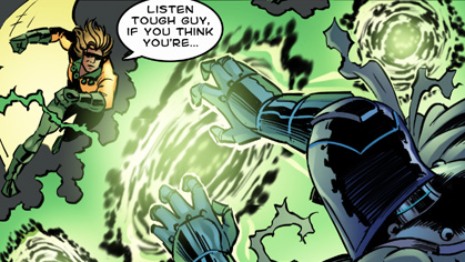
This is a nice scene setter. Great visuals, great moment!

A lot about comic books is neither right nor wrong, but rather, simply a matter of choices considered and exercised. There are plenty of comic books that other people love, which I am not enamored with, and likewise, there are comic books that I consider to be marvelous bits of literary scrumptiousness that others would no doubt view with disdain.

Starstriker or Starneck?
Unstoppable Origins # 1 features a front cover that has striking poses and decent coloring, but for some reason, Starstriker's neck looks a bit too long. It is an anatomical quirk that my eye keeps gravitating to it, as I sit and visually soak in this cover.

Of the two characters displayed on the front cover, Interceptor is, by far and away, the more visually engaging - and visually exciting - of the two.

Two flags also adorn the front cover, the Union Jack of British fame and the flag of Puerto Rico. They inject large doses of color, and act as visual stimuli, and while they help to inform the reader of the characters' respective origins, they don't really drive the imagination and get the juices flowing.

Judging solely by the front cover art, Interceptor clearly means business, and Starstriker is more in pose mode, than a man of action.
Visual blandness.

This is where we begin to flip the page, to see what lies on yonder interior pages of this comic book.

A quick flip past a boring credits page leads the reader to Puerto Rico, and to the first real page of the first of two separate stories.

The interior art is of a middling quality. It's not bad, but neither is it particularly imaginative.

As you begin flipping pages and reading the story, certainly, some of the creatures that you encounter are imaginatively drawn. But, for my personal taste, it is too little to entertain my eye for very long. My reaction to it is subdued.

Marocael
The Story of Starstriker tells the origin of how the character got his name, which is a bit cheesy. But, in fairness, comic books and cheesiness have a long history of going hand in hand. Such humble tabloid beginnings!

The origin of Starstriker's powers is more interesting than the origin of his name, but even there, one can only work so much depth into a dozen or so pages.

And that's one of the core problems with Unstoppable Origins # 1. It is said that haste makes waste, and I find myself wondering why I wasted my time trying to learn about not just one - but two - character(s), each allocated only a dozen pages to flesh them out from the point of the reader knowing nothing about them, whatsoever, to bringing them up to snuff on who these super powered individuals are.

This is the visual real deal.
Unstoppable Origins # 1 teaches us about Starstriker's link to another individual, one named Marocael, a character that I first encountered in a brief mention in Unstoppable Origins # 4: The Origin of Dr. Zero.

Starstriker's origin has a certain generic feel to it. The cave that Marocael guarded - was it the only such cave in existence? From whence does he gain his powers? From an entity called Mother Earth. Neither the cave nor Mother Earth do much to imbue Starstriker with an origin that tempts you, as a reader, to get lost in thought about such things.

Mother Earth
In Unstoppable Origins # 4: The Origin of Dr. Zero, we were given a genuine, honest-to-God villain that has an authentic air of individuality about him. In Starstriker's origin, however, who were the demons and monsters that escaped? Who knows?! Various things collectively contribute to watering down Starstriker's significance within the Unstoppable Comics universe.

The single best thing about Unstoppable Origins # 1 is to be found in Starstriker's origin, and not in Interceptor's origin. Namely, it's that splash page/dual page panel work that is bright and colorful and full of the imagination playing out directly before the reader in visual form. Such a pity that the rest of Unstoppable Origins # 1 did not take its cue from that splash-fest of visual goodness!

Visual energy grabs the eye!
Interceptor's origin is a tad more interesting than Starstriker's origin, and better equipped for human drama. Plus, it ties the character directly to the mythos of the Lady of the Lake of Excalibur fame.

But, visually, the story pales next to what it strives for, in a literary sense. JayDee Rosario's imagination was much bigger than the artists came prepared for.

Ironically, Interceptor commanded more interest from me, when he was just a soccer player, than after he became adorned with super powers, courtesy of the shield that he carries.

A lively expression.
And that shield? What's up with that? As a geometric shape, it's fine. Yet, for detail and ornamentation, it is bland and visually boring. What a wasted opportunity that the shield turned out to be - unless there's something in store for it in a future issue. Let's hope so!

I am not a fan of how the Lady in the Lake sought Marcus Penn out. That strikes me as being out of synch with the Lady of the Lake's preexisting mystique.

Plus, the time away that Marcus took, what kind of ship was he on? A cruise ship? On a lake in England? The largest lake in England is less than six square miles in surface area. So, has the Lady of the Lake now become the Lady of the Sea?
Cruise ship or ferry?

It just struck me as odd. Something just didn't quite seem to fit. This oddity left me stuck at a chasm, one that my mind doesn't want to suspend disbelief for, that I might buy in to Interceptor's origin.

Unstoppable Origins # 1 did give me one thing that was worth mentioning - and that was a nice visual introduction for the Gravewalker. Unfortunately, JayDee Rosario's lettering for that moment did not rise to the visual grandeur of the occasion.

Now, THIS is the Gravewalker that I've been waiting to see!

But, sadly to say, Gravewalker went visually downhill from there, in Unstoppable Origins # 1. His battle with Interceptor was a rushed affair. As abruptly as he appeared, Gravewalker departed. What the Hell?!

Gravewalker doing a poor imitation of Thor.

Overall, neither the art nor the coloring chart memorable ground. This is definitely middle ground stuff, where such considerations are concerned.

Very nice special effects lettering!
The special effects lettering proved to be a mixed bag, with some of it being pretty good (notably in the Origin of Interceptor), and some of it being of the so-so variety.

The lettering of the speech bubbles was solid, and the lettering of the narrative boxes was acceptable. The lettering is actually the most consistently decent selling point of this particular comic book from the Unstoppable Comics universe.

As to the visual special effects, this issue proved to be a very underwhelming experience - one that I hope not to repeat anytime soon.


The two stories contained in this issue were drawn by two different pencilers. I think that the penciled art in the Origin of Starstriker was the more imaginative and anatomically interesting of the two, but I also feel that the penciled work in the Origin of Interceptor yielded better facial expressions and achieved a greater emotional attachment on this reader's part to the character at the center of the story's attention.

More nice lettering!
All things considered, this is not a comic book that I would encourage people to go out and buy, and particularly if you are not already familiar with the Unstoppable Comics universe, already. There's just not enough meat on the bones, to warrant anything resembling a ringing endorsement.

But, I will quantify that comment by saying that I already know, for a first-hand fact, that the level of quality increases noticeably for other Unstoppable Comics material that can readily be found in other issues from this publisher.


Visual scenes like this help to make a positive visual impact on the reader!


The Origin of Starstriker
Publisher: Unstoppable Comics
Writer: Jaydee Rosario
Penciler: Craig Shepard
Inker: Alex Rivera
Colorist: Michael Summers
Letterer: Jaydee Rosario

The Origin of Interceptor

Publisher: Unstoppable Comics
Writer: Jaydee Rosario
Penciler: Rushsaun Wilkerson
Inker: Alex Rivera
Colorist: Michael Summers
Letterer: Jaydee Rosario

Wednesday, December 17, 2014

Review - Unstoppable Origins # 4: The Origin of Dr. Zero

From that bastion of comic book superherodom, Unstoppable Comics, comes a comic book titled Unstoppable Origins # 4. I first caught wind of it when it was a crowdfunding project on Kickstarter.

I backed it. The project ended - it's funding goal met and exceeded! Shortly thereafter, a digital copy of the comic book in PDF format made its way into my e-mail in-box.

I consumed it, in short order. Now, after all, not only was this a new title, it was also my first comic book encounter with this company, Unstoppable Comics.

If I may be so bold, if I may be so blunt, the bottom line is that I enjoyed it.

A lot.

For starters, it's got a great front cover. The cover art depicts a guy with energy emanating from behind him, and his clothing is in tatters. He's wearing a metal helmet and gloves. His helmet reminds me of a what you might get if you cross a Cylon with both Rom: Spaceknight and Doctor Doom. That's what it made me think of, anyway. His facial expression, what we see of it, drives home the point that what he is experiencing, from the impact of this energy upon him, is pain.

Having never encountered either the company or the character, before, I really didn't know what to expect - or to think. My impression of what I had encountered, when my impression was formed in its totality based solely and only upon what was being presented on the Kickstarter project page, can be found over on another blog that I wrote by clicking on the following link:

http://squatchkick.blogspot.com/2014/08/kickstarter-project-unstoppable-origins.html


But, that was a review of the Kickstarter project, and what was being presented therein. It was not a review of the comic book, as far as from the perspective of someone who had actually read the finished product. Hence, why I am reviewing the comic book here. Now, I have the advantage of the full experience.

And that, I want to convey, is a good thing.

It really is. I feel that what I ended up receiving was a solid product.

I enjoyed it. It was reading that was both enjoyable and interesting. All things considered, both good and bad, taken together still left me feeling as though I was glad that I had backed the Kickstarter project for this comic book, in the first place, and equally glad (if not more so) that I had took the time and made the effort to read this comic book from cover to cover, all of the way through.


Here, we have a story that makes sense. It gets me interested on page number one, and it retains my interest across the whole issue. When I reached the last page, it left me wanting more.

Ack! It ended here. Why did it have to end so soon.

Great front covers for comic books are OK. They're a good thing. There's a great thing, actually. They grab the eye. They tempt you. But, they don't always relate to what's on the inside.

Unstoppable Origins # 4 doesn't have that problem. The front cover is a perfect choice to tout what lies within, just beyond that initial visual horizon.

The origin at issue in this particular issue is that of one of the super villains from the Unstoppable Comics universe - Dr. Zero.

The issue does a good job, I feel, of not just telling the origin of Dr. Zero, but also, of giving the reader a glimpse of a greater array of characters that populate this universe.

The art and the coloring are what attracted me to this project in the first place - but, it is the storyline of the writer that closes the deal and makes it all work.

In the overall scheme of things, this comic book has more good points than bad points. Actually, it has very few weaknesses, and an abundance of strengths. It is an issue that has substance to it, and on more than one level.

In my considered opinion, the issue's greatest weakness, if it has one, lies in its lettering. Overall, the lettering is OK. In any event, the lettering is legible. I had no problem reading the comic. There are a few minor quibbles with select instances of punctuation and grammar, but I don't want to leave anyone with the wrong impression that it approaches rampant sloppiness - for it doesn't. But, it could have benefited from an even more thorough proof-reading than what it was subjected to.

I don't give the lettering an A+, but neither do I give it a failing grade, all things considered. It would probably get a B rating from me, on the lettering. It is far better than the average independent comic book, as far as those considerations go. These particular criticisms are more a criticism of the editing, than with the lettering, per se, as that is one of the core functions that naturally lie within the editing domain. Yet, it is through the lettering that such shortcomings become noticeable, as these problems are text-based in nature. The bulk of the editing is fine, though.


This issue has some decent special effects artwork encompassed within its pages. This really imbues the comic with a very energetic feeling. The special effects lettering, however, I have mixed feelings about. The strength of the issue does not lie there.

The cast of characters is visually diverse, and visually interesting. The art, itself, is one of the great strengths of this issue. Dynamic poses and good facial expressions make the art more than just pretty pictures to look at. They are integral to making a superhero type comic book to come alive. This issue gets that part of the equation right.

The coloring is solid, but it is not quite as consistently strong across all pages of the issue, as the art that underlies it is. But, it really does contain some very nice instances of color with vibrancy. It caught my eye, during the Kickstarter, and it continued to catch my eye, after I received the final product via e-mail.

Unstoppable Origins # 4, the Origin of Dr. Zero, is flush with color. The quality of the color on display in this issue is head and shoulders above most independent comic books that I encounter. Some of it, though, is solid gold - really great, as far as coloring goes. None of it is terrible.


The writer succeeds in giving us a villain that clicks, one who it is easy to have some sympathy with, as to how he became who he was - and even with why he became a villain.

But, because this is only an origin issue, Dr. Zero begs to be fleshed out, in future stories.

Another of this issue's top strengths lies in its use of panels. There's lots of variety to the panels on display, and even instances of characters breaking out of panels. With a lot of independent comic books, panels seem to be something given little, if any, thought. Here, though, they help to transform the overall work into a true visual treat.

When all is said and done, this issue of this comic book, which served as the gateway for my entry into this particular comic book universe, made a very positive impact upon me. It hooked my interest - not just for this one issue, but for a whole universe that it posits before me.

It left me wanting more - and that, in a nutshell, persuades me that it does an awful lot of things right.


If this is the kind of comic book products that Unstoppable Comics intends to publish, then I think that comic book readers have something worth looking forward to.

Publisher: Unstoppable Comics
Writer: Jaydee Rosario
Illustrator: Russ Leach
Colorist: Michael Summers
Letterer: Jaydee Rosario
Editor: Richard Rodriguez