Metron

Metron
Showing posts with label kickstarter. Show all posts

Tuesday, March 31, 2015

Crowdfunding meets the underdog


I will freely confess that I am a big fan of both crowdfunding, in general, and of Kickstarter, specifically. They both allow for creative sparks to take actual life. They make things that might otherwise be left relegated to the obscurity of the idea realm, alone, into reality. In other words, they make dreams come true.

Maybe not for everyone, but certainly, for some.

This blog of mine that I seem to spend far more time forgetting about than I do posting on is focused primarily upon comic books or things of a comic nature. So, it should come as a surprise to no one that happens upon this out of the way blog upon the Internet of Many that my gaze for this particular blog posting lands squarely - and heavily - upon (what else?) a comic book.

Sidekicks: Dedicated - Dependable - Disrespected is a crowdfunding project launched by creator and writer Russell Brettholtz.

Writer Russell Brettholtz
Now, it's not important that you know who Russell BrettHoltz is. It's not even important whether you have ever heard of his whole Sidekicks comics concept before or not. No, what's important, for the purpose of this blog posting, is that I tell you why I am backing this project - and for that matter, why the Sidekicks concept for a series of comic books attracted my attention in the first place.

I'll take the last one first.

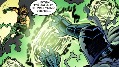
I've long been a fan of comic books, and of the superhero genre of comic books, specifically. Thus, the concept of what a sidekick is has long since become ingrained into my entertainment-loving psyche.

Yet, despite their close association with superheroes (or even super villains, for that matter), nonetheless, to be a sidekick is, by and large, to suffer the fate of being second fiddle. It's Batman and Robin, not Robin and Batman, after all.

People can relate to what it's like to play second fiddle, in life. Hell, it's part and parcel of the legacy of being an underdog. Who amongst us can't relate to being an underdog at some point in our respective lives?

To crowdfund a project for the very first time can no doubt come across as an intimidating prospect, for many. Thus, to launch a Kickstarter, at all, has a thick air of underdog quality about it. Doubt has a way of seeping in. Underdog status attaches, whether one likes it or not, whether one wants it to or not.

You're under the gun. You've got a project to fund. It's work. It's time consuming. Every crowdfunding project needs a superhero to accompany it, as standard equipment. But, life just plain doesn't work that way.

Now, Russell Brettholtz has crowdfunded, before. This ain't his first attempt at utilizing crowdfunding to turn dream into reality. He's attended this dance, before.

But, were you to ask him about his current project, Sidekicks: Dedicated - Dependable - Disrespected, I suspect that he would tell you that he's feeling a little bit under the gun, right now.


Time is running out, and he still has a considerable distance to close, on the funding end of things, before this latest venture into the realm of crowdfunding becomes successfully funded.

I'm backing this project, because first and foremost, it reeks of quality to me. Brettholtz's Sidekicks concept has always caught my eye, from the first moment that I laid eyes on it before his first Kickstarter that embodied it, to this latest incarnation of the same.

Sidekicks is blessed with characters that have been imbued with a heavy dose of humanity. Russell has a way of making them come alive, to me. They feel more real. I can relate to them - not just as characters, but as personalities.

The Flying Fox
With barely five days left in his project's crowdfunding campaign, his project is a little more than half way to its funding goal. It may succeed. It may fail. And it is the prospect of failure that moves something inside of me. Something within tells me that both Russell Brettholtz and this Sidekicks: Dedicated - Dependable - Disrespected project of his could use a few sidekicks of their own.

Now, the world won't end, certainly, if this project fails to meet its funding goal. But, I can't help but to think that the world won't be the better for it, if it does.

While I do love both Kickstarter and crowdfunding, I tend to back projects with small pledge amounts. I'm not one of the big guys, when it comes to the wallet wars. Nope, I'm just a little guy. Meet the proverbial nobody.

That's Mr. Nobody, to you!

I believe in becoming part of the crowd, not in becoming the crowd. I have no desire to become a crowd of one, and effectively try to fund a crowdfunding project to success, all on my own.

But, some crowdfunding projects just seem to have a way of mattering to you more than others. Granted, it doesn't automatically translate into more money magically appearing in your wallet, to make upping the ante on your pledge of support substantially bigger. Yet, projects like this one seem to press upon me a renewed sense of importance in them becoming a reality.

So, while I don't even have the benefit of a decent costume to wear, I choose to enter the fray, just the same.

Won't you join me?

The clock is ticking, and right now, Time, itself, seems to be the biggest enemy of all. Time is running out. Who will ride to the rescue? Who will save the day?

Click HERE to visit the Kickstarter project page for Sidekicks: Dedicated - Dependable - Disrespected

Never been a sidekick for a crowdfunding project, before? Not a problem. Just climb aboard. Just join in.

Still undecided? Just take your time.

You've got five days.

Me??

I'm already in the fight!

Wednesday, December 17, 2014

Review - Unstoppable Origins # 4: The Origin of Dr. Zero

From that bastion of comic book superherodom, Unstoppable Comics, comes a comic book titled Unstoppable Origins # 4. I first caught wind of it when it was a crowdfunding project on Kickstarter.

I backed it. The project ended - it's funding goal met and exceeded! Shortly thereafter, a digital copy of the comic book in PDF format made its way into my e-mail in-box.

I consumed it, in short order. Now, after all, not only was this a new title, it was also my first comic book encounter with this company, Unstoppable Comics.

If I may be so bold, if I may be so blunt, the bottom line is that I enjoyed it.

A lot.

For starters, it's got a great front cover. The cover art depicts a guy with energy emanating from behind him, and his clothing is in tatters. He's wearing a metal helmet and gloves. His helmet reminds me of a what you might get if you cross a Cylon with both Rom: Spaceknight and Doctor Doom. That's what it made me think of, anyway. His facial expression, what we see of it, drives home the point that what he is experiencing, from the impact of this energy upon him, is pain.

Having never encountered either the company or the character, before, I really didn't know what to expect - or to think. My impression of what I had encountered, when my impression was formed in its totality based solely and only upon what was being presented on the Kickstarter project page, can be found over on another blog that I wrote by clicking on the following link:

http://squatchkick.blogspot.com/2014/08/kickstarter-project-unstoppable-origins.html


But, that was a review of the Kickstarter project, and what was being presented therein. It was not a review of the comic book, as far as from the perspective of someone who had actually read the finished product. Hence, why I am reviewing the comic book here. Now, I have the advantage of the full experience.

And that, I want to convey, is a good thing.

It really is. I feel that what I ended up receiving was a solid product.

I enjoyed it. It was reading that was both enjoyable and interesting. All things considered, both good and bad, taken together still left me feeling as though I was glad that I had backed the Kickstarter project for this comic book, in the first place, and equally glad (if not more so) that I had took the time and made the effort to read this comic book from cover to cover, all of the way through.


Here, we have a story that makes sense. It gets me interested on page number one, and it retains my interest across the whole issue. When I reached the last page, it left me wanting more.

Ack! It ended here. Why did it have to end so soon.

Great front covers for comic books are OK. They're a good thing. There's a great thing, actually. They grab the eye. They tempt you. But, they don't always relate to what's on the inside.

Unstoppable Origins # 4 doesn't have that problem. The front cover is a perfect choice to tout what lies within, just beyond that initial visual horizon.

The origin at issue in this particular issue is that of one of the super villains from the Unstoppable Comics universe - Dr. Zero.

The issue does a good job, I feel, of not just telling the origin of Dr. Zero, but also, of giving the reader a glimpse of a greater array of characters that populate this universe.

The art and the coloring are what attracted me to this project in the first place - but, it is the storyline of the writer that closes the deal and makes it all work.

In the overall scheme of things, this comic book has more good points than bad points. Actually, it has very few weaknesses, and an abundance of strengths. It is an issue that has substance to it, and on more than one level.

In my considered opinion, the issue's greatest weakness, if it has one, lies in its lettering. Overall, the lettering is OK. In any event, the lettering is legible. I had no problem reading the comic. There are a few minor quibbles with select instances of punctuation and grammar, but I don't want to leave anyone with the wrong impression that it approaches rampant sloppiness - for it doesn't. But, it could have benefited from an even more thorough proof-reading than what it was subjected to.

I don't give the lettering an A+, but neither do I give it a failing grade, all things considered. It would probably get a B rating from me, on the lettering. It is far better than the average independent comic book, as far as those considerations go. These particular criticisms are more a criticism of the editing, than with the lettering, per se, as that is one of the core functions that naturally lie within the editing domain. Yet, it is through the lettering that such shortcomings become noticeable, as these problems are text-based in nature. The bulk of the editing is fine, though.


This issue has some decent special effects artwork encompassed within its pages. This really imbues the comic with a very energetic feeling. The special effects lettering, however, I have mixed feelings about. The strength of the issue does not lie there.

The cast of characters is visually diverse, and visually interesting. The art, itself, is one of the great strengths of this issue. Dynamic poses and good facial expressions make the art more than just pretty pictures to look at. They are integral to making a superhero type comic book to come alive. This issue gets that part of the equation right.

The coloring is solid, but it is not quite as consistently strong across all pages of the issue, as the art that underlies it is. But, it really does contain some very nice instances of color with vibrancy. It caught my eye, during the Kickstarter, and it continued to catch my eye, after I received the final product via e-mail.

Unstoppable Origins # 4, the Origin of Dr. Zero, is flush with color. The quality of the color on display in this issue is head and shoulders above most independent comic books that I encounter. Some of it, though, is solid gold - really great, as far as coloring goes. None of it is terrible.


The writer succeeds in giving us a villain that clicks, one who it is easy to have some sympathy with, as to how he became who he was - and even with why he became a villain.

But, because this is only an origin issue, Dr. Zero begs to be fleshed out, in future stories.

Another of this issue's top strengths lies in its use of panels. There's lots of variety to the panels on display, and even instances of characters breaking out of panels. With a lot of independent comic books, panels seem to be something given little, if any, thought. Here, though, they help to transform the overall work into a true visual treat.

When all is said and done, this issue of this comic book, which served as the gateway for my entry into this particular comic book universe, made a very positive impact upon me. It hooked my interest - not just for this one issue, but for a whole universe that it posits before me.

It left me wanting more - and that, in a nutshell, persuades me that it does an awful lot of things right.


If this is the kind of comic book products that Unstoppable Comics intends to publish, then I think that comic book readers have something worth looking forward to.

Publisher: Unstoppable Comics
Writer: Jaydee Rosario
Illustrator: Russ Leach
Colorist: Michael Summers
Letterer: Jaydee Rosario
Editor: Richard Rodriguez

Sunday, August 10, 2014

Meet the Maestro of Stylish Horror

As a kid growing up, I didn't like art.

Not that I didn't like any art, for most assuredly, I did. Some of it, I found compelling, even back then.

But, it wasn't simply art, alone, that compelled me, that drew me in, that captured my imagination and freed my mind.

No, it was art in class, at school, that was the epitome of disinterest for me. The only thing that rivaled it was probably music...or health. Egad! What boring subjects. What atrocities of disinterest!

Fast forward through time to the present day. Back then, it was art combined with stories, in the form of comic books, that interested me. Michelangelo had nothing upon the artistry laid bare upon the pages of comic book superhero fare.

I read them. I consumed them. Due to the nature of what they were, I could gorge upon them, time and time and time, again. Is there a greater passion in one's youthful days?

Now, these days, I read relatively few comic books. I don't like them any the less. Rather, my tastes have changed. These days, I tend to gorge more upon the art of the comics realm, than I do upon the wholeness of the books, themselves.

Hence, why I tend to spend vast reams of time at an online locale called DigitalWebbing. In the forum, there, I encounter a wide variety of art, with artists in tow. Hence, how I first encountered Montgomery "Monty" Borror.

He had posted about a KickStarter project that he had launched called HP Lovecraft Versus Aleister Crowley.
 
Howard Phillips "H. P." Lovecraft is a name that has long since become synonymous with the genre of horror. Others have built upon the legacy that he authored, and in the realm of art, to suggest that Lovecraft has been an influence would be an understatement of unspeakable magnitude.

Which is why it is a true delight to encounter an artist whose body of work that I wasn't familiar with, before, one who is able to bring the Lovecraftian sub-genre of horror to life with strokes of pen and brush.

One of the true beauties of Lovecraftian-style art is that each artist that approaches horror, that they might render it visually, is that they each tend to evince a certain uniqueness in their style. Montgomery Borror's work has a very burnished aspect to it.

But, art is about more - far more - than merely mastering details and composition and various elements of the visual realm in rendered form. When I behold a piece of art, I want it to speak to my imagination, to awaken the person who lives within me. I want to see more than nicely rendered figures and details that bespoke unerring perfection. Something should click - inside!

Take Monty Borror's take on the Creature from the Black Lagoon, for example.

Cthulhu from the Black Lagoon, an imaginative take on what is, for myself, anyway, an old film. I recall watching this movie as a kid. Now, all these many years later, here's Montgomery Borror tickling my imagination. It's how the imagination expands, taking more than one concept and crafting something new, yet something eerily familiar. Thus expands the Cthulhu mythos!

This is exactly what the mind cries out for, to be engaged, to be entertained, and yes, my dear friend, at times, even to be terrified.

It is the horror genre of art that allows us to face and to push past our fears. Horror is often represented with blood and gore steeped in and taken to excess, but such visual trinkets hardly even begin to touch upon the core nature and true depth of horror as a tool of the human imagination. Indeed, at times, unlimited gore and scenes drenched in blood only serve to diminish the horror that they seek to pay homage to.

In comic book form, horror tells a story. Thus, that which leads up to the crescendo, whether in words or in art, is critical to setting the tone and the mood. One of the things that artist Montgomery Borror excels at is setting the mood. He tends to saturate the work as a whole in it.

The craft at which he excels is not limited to splash pages writ large, to mere instances where the horror climaxes in full measure on a grand scale. Far from it, in fact.

Horror, you see, must build. It is intrinsic to the core of what it is. Otherwise, the imagination gets short-changed. You end up with shock, but gutted of the greater part of its substance.


I am drawn to energy in art. It tantalizes the soul. It moves the heart to adoration. It is said that beauty lies in the eyes of the beholder, and what is art, but beauty by another name?

It has been interesting to track, and to follow along, the progress of Monty Borror's KickStarter project - HP Lovecraft Versus Aleister Crowley. One aspect of his art that I find to be interesting is that it mirrors Monty's subdued nature, something that manifests itself in various videos that he has done for his KickStarter.

He comes across as quite comfortable in conversing in front of the camera, as he speaks to his backers and potential supporters that encounter his KickStarter - which resides in the midst of so many other projects, all vying for the attention and competing for the support of the public at large.

Even still, Mister Borror is no cauldron of enthusiasm boiling over. He strikes a balance between down-to-earth and reserved. As a personality, Monty is no Lovecraftian horror to behold. He interacts with his backers, which might seem a rather obvious thing for anyone launching a KickStarter project to do, yet which they all too often fail to do.

In a relatively short span of time, I have come to embrace KickStarter as one of the primary mechanisms whereby I seek out the art of artists, particular those of the independent variety.

Browsing the project pages of KickStarter projects reminds me of watching episodes of Gordon Ramsey's Kitchen Nightmares. Invariably, creators fail to heed the same lessons, over and over and over, time after time after time.

The interaction with project backers is key to a given project developing a story within a story. Monty Borror seems to grasp this key fact. It is one of the reasons why I have transitioned somewhere along the way from being just a KickStarter project backer to being a full-fledged fan.

I like the fact that he's not scared to post updates, to keep his project backers in the loop, or to call out various backers by name in the videos that he makes. This approach helps him to maintain interest on the part of others in his comic book project bubbling with relevance, and it also helps him to make a personal connection with the people supporting him.


Can the "most wicked man in the world" stop Lovecraft from bringing on the Ragnarok? Find out, by supporting artist Montgomery Borror, the Maestro of Stylish Horror, in his KickStarter venture of:

HP Lovecraft Versus Aleister Crowley


Be sure to also check out more of Monty's artistic handiwork by visiting

Saturday, August 2, 2014

Meanwhile, in Gotham City ... er ... KickStarter City


Wow!! It's been a long time.

Far too long, in fact. Time to blow the dust off this place, and get posting, again. This blog place was started on a whim, a mere whim I tell ya, but even that's no excuse to abandon a blog that holds such potential to...uh.....to...uh....to do what, exactly?

I remember saying something about a super villain lair, but then Starbreaker and Mordru showed up, and the next thing that I know, I was off trying to create a magazine of some sort.

Silly me.

But, now, I'm back. BACK, I SAY!!

Back with a vengeance.

Vengeance is mine, saith the LORD. OK, so vengeance is out. Let's just agree that I'm back, and leave it at that. Deal??

No! Wait!! If I wanted to leave it at that, then I wouldn't have fired the old blog's engine up, now would I? Oh, sure, it's sputtering, right now, but just wait until you see it flying. Just you wait and see/

What's that? Oh...You'll wait and see, eh? Fine, have it your way, just don't let it be said that nobody ever told you that I was back.

Oh, and did I mention, I've recently been taking an extended tour through KickStarter City?

I don't even have a KickStarter project, nor do I have a plan for one in the works. But, I have been busy trying to learn a little more about that medium, and going forward, you'll probably see me begin to explain what I have learned along the way.

You don't have to be the world's greatest detective to figure out that I have something under my sleeve. Hey, super villain lair, remember?

Anyway, KickStarter reminds me of Gotham City, somewhat. It has the upscale element of society (such as the Bruce Waynes of the world), and it has a seedier side - aka, the failures, as in KickStarter projects that failed. Touring the projects conjures up images of J.J. and Florida Evans. Those were good times, to be sure. But, like I was saying, whatever else that you may feel about it, KickStarter is a colorful place, to say the least.

Lots of colorful characters - many of which are seeking to fund comic book projects of their very own.

Of course, it's a lot easier to find a good comic book project on KickStarter to back, than it is to find a really definitive image of Gotham City on the Internet.

The Joker, Batman's arch-villain, personifies the bad side of Gotham City come to life, and run through a magnifying glass. Gotham City is a character unto itself, an entity that broods and looms over all who inhabit it.

How much of the KickStarter entity, the one that broods and looms over all KickStarter projects and their respective creators, will YOUR next KickStarter project reflect, I wonder?