Metron

Metron

Saturday, January 3, 2015

Review - Theodicy: Book Two

Recently, I reviewed Book One of the Theodicy series of comic books. That review can be found here. For all of my complaints about that issue, the fact remains undisturbed that I ended up liking Book One.

Theodicy: Book Two takes up where Theodicy: Book One left off. Unfortunately for this series, Book Two offers no salvation for comic book fans who gravitate toward either art or coloring, to sate their thirst for comic book greatness.

The very same individuals who contributed in various ways to the creation of Book One are also responsible for the creation of Book Two. How very unfortunate then, for both this series and its readership, that the visual imagery offered up in Theodicy: Book Two remains mired where it shouldn't be.

Lest anyone misconstrue where my criticism falls the hardest, make no mistake - the coloring remains the biggest disappointment in my exploration of this particular comic book series.

I will even go so far as to say that the art and the coloring for Book Two are worse than they were for Book One.

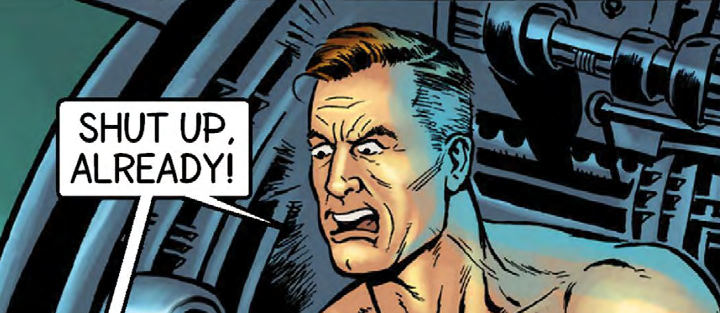
Nice speech bubbles. Good lettering. Deficient anatomy. So-so coloring.

Why?

Well, at least in Theodicy: Book One, there was an entire page of art - namely, the one that features what I shall dub "the water scene" that converted me to a fan of Book One. Nothing, whatsoever, in Theodicy: Book Two even remotely approaches the visual impact that the page in question from Book One managed to achieve. In a word, that page left its mark. In contrast, Book Two foundered.

Good visual energy is generated here.
The problem with Theodicy: Book Two is not the story. The underlying storyline remains viable. The writing continues to engage me. The dialogue between characters is strong, and the work as a whole benefits substantially by presenting the reader with intelligently conceived characters.

That is not to say that all characters are equally strong, but this comic book series has a cast of characters that includes several different ones that are worth reading about and following. Notably, Book Two introduces a character who is a miracle investigator that expands upon an already solid cast.

Special effects lettering in Book Two is slightly improved upon from what we were treated to in Book One of the Theodicy series. Even still, it remains a largely unimaginative visual footnote. There remains enormous room for utilization of special effects lettering to drive the visual interest element of this series. Basically, it's largely a missed opportunity, one that the series' creators seem content to do little with.

How boring an example of special effects letting is this?

On the lettering as a whole, it remains pretty solid. Indeed, the lettering is one of the saving graces of this comic book title. Some of the speech bubbles try to cram a bit too much text into them, resulting in smaller text than I would prefer. But, none of it rose to the level of being a critical flaw.

On a positive note, there are numerous examples of lettering in Theodicy: Book Two that are right on the money. In comic books, even though it often seems to be lost on the bulk of the independent comic book industry, lettering is a big deal.

Good lettering making a solid and positive visual impact.
A really big deal, in fact!

Lettering is arguably the most under-appreciated facet of comic book creation. Good lettering is worth its weight in visual gold to a comic book. Letterer Kel Nuttall is pulling his fair share of weight - and then some, where this comic book series is concerned. I single Kel out for special recognition, by virtue of the fact that the lettering on display warrants it.

Verily, in my review of comic books, I have no vested interest in crucifying the creators of the very things that I undertake to review. Whether I gape in awe and admiration, or whether I reel, aghast at what I find, nonetheless, I enjoy comic books as a medium of entertainment. I also thoroughly enjoy encountering comic book creators foisting new comic book creations into the public psyche.

That said, as I explore the pages of Theodicy: Book Two, as I flip them back and forth, going over them time and time, again, I invariably keep coming back to what I feel are the biggest shortcomings with the Theodicy series, to date.

This is NOT professional grade coloring!
One, the coloring. Two, the art.

The art is a combination of two things - pencils and inking. Because the colorist keeps on saturating the panels with his coloring theology of choice, the end result of the penciling and the inking is continually corrupted, visually speaking.

The colorist isn't without talent, to be certain. Actually, there is a lot of coloring talent on display across the pages of Books One and Two in the Theodicy series.

That said, the coloring of human skin and the propensity for glaring, plain backgrounds are primary contributors to the visual famine that plagues the imagery of this comic book series. The attempt to utilizing lighting and shadows on faces, in particular, leaves me shaking my head in dismay.

My colorist, my colorist, why hath thou forsaken me?

White splotches populate people and walls.
The inherent nature of comic books as an art form typically means that pencils, inking, and coloring all intermingle to such a degree that, absent seeing each contribution standing alone, it can be a constant challenge to give proper and full credit where it is due.

I believe that the underlying pencils are more at fault than the inking, where Theodicy: Book Two is concerned.

Why?

For the very simple reason that it falls to the pencils to establish the various visual zones or segments of white space. Inking is often referred to as the embellishment of pencils, although personally speaking, I think that such a characterization substantially understates inking as its own medium of expression.

In Theodicy: Book Two, the inker is working with backgrounds that, in numerous instances, are lacking in any actual details to ink. The end result is a diminishment of the comic book's overall visual impact. While some instances of this technique are useful for focusing the reader upon a particular character, other instances of it leave me wondering why a given panel bothers to make so little impact upon me. That is a good way to generate disinterest on the part of the reader, which is something that a comic book should strive to avoid.

Boring road. Boring sidewalk. Boring car. Boring victim.
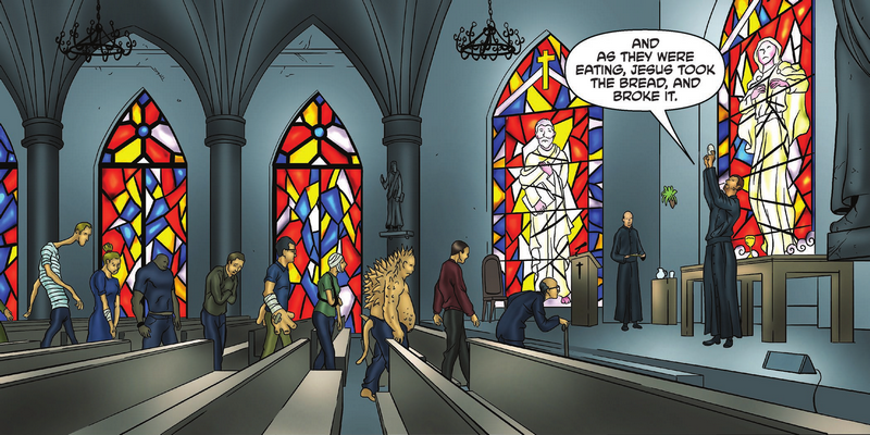
This latest installment in the Theodicy series does not mean that the inker gets off scot-free, by any means. Close ups of stained glass windows, walls made of bricks or blocks, and even doors are missed opportunities for the inker to increase the visual heft of this book.

But, I don't read through or visually explore Theodicy: Book Two, and say to myself, "Hey, the inking of this comic book is really screwing this one over!" That's simply not the case. The greatest visual sins of Theodicy: Book Two lie not with the inker.

One of what I feel to be amongst the greatest mistakes of aspiring comic book creators is what I shall characterize as the static visual treatment of the background environment in which comic book characters are visually posited before the reader.

Theodicy: Book Two is guilty of this. Take, for instance, a wall or a road. In one panel, a very light visual treatment of such innocuous, ordinary things might be beneficial to a comic book. Other panels featuring such things might benefit greatly from greater attention to detail or emphasis of the same. Book Two of the Theodicy series deserves to be taken to task for failing to visually demonstrate a keen appreciation for this basic fact.

Infrared vision or visual eyesore?

This comic book did make some attempts at being imaginative with coloring, notably where the Sanction Collection Agency is attempting to collect a "debt." I am talking about a scene where one of that entity's personnel utilizes infrared vision to see inside of a house. But, imaginative though it may be in concept, nevertheless, it ends up coming across as some of the worst coloring in the issue, in practice.
Here is a better example of a concept effectively implemented, visually.

Overall, the problem with the coloring lies less in the palette of colors chosen by the colorist than with their penchant for manipulating their colors with filter effects. That's how I will characterize it, anyway.

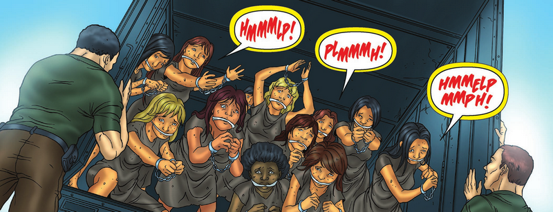
Some of the speech bubbles with yellow border that appeared at the beginning of Book Two, I felt that they worked fairly well, in the instances in which they were resorted to. I did not really care for the speech bubbles that appeared further back in the issue, which featured yellow coloring on the interior of the speech bubbles. This particular item wasn't visually critical, but I'm not really sure what the rationalization was for it being resorted to, in the first place.

Quality speech bubbles and nice lettering.
Overall, the presentation of speech bubbles in Theodicy: Book Two was visually strong. Both the speech bubbles and the narrative boxes are visual positives for this issue.

There are some decent facial expressions in Book Two, but overall, I don't think that the penciler utilization of facial expressions was as strong, as it was in Book One which preceded it. For the very reason that the Theodicy series is, at its core, a tale of human drama playing itself out against a backdrop of theological trappings, to not capitalize upon the use of facial expressions (and the attendant art form of exaggeration that they naturally embody), is to do a great disservice to this comic book series. It falls to the penciler to dominate this particular aspect of the panel work. More attention to detail is needed in this area.


This lettering, while mild, is more visually interesting than the anatomy.
As a whole, Theodicy: Book Two succeeds at the individual panel level more than it does as a collective whole. Certainly, it succeeds at advancing the storyline, but what it does not do is to maintain the same degree of momentum achieved at the end of Theodicy: Book One.

On the story end of things, Theodicy: Book Two leaves the reader hanging in suspense. Book Two succeeds on this level, but I don't believe that it pulled it off quite as successfully as was achieved with the ending of Book One in the series.

Lots of visual eye candy in play. This panel clicks.
Because the series encompasses a setting where violence is readily resorted to by certain elements, it leaves the reader wondering which of the characters will actually make it and which ones won't. One level which I feel Theodicy, as a series, succeeds at is on the level of persuading me, as a reader, to begin to grow attachment to certain of the characters. This is important, as an ingredient of success for the human drama element of the tale.

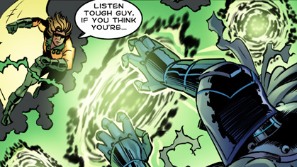
Yellow border on speech bubble succeeds in spite of yellow sky glare.
Theodicy: Book Two shows progress, I think, in the area of human hair. It's a small item, to be certain, but I do feel that hair is one of the better depicted aspects of human anatomy to be found in this series, so far.

Some of the characters in this series utilize emotion, well, and this is showcased in some of the dialogue that takes place between characters. This is one of the core reasons that the human drama of the story actually enjoys some tangible drama in its telling.

Good injection of emotion.
In summation, after having read through Theodicy: Book Two from cover to cover, I find myself still interested in learning what is yet to come. The ending of Book One left me in a more elevated state of interest, compared to Book Two, but when all is said and done, and you get right down to it, I still find myself along for the ride, as this series heads into Theodicy: Book Three.


Writer: Chad Handley
Penciler: Fernando Brazuna
Inker: Ryan Boltz
Colorist: Minan Ghibliest
Letterer: Kel Nuttall


Tuesday, December 30, 2014

Review - Bud Colbert: Time-Travelin' Janitor - Issue # 1

You owe it to yourself to join Bud Colbert, as he explodes onto the pages of this humor-laced comic book, in a no-holds-barred adventure through time.

Did I mention that he's a janitor?

But, he's much more than just that. What we have here, people, is a home-grown slice of Americana, circa 1961.

He's rockin' while he's moppin', but sometimes in life, shit just has a way of happening.

Call it fate. Call it destiny. Call it the will of God.

But, whatever you call it, don't call it boring, for that's something that Bud definitely ain't!

So, grab yourself a brew (Bud recommends Studweiser), and guzzle down some laughs and smiles, as Bud Colbert's antics transport you along the daring road of adventure.

Published by Checkmate Comics, this righteous romp is a barrel of fun. Well, for you and I, anyway. For Bud? Well, he's got his work cut out for him, and he has to save the day.

If only he knew how.

Bud Colbert is a cross between James Dean, John Wayne, and Rodney Dangerfield, with a little bit of Elvis Presley and Indiana Jones tossed in for good measure. That's how I see him, anyway.

Unlike with some comic books, there's no doubt about who the hero is, in this one. He's bold. He's brash. He's all up in your face, but he still takes time out to comb his hair, have a smoke, and swill some beer.

Circumstances have a way of overtaking Bud and his best laid plans, and soon enough, he's in way over his head. Yet, it falls to him to save civilization. As if he ain't got better things to do!

I just love this comic book!

Accidents on the job suck, but what sucks even more is getting Shanghaied by people from the future - people who are focused on something that Bud can't quite relate to, to put it mildly.


Chaos ensues!

Whump! Thrak! Bud Colbert is on the attack, and he seeks to escape, to get back to who he was and to what he was doing, before things got all strange on him.

This is one of those comic books where I want to show it all to you, but at the same time, I don't want to show you anything, at all, lest I inadvertently spoil the fun of the storyline as it lays itself bare before you in grand style.

Through it all, from one mess to a bigger mess, Bud remains undaunted. He is ever himself, it seems.

God help us all!

A hero for the common man, Bud Colbert is larger than life. When his situation isn't scaring the Bejesus out of him, his priorities remain unfazed.

It's probably best, if you don't piss him off, though. For, if you do, then hold on, buddy! The shit will definitely hit the fan, American style.

Bud Colbert, the time-travelin' janitor, isn't for everybody. But, it should be. Yeah, I'm talking to you!

Honest to God, though, I'm not sure what I like the most about this comic book.

Is it the art? The coloring? The plot of the story?

Or could it be, just could it be, the dialogue?

This thing, this wonderful little hobgoblin of humorous delight, grows on you right from the get-go. But, once Bud awakens to the surprise of his life, the powder keg of this little adventure ignites.

Krakt! Pop! Aaaagh!

It just crackles with swagger. All that Bud really wants is to just get back to how things were, before - before the un-American types spoiled his day.

But, for the reader, it's a Paul Bunyon-sized tall tale that you just don't want to see come to an end. It's a B-grade 50's movie without the movie, one that plays itself out in print.


It harkens back to another era, to a simpler time. Nothing's too complicated for Bud Colbert. He doesn't sweat the small things - like details! 

Or physics, for that matter.


The true nitty-gritty of this adventure, the plate upon which much gets heaped, is Bud's personality, as it makes its way to the center stage of the reader's attention.

As Bud rises to the occasion, laughs ensue.

For me, at least, Bud Colbert: Time-Travelin' Janitor is an instant classic. If you don't end up liking it, then Bud won't care - and neither will I.

Because, you see, there are more important things afoot in this universe that we share. And, if anybody was ever meant to be right smack dab in the middle of it all, when the whole damned universe goes to Hell, then that person, my fair comic-book-reading friend, is none other than the one, the only, the ever-irrepressible Bud Colbert.

In this trek across the space-time continuum, like me, you may well see a little bit of Clint Eastwood and Marlon Brando in Bud Colbert. But, hey, that's OK. It's a cinematic tour de force, minus the cinema, and Bud Colbert is man enough for you to see little bits and pieces of a lot of different macho personalities manifest themselves in him.


Pop a top, good buddy!

Pull yourself up a chair, and do yourself a favor, and go ahead and order this damned thing. No, you probably don't really deserve it, but what the Hell? You only live once - unless you're traveling through time with Bud Colbert, of course!

Of course.

What else would you expect?

Fhoom! Clunk!

Did I mention that it goes great with beer?

Maybe it does, maybe it doesn't. There's only one sure fire way to find out, and that's to check it out for yourself.

If you're easily offended, then you might want to seek sanctuary in some other comic book. Not that Bud Colbert aims to offend, and not that he should offend, but people being people, you just plain never know.

Know what I mean?

Abra-ka-dabra!

My least favorite part of this comic book was the white lettering on the pages where Bud is rock'n it, while at work.

But, that's a fairly small nit to pick with the best dang hero to happen along in quite some time. Seems to me that the least that I can do is to cut Bud Colbert a little slack. After all, it's not like he wasn't clocked in, when the world went to Hell in a handbasket all around him.

Kra-Boooom!!

To be certain, this comic book isn't perfect - nor does it make any pretense to be.

There were a few instances where the lettering for the time machine's voice were a tad hard for me to read, without zooming in closer.

Did I mention that I went the digital route?

Like you, I was a bit wary about parting ways with $10.99 for the print version of this comic book.

WWBD??

What would Bud do?

Me? I opted for the $2.99 way out - and boy, am I ever glad that I did! If I hadn't, then I would still be waiting on the thing to arrive, and it's taken a whole lifetime for this comic book to find its way to me, already. I consider myself pretty darned lucky to have snagged it, when I did.

But, if you splurge for the hard copy, then you'll have something uber manly that you can decorate your coffee table with - Forever!


Anyway, I am going to take a cue from Bud Colbert, and wind this rambling excuse for a review up.

Do the right thing. Do the patriotic thing. Do yourself a favor.

Buy Bud Colbert: Time-Travelin' Janitor, today!

God bless America! God bless Bud Colbert!


Website: http://morttodd.com/bud.html
Writers: Jim Fader & Troy Lowe
Artist: Pat Carbajal
Colorist: Javi Laparra
Editor: Roger McKenzie

Sunday, December 28, 2014

Review - Theodicy: Book One

One of the things that I do, when I obtain a new comic book, whether for review purposes or not, is to just flip through it, catching only fleeting glimpses of the art and coloring that lies in store for me.

I do it for my own reasons. I do it for my own purposes. I find it to be continually useful, as it instructs me in a first-hand and forceful manner to abide by the dictum, "Never judge a book by its cover."

Theodicy: Book One is a perfect example of this axiom in play. Just flipping through the pages, without bothering to absorb either the story that it tells or the talent that it encapsulates, is to miss this little gem of a comic book.

I was actually asked to review this comic book a couple of months ago, and circumstances and health conspired to effectuate me losing track of it. I wasn't even looking for it, when I happened back upon the digital copy that writer Chad Handley had sent to me back on October 1st, 2014.

I won't call it a miracle, that it made its way back to my attention, but I am thankful that it did, nonetheless. 


Note the contortion of anatomy in transition from neck to face.

At a glance, this is not a comic book that I would gravitate to. The coloring and the art of the interior pages relegate this work into the realm of standard fare independent comic bookdom. In other words, there's plenty wrong with them.

Make no mistake, the art and the coloring of Theodicy: Book One is a long, long way from the very worst that independently published comic books have to offer. Yet, neither rise to the occasion of showcasing this little diamond in the rough.


Though I read this comic book in PDF format, which is a digital format, if this comic book were in traditional paper form, and if it was sitting on the shelf of my local comic book shop, its front cover would catch my eye.

The front cover features an artistic depiction of a young boy, a quadruple amputee, wearing a Jesus Heart Me (Jesus Loves Me) tee-shirt. The artwork of the front cover is actually the best drawn and best colored art to be found in the entire issue. None of the interior pages are as fortunate.

That said, the front cover's art and coloring neither offend me nor attract me to sufficient degree that I feel compelled to open the book, to see what's inside. In that sense, I would adjudge the front cover art to be a failure, for isn't that the whole or overriding purpose of any comic book's front cover? If it doesn't grasp me, if it doesn't command my attention, if it doesn't interest me with artistic temptation, itself, then aren't I - and others like me - likely to simply pass it by?

All the more to pity, then, for this is comic book ground that should not be allowed to lie fallow.

Theodicy's theme is a religious one, and it makes sparing - but effective - use of resort to the quoting of scripture from the Bible to ground itself and to serve as a foundation for suspension of disbelief, that readers might allow themselves to get swept up into the story, itself.


Once I turn past the credits page, and land squarely on the first page of the story, itself, I am met by coloring that so visually dominates the eye-scape that I immediately want to just close the book.

Amateur. Amateur. It just screams amateur, at me, in a visual manner. I can already tell that I am not going to like this comic book. Oh, God, do I really have to review this?

Fast forward to the end of Book One, and somehow or other. by hook or by crook, Theodicy has managed to snag me. It leaves me on a high note, wanting more.

For all of its many shortcomings, I end up liking the damned thing. And that, to me, is the mark of a fundamentally sound comic book. The art and the coloring are typically the visual equivalent of smoke and mirrors of comic books. They are often pretty and attractive or eye-popping.

But, they never are a full and proper substitute for competent story-telling and adequate lettering.

Like many independent comic books, Theodicy: Book One has its share of typos. That accounted for and aside, the lettering present here in this issue is more than up to the task at hand. Bad lettering can kill an otherwise great comic book, but as this issue more than amply demonstrates, competent lettering can salvage even second tier art and coloring to deliver unto the end reader a positive reading experience.

Theodicy: Book One features a couple of pages about the issue's creative team. One of these pages lists writer Chris Handley as possessing a Master's Degree in screenwriting from Hollins University.


Well, I know next to nothing about screenwriting, but what I do know is this - the writing for Theodicy: Book One is this issue's true path to salvation.

Though this comic book deals with religious and theological fare, it tackles the subject matter with equal portions of seriousness and humanity's proclivity for error. It yields a very human approach to certain issues, and it brings the issue of doubt in God to the forefront - doubt forged in the furnace of things that happen in the real world, every single day.


The confrontation in the book between a character named Paul and a statue of Jesus Christ sets the stage for an atheist's baptism, of sorts, but while Paul is the one left soaked from the water, I was the one who felt like a fish hooked and yanked from the water.

If one were to simply flip through the book and happen upon this scene, the end effect isn't nearly as effective as if one allows the story to lead them to where it is going, panel by panel.

Speaking of panels, Theodicy: Book One is imaginatively stale, insofar as imaginative use of panels goes, which is not the exact, same thing as effective use of panels.

This issue derives far greater positive effect from its use of speech bubbles, than it derives from its exploitation of panels, visually speaking.


While I am not a fan of the coloring, overall, I will concede that I did like the coloring of the stained glass imagery that appears within the pages of this comic book. They do a great job of setting the mood of certain panels, and they visually deliver, in sharp contrast to a lot of the coloring that dominates the pages of this comic book.

The art on the pages could have benefited considerably, if the artist had invested more time in their rendering of both human anatomy and details. A huge amount of potential visual interest simply never materialized for me, with the end effect being more of a visual dumbing down of the end product.

With regard to the special effects lettering, it is a gospel of mediocrity writ large. There is some sprinkled throughout, but it seems to have been little more than an afterthought. The end result is that it proves to be a meager offering incapable of paying visual penance to the underlying vessel that is the story.

As with every comic book ever produced, it is what it is, for better or for worse. All things considered, though, Theodicy: Book One is a comic book that I can and do recommend to others. The search for a good comic book is often times as elusive as the search for God, or so it seems to me. There are a lot of things about this comic book that I don't like. Nonetheless, when taken and considered and digested as a whole, Theodicy: Book One is greater than the sum of its individual parts.


Writer: Chad Handley
Penciler: Fernando Brazuna
Inker: Ryan Boltz
Colorist: Minan Ghibliest
Letterer: Kel Nuttall

Review - Interceptor # 1

Recently billed as the most successful Kickstarter that they've had at Unstoppable Comics, issue # 1 of Interceptor is the latest reading fare to make its way to me, from the realm of comicdom. Hither, now, comes my review of it!

Regardless of Interceptor # 1's billing as Unstoppable Comics most successful Kickstarter to date, make no mistake - it is not Unstoppable Comics' best comic book produced, to date.

Far from it, in fact.

However, I quantify that statement by pointing out that the issue, itself, proclaims August 2014 as its actual time of creation, even though the Kickstarter project for this issue didn't end until December 19th, 2014. Thus, there's a span of four months to account for, when weighing and assessing and comparing Interceptor # 1 to other comic books by the same company.

For example, another comic book that they published, one that I recently reviewed - namely, Unstoppable Origins # 4: The Origin of Dr. Zero - asserts September 2014 as its time of creation, even though I read and reviewed it prior to ever reading Interceptor # 1. So, unless Unstoppable Comics got the dates wrong on the inside pages of its own comic books, from a creation point of view, Interceptor issue number one strikes me as an earlier product than The Origin of Dr. Zero. As such, this helps me to reconcile what I feel are some of the shortcomings with Interceptor # 1.


Before I go into greater detail of the issue's respective strengths and weaknesses, I would preface my remarks-to-come with a simple statement that I enjoyed reading the comic book. Rest assured, by this point in time, I count myself as a true fan of Unstoppable Comics. I look forward to each of their new comic books, as they come out, and I think that, by and large, they are doing a very respectable job of publishing what I feel are quality comic book products.

That said, I have no qualms about criticizing various instances of what I feel are points of weakness in the end product that they are putting in the hands of comic book readers.

The credits page of Interceptor # 1 lists the following individuals as being responsible for the comic book that I have just read and am now reviewing. Respectively, they are:

Brandon Easton - Writer
Russ Leach - Illustrator
Michael Summers - Colorist
Letterer - JayDee Rosario
Richard Rodriguez - Editor
Max Dunbar - Variant Cover


Issue number one of Interceptor is a mixed bag, one that leaves me a bit miffed. On the one hand, it contains a select few instances of panels that are spot on the money for being top notch. On the other hand, the bulk of what we see in the panels that collectively comprise the various pages of this comic book do not even remotely rise to that level of praise worthiness.

Interceptor # 1 isn't terrible. It's really not.

But, neither is it terrific.

Instead, it is a mish-mash, a veritable hodgepodge of middle ground accomplishment.

Of the individuals listed in the credits for this comic book, the one that I, personally, think should come in for the least criticism is Max Dunbar. After all, his contribution to the effort that was this issue is confined to the variant front cover for it.

The pre-order front cover does a pretty good job of crafting a visually interesting front cover. It visually entices me, somewhat. It doesn't reach out and grab me, nor does it make me drool with excitement, when I look at it. But, for the most part, the front cover works. It serves its purpose. It gets the job done.

It's job only, though. What it does not get done are the other jobs - namely, the jobs attributed to the other individuals previously listed, above.


Max's variant cover grabs my eye, with Interceptor in running form in the foreground, as a giant Union Jack dominates the background. It's not a better, not more visually interesting, alternative to the pre-order version of the front cover for this comic book, but it does embody more visual energy than its more visually interesting counterpart.

Overall, Russ Leach manages to churn out some pretty decent artwork. This issue was not a stellar performance by Russ, to be certain, where the artwork is concerned, but I will say this for him - his work is consistently good, with much of it being well above par, compared to what you usually find scattered throughout the independent comic book industry.

None of Russ's artwork in this particular issue is terrible. None of it is really even bad. Rather, the biggest visual drain on the artwork rendered by Russ Leach for Interceptor # 1 is the coloring that accompanied it.

Not that I want to say that colorist Michael Summers was the real villain of this issue, but yeah, he was. Sorry, Michael, but it's true.

And that is where the greatest mystery of issue # 1 of Interceptor lies. The great unknown is not the magical ley lines that writer Brandon Easton has dangled before us. Rather, it's how Michael Summers' coloring can vary so greatly across the pages of a single issue.

What the Hell is going on here, guys?

This particular issue runs the coloring gamut from excellent to ho hum. In other words, it's a consistency issue.

I do not believe that Interceptor # 1 is a sterling example of Russ Leach's most imaginative drawing, as an illustrator, but from page to page from front page to last page, Russ Leach's artwork is rendered consistently better than Michael Summers' coloring.

Two of the four panels on the first page of this story are rock solid eye candy, both from a drawing perspective and from a coloring perspective. The other two are little more than an exercise in coloring mediocrity. Not terrible, but nothing to write home about, either.

The villain, Throttle, gets issue # 1 off to a good start.

Colorist Michael Summers' crowning glory for this issue is his treatment in colors of the character known as Throttle, although there are some instances of Interceptor that make Michael's work as a colorist shine.

The far more interesting, Throttle, beating up on Interceptor.

Brandon Easton's contributions as the writer for this issue are successful, all things considered. But, the story that he tells, while it gets the job done, does not make me clamor for more. It was an interesting story. It was OK. It was all right. But, it doesn't make me want to subscribe to Interceptor, compared to how I was left feeling after reading Unstoppable Origins # 4: The Origin of Dr. Zero.

There, somebody needed to slap JayDee Rosario around, and make him stay in a room until he delivered the next issue of Dr. Zero to us. Here, I'm more interested in seeing what Unstoppable Comics comes out with next, more so than I am in following the further adventures of Interceptor. Blame me, if you like, but that's what you guys at Unstoppable Comics made me feel, where Interceptor # 1 is concerned.

Interceptor carries a shield called Pridewynter.
On the editing front, Richard Rodriguez did a better job on the story part, than he did on the punctuation front. The editing needs more attention to detail, but for whatever flaws that it may have, ultimately, it's a very readable story. It's easy to follow, and it's legible.

Which leads us into the lettering, and to my main man over at Unstoppable Comics, the illustrious Jaydee Rosario.
Is this the real JayDee Rosario??

Interceptor # 1 makes use of narrative boxes, something that was noticeably absent from Unstoppable Origins # 4: The Origin of Dr. Zero. Perhaps credit for that should go to the editor, rather than the letterer, but that particular quibble aside, the lettering suffices to get the job done.

At times, it feels a slight bit cramped, relative to the size of the speech bubbles utilized in select instances, but none of it rises to the level of critical.

Far better that the lettering be legible than that it be a visual parade of horribles - as is often the case with comic books published by independent publishers across the comic book industry.

Of course, there is that opening narrative box that is quasi-pale red with yellow lettering - which was definitely not lettering's finest moment.

But, the grand bulk of the lettering is presented with black text in a white speech bubble, which yields solid visual contrast, so that the simple act of reading a comic book doesn't become a form of visual torture.


I like this!
In terms of the special effects lettering presented here, issue # 1 of Interceptor is no tour de force of visual delight. Instead, once again, readers are given the mixed bag treatment. Not horrible, but nothing that rises to a visual majesty. Rather, what we are treated to largely seems to be content to just get the job done.

This, not so much.
This issue of Interceptor continues Unstoppable Comics' apparent tradition of injecting interesting concepts into its storylines. I liked the ley lines concept a lot, and I also liked the link between Interceptor's shield and the famous sword of literary fame, Excalibur. The Axis of Neverwynter also caught my eye and my interest.

But, when all was said and done, I was more interested, as a reader, in one of the villains - Throttle - than I was in the hero, Interceptor.

The villain, Grave Walker, fell flat with me.


Grave Walker in action.
As with many things in the superhero genre, Interceptor # 1 struck me as being more worried with creating an origin story for a character, than in simply telling an interesting tale in a very interesting way.

Sure, it's interesting, because it is new to me. The characters are new, and the story, itself, is new. But, beyond that, it doesn't really win me over to the title's namesake character, nor does it persuade me

that the title, itself, is worth following, as a series.
Rather than drawing me into a compelling storyline, Interceptor # 1 leaves me feeling distant. It's not outright boring, but neither is it particularly exciting. Instead, it is interesting, but interesting with a touch of the mundane.

Nonetheless, for all of its flaws and shortcomings, Interceptor # 1 doesn't make me like Unstoppable Comics, any the less. Each issue presents its own set of challenges, and overall, my impression of the company is a very positive one. I don't have to look forward to what Interceptor is doing next, in order to still be very interested in what Unstoppable Comics is coming out with next.


Publisher: Unstoppable Comics
Brandon Easton - Writer
Russ Leach - Illustrator
Michael Summers - Colorist
Letterer - JayDee Rosario
Richard Rodriguez - Editor
Max Dunbar - Variant Cover


Wednesday, December 17, 2014

Review - Unstoppable Origins # 4: The Origin of Dr. Zero

From that bastion of comic book superherodom, Unstoppable Comics, comes a comic book titled Unstoppable Origins # 4. I first caught wind of it when it was a crowdfunding project on Kickstarter.

I backed it. The project ended - it's funding goal met and exceeded! Shortly thereafter, a digital copy of the comic book in PDF format made its way into my e-mail in-box.

I consumed it, in short order. Now, after all, not only was this a new title, it was also my first comic book encounter with this company, Unstoppable Comics.

If I may be so bold, if I may be so blunt, the bottom line is that I enjoyed it.

A lot.

For starters, it's got a great front cover. The cover art depicts a guy with energy emanating from behind him, and his clothing is in tatters. He's wearing a metal helmet and gloves. His helmet reminds me of a what you might get if you cross a Cylon with both Rom: Spaceknight and Doctor Doom. That's what it made me think of, anyway. His facial expression, what we see of it, drives home the point that what he is experiencing, from the impact of this energy upon him, is pain.

Having never encountered either the company or the character, before, I really didn't know what to expect - or to think. My impression of what I had encountered, when my impression was formed in its totality based solely and only upon what was being presented on the Kickstarter project page, can be found over on another blog that I wrote by clicking on the following link:

http://squatchkick.blogspot.com/2014/08/kickstarter-project-unstoppable-origins.html


But, that was a review of the Kickstarter project, and what was being presented therein. It was not a review of the comic book, as far as from the perspective of someone who had actually read the finished product. Hence, why I am reviewing the comic book here. Now, I have the advantage of the full experience.

And that, I want to convey, is a good thing.

It really is. I feel that what I ended up receiving was a solid product.

I enjoyed it. It was reading that was both enjoyable and interesting. All things considered, both good and bad, taken together still left me feeling as though I was glad that I had backed the Kickstarter project for this comic book, in the first place, and equally glad (if not more so) that I had took the time and made the effort to read this comic book from cover to cover, all of the way through.


Here, we have a story that makes sense. It gets me interested on page number one, and it retains my interest across the whole issue. When I reached the last page, it left me wanting more.

Ack! It ended here. Why did it have to end so soon.

Great front covers for comic books are OK. They're a good thing. There's a great thing, actually. They grab the eye. They tempt you. But, they don't always relate to what's on the inside.

Unstoppable Origins # 4 doesn't have that problem. The front cover is a perfect choice to tout what lies within, just beyond that initial visual horizon.

The origin at issue in this particular issue is that of one of the super villains from the Unstoppable Comics universe - Dr. Zero.

The issue does a good job, I feel, of not just telling the origin of Dr. Zero, but also, of giving the reader a glimpse of a greater array of characters that populate this universe.

The art and the coloring are what attracted me to this project in the first place - but, it is the storyline of the writer that closes the deal and makes it all work.

In the overall scheme of things, this comic book has more good points than bad points. Actually, it has very few weaknesses, and an abundance of strengths. It is an issue that has substance to it, and on more than one level.

In my considered opinion, the issue's greatest weakness, if it has one, lies in its lettering. Overall, the lettering is OK. In any event, the lettering is legible. I had no problem reading the comic. There are a few minor quibbles with select instances of punctuation and grammar, but I don't want to leave anyone with the wrong impression that it approaches rampant sloppiness - for it doesn't. But, it could have benefited from an even more thorough proof-reading than what it was subjected to.

I don't give the lettering an A+, but neither do I give it a failing grade, all things considered. It would probably get a B rating from me, on the lettering. It is far better than the average independent comic book, as far as those considerations go. These particular criticisms are more a criticism of the editing, than with the lettering, per se, as that is one of the core functions that naturally lie within the editing domain. Yet, it is through the lettering that such shortcomings become noticeable, as these problems are text-based in nature. The bulk of the editing is fine, though.


This issue has some decent special effects artwork encompassed within its pages. This really imbues the comic with a very energetic feeling. The special effects lettering, however, I have mixed feelings about. The strength of the issue does not lie there.

The cast of characters is visually diverse, and visually interesting. The art, itself, is one of the great strengths of this issue. Dynamic poses and good facial expressions make the art more than just pretty pictures to look at. They are integral to making a superhero type comic book to come alive. This issue gets that part of the equation right.

The coloring is solid, but it is not quite as consistently strong across all pages of the issue, as the art that underlies it is. But, it really does contain some very nice instances of color with vibrancy. It caught my eye, during the Kickstarter, and it continued to catch my eye, after I received the final product via e-mail.

Unstoppable Origins # 4, the Origin of Dr. Zero, is flush with color. The quality of the color on display in this issue is head and shoulders above most independent comic books that I encounter. Some of it, though, is solid gold - really great, as far as coloring goes. None of it is terrible.


The writer succeeds in giving us a villain that clicks, one who it is easy to have some sympathy with, as to how he became who he was - and even with why he became a villain.

But, because this is only an origin issue, Dr. Zero begs to be fleshed out, in future stories.

Another of this issue's top strengths lies in its use of panels. There's lots of variety to the panels on display, and even instances of characters breaking out of panels. With a lot of independent comic books, panels seem to be something given little, if any, thought. Here, though, they help to transform the overall work into a true visual treat.

When all is said and done, this issue of this comic book, which served as the gateway for my entry into this particular comic book universe, made a very positive impact upon me. It hooked my interest - not just for this one issue, but for a whole universe that it posits before me.

It left me wanting more - and that, in a nutshell, persuades me that it does an awful lot of things right.


If this is the kind of comic book products that Unstoppable Comics intends to publish, then I think that comic book readers have something worth looking forward to.

Publisher: Unstoppable Comics
Writer: Jaydee Rosario
Illustrator: Russ Leach
Colorist: Michael Summers
Letterer: Jaydee Rosario
Editor: Richard Rodriguez